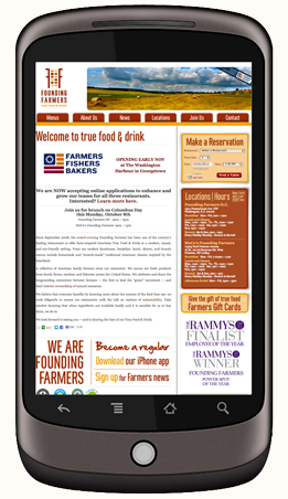
Are we really entering a post-PC world? Surging numbers of mobile users certainly make the future look that way. Mobile will soon become the standard web browsing experience- your “main website” will be your mobile site! This seismic shift means it’s crucial to build excellent mobile sites now to offer mobile visitors everything your desktop version delivers- and maybe even more. A solid mobile design is essential to prepare your company for the next big leaps in technology, too, which will focus heavily on mobile possibilities. You probably already know your mobile site should include something called responsive design. What you may not know is that not all responsive design is the same.
Just a couple of years ago, mobile-compatible sites were rare. Most administrators didn’t even have mobile versions of their sites- users had to deal with frustrating load times, painfully tiny text, awkward oversized navigation, and some non-functional features if they wanted info on the go. Development lagged behind hardware, reducing mobile browsing to a desperate measure most only resorted to in a pinch, maybe for quick driving instructions or business hours. Things have changed quite a bit since then!
Mobile users are everywhere, and they no longer have patience for anything less than full mobile optimization.
Mobile sites of yesteryear were not very much fun >
Users expect pages that load lightning-fast and give them exactly what they’re looking for, front and center. They expect mobile-specific features that automates much of the work for them, detecting location, device type, preferences, and more. They won’t poke around your site, pinching and zooming to find what they need. They’ll get frustrated and go to another site with better mobile design.
These users expect to meet objectives in even less time than PC users, in a simpler format, on an even smaller screen. This calls for some creative new approaches made just for mobile.
Some developers will approach your mobile site by delivering a great-looking desktop version and then simply “scaling it back” for smaller screens. They might use a plug-in to automatically condense your info, or resize and rearrange your layout to fit, or even cut out crucial features to produce a “lite” version of your site. These are outdated approaches to mobile design. Not only do they consume more work hours (and presumably more cash) than current strategies, they also weaken your site overall.
Flaws with these Common Mobile Development Strategies:
1) Mobile sites shouldn’t be conceptualized or executed as watered-down versions of the full site. The WC3 recommends a “One Web” approach to design today, which means “making the same information and services available across all device platforms,” as much as reasonably possible.
Mobile is a huge design opportunity- not a downgrade-
and the future belongs to those who realize it.
2) Mobile users are not just desktop users on a smaller screen, and simply resizing your desktop site won’t cut it for them. They have different sets of expectations, needs, and priorities. They use the web differently and need sites designed specifically for them. Starting with the question “What do mobile visitors want to do on your site?” is key. A good designer will know the answers and get them right in front of your customers.
Mobile-friendly doesn’t just mean your site will load on a smartphone or tablet screen; it means your site is responsive, not only in terms of size or layout, but responsive to actual mobile user needs.
3) Great mobile design isn’t something you tack on to the end of development. Mobile design that works- gets you sales and prepares you for tomorrow’s web- is embedded in the development process from start to finish.
Mobile design is a huge design opportunity, not a downgrade, and the future belongs to those who realize it.
So What’s the Smart Way to Design for Mobile?
There are three basic approaches in professional mobile design today. Each has their own benefits. MagicLamp can help you pick the one that best fits your particular goals.
Responsive Web Design is the most common one web approach. It uses CSS queries to modify the presentation of a website based on the device display.
Benefits: Designers can use a single template for all devices, and just use CSS to determine how content is rendered on different screens.
Limitations: Testing can be a tedious process and may require some work to get site sections to size cohesively, otherwise sites can end up looking like puzzle pieces that don’t fit quite right.
Responsive sites can be sluggish in loading and performance. Why? Because they load media templates for all possible devices at once, and users have to wait for every page element to load before they can browse. This can be mitigated by incorporating a mobile first approach, where the mobile use case is prioritized during development. However, this often entails a lengthy development process, which can mean rebuilding your site from the ground up. When it’s done, though, you’ve got a really solid foundation for future mobile development and a site that’s truly responsive.
See MagicLamps’s work on these fully responsive client sites:
Aptare
HearUSA
Client-Side Adaptive Design can deliver experiences targeted at specific devices and contexts. Adaptations happen on the client side, right in the user’s browser.
Benefits: Client-side adaptive uses JavaScript to detect device types and display your site in different ways depending on device capability. For example, smartphones with retina displays will receive retina-quality images, and phones with regular displays will receive standard quality images. You can even target your marketing to specific device models, offering iPhone users a site that’s dialed into conversions for apple users, for example.
Another big advantage of client-side adaptive over responsive: you don’t have to rebuild your website! Your developer will simply build an adaptive layer on top of your existing content and code base. Testing is also a snap with client-side adaptive, since you’ll use one set of HTML and Java templates across all devices.
Adaptive design also performs better and loads faster than responsive, because only the required resources are loaded by the device. CDN networks like Akamai and Edgecast can use most of their caching functionality without disrupting user experience.
Limitations: Client-side has a higher barrier to entry than responsive. You’ll need a developer with advanced skills and a solid grasp of JavaScript. You’ll also need to maintain and update your client-side adaptations regularly, since they’re a kind of layer on top of your existing code base.

See Client-Side Adaptive in action:
Threadless
iDeel
Server-Side Adaptive makes the web server do the heavy lifting of detecting a user’s device and loading the appropriate template. This approach goes beyond customized experiences for devices, so that you can even dial marketing into specific user behaviors and preferences.
Server-side adaptive features multiple device-specific templates, but unlike responsive, only the necessary template is loaded to the device, eliminating the slow performance issues responsive can suffer from.
Benefits: Server-side adaptive utilizes distinct templates for each individual device model, allowing for even greater customization, and it keeps device-detection logic on the server, making for lighter mobile pages that load faster.
Many server-side plugins are available for common CMSs and eCommerce systems like Magento.
If you’re looking to invest in an ultra-customized user experience with high performance capabilities, server-side adaptive is the way to go.
Limitations: When mobile user agent detection is performed on the server, many common caching mechanisms deployed by CDNs need to be turned off. This can result in slower user experience for both mobile and desktop users.
Server-side requires the most extensive upfront changes of these three approaches, including significant upgrades to your back-end systems, which can require hefty development time and investment. Managing multiple templates also raises ongoing maintenance costs, and performance can be impaired when servers are under heavy traffic.
See how server-side adaptive works:
Etsy
One Kings Lane
OnlineShoes.com
With so many different capabilities to compare, it can be tough deciding which approach is right for you on your own. MagicLamp developers have experience with every type of mobile approach, and we would love to tell you which one would fit you best and why.
Tell us about your project and get a free consultation now.

