MagicLamp relaunched high fashion retailer Opening Ceremony’s site this week, unrolling a smart, contemporary minimalist design that sets all attention squarely on the products.
The new design features a layout that’s even more minimalist than OC’s previous look, stark typographic treatments, and a new integrated Twitter feed. We removed the pastel design accents and background color gradients, paring the site’s palette down to classic black and white. With the new look, all of the color is in the products, creating a crisp, impeccable aesthetic fitting for this hip cosmopolitan brand.

Photos on the new homepage nest together in a gridded javascript layout nicknamed “masonry,” a name reflecting how elements of different sizes are laid in and fitted together, much like fine stonework. Semi-opaque white overlays with descriptive text (we used Adobe’s typekit) appear over each photo as visitors roll over images.
Overall, the site’s new incarnation is much more visual, heavily emphasizing images over text. OC’s new blog in particular is a great example of this strategy: huge, crisp, color-saturated images you could practically fall into dominate the screen. Your eyes can’t help but soak up the visual feast. The effect is that readers actually associate entries with the image more directly than the title or text, resulting in quicker processing and response time and greater emotional engagement. The shift from text to image is a big movement in web design today as we discover more about the psychological primacy of images and the benefits of engaging the intuitive, image-responsive right brain in user experience.
Opening Ceremony made another big announcement this week: their MICA Smart Bracelet, a smartphone-like mobile device produced in partnership with Intel, was unveiled yesterday and will be available at OC stores for the 2014 holiday season. OC is in the vanguard of companies to enter the luxury tech wear market.
Kudos to our longtime partner Opening Ceremony on all of their exciting new developments!
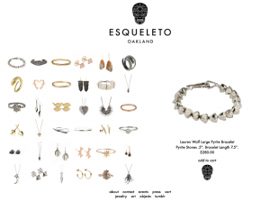
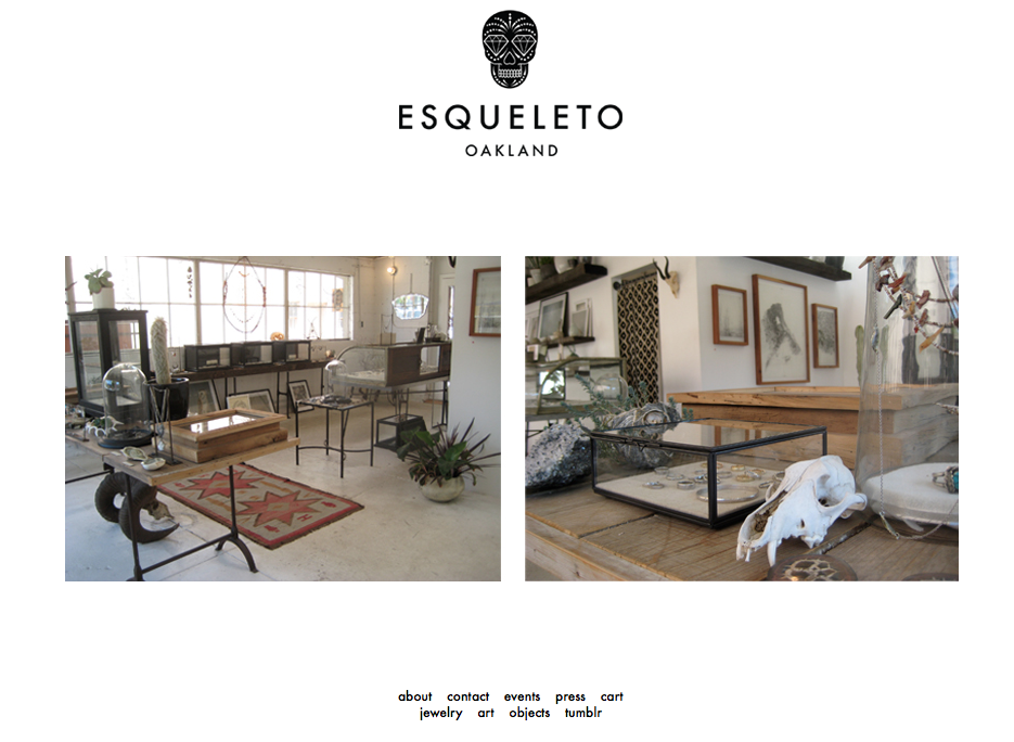
 Magiclamp fully integrated the design of the Esqueleto brand with the needed modern function of the Magic Shopping Cart, which includes integration with the custom Content Management System. The result is a beautiful and minimalistic website whose real appeal lies in the speed and functionality delivered by MagicLamp’s custom JavaScript programming and image-based scripting. MagicLamp integrated a custom Zoom feature into the product pages, so Esqueleto’s website visitors are offered a comprehensive view of the objects, jewelry and art of the shop.
 The Esqueleto website provides its visitor with a very strong impression of quality and value. In an global eCommerce environment where aesthetics and value attribution are increasingly important, Magiclamp Networks delivers a product that raises the bar in eCommerce and custom web development. The simple, clean aesthetic of Esqueleto.com allows the website to virtually disappear from the viewers mind, so all that is left to see are the unique imperfections of handcrafted art.
.png)

