COWBOY CHARCOAL
APTARE
GREI
Yes, It’s easy to understand why WooCommerce powers 37% of online stores, and now GREI’s website further distinguishes those offerings.

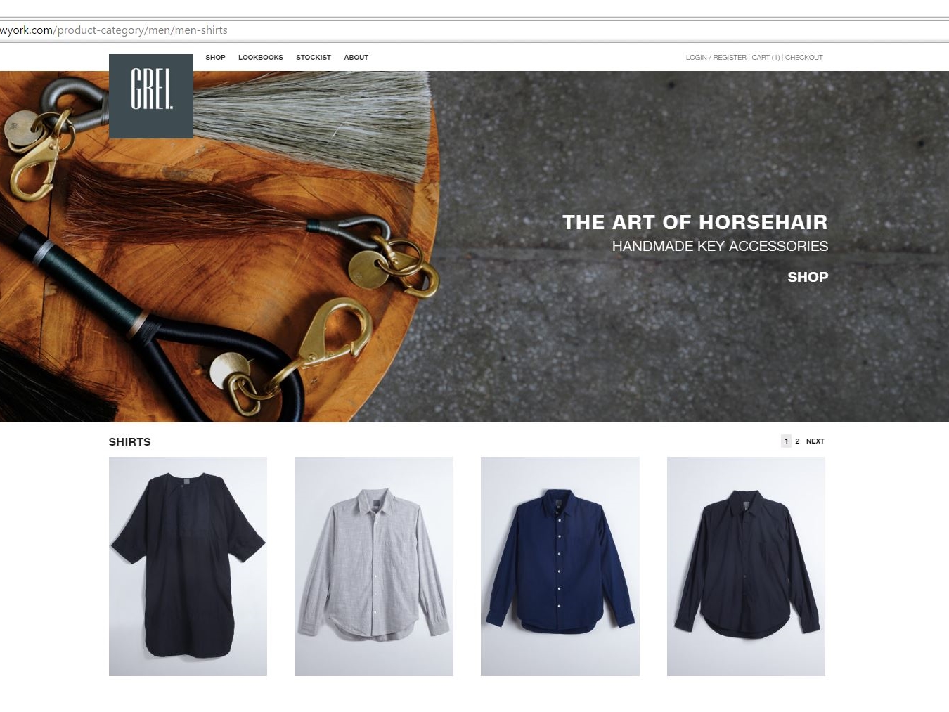

Yes, It’s easy to understand why WooCommerce powers 37% of online stores, and now GREI’s website further distinguishes those offerings.


WordPress once again displays its flexibility in hosting a database-driven site, this time to serve the hearing challenged customer in both the USA and Canada.
Through use of Google Maps and integrating the importable data in Microsoft Excel worksheets, MagicLamp has created a responsive, highly functional and updateable resource that can locate the office of a HearUSA or HearCanada provider as well as any surrounding services the customer might seek.
The Google map on the site’s home page displays a list of 200 providers searchable by clicking on the “View Center Details” link for the customer’s geographical location. There the customer can review the menu bar of options about hearing loss and hearing aids along with the customized content of that specific provider (i.e. provider’s profile, local special events, etc.).
The dual-skinned database can switch between both sides of a geographic border to provide the most accessible location for the customer seeking hearing services. MagicLamp has also given the customer the means to either sign up onsite or call for free hearing evaluation. Bottom of the home page features discount coupons for hearing aid purchases and services, as well as HearUSA and HearCanada’s accreditation.
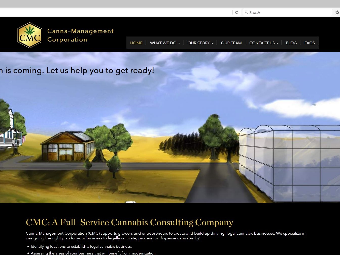
As legalization of medical marijuana becomes more mainstream, the need for governance and guidelines for the growing and processing of it leaves a void to be filled. Enter Canna-Management Corporation.
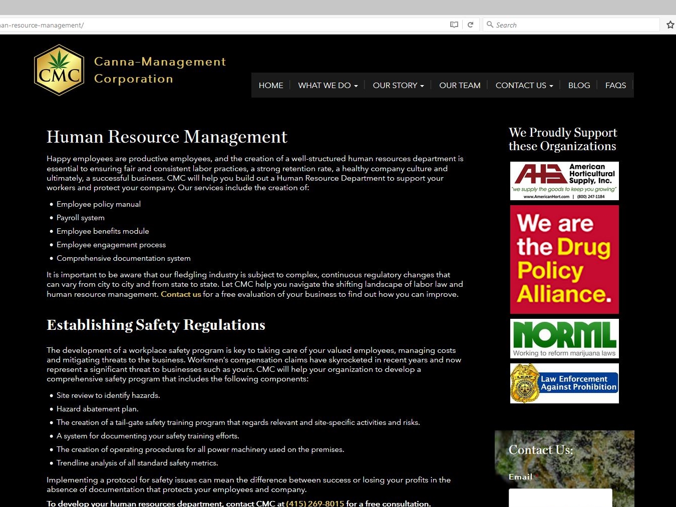
This authoritative WordPress site designed by MagicLamp reflects CMC’s masterful foresight in assembling a comprehensive resource of information and a knowledgeable support team to advise and guide businesses considering legal cannabis production.
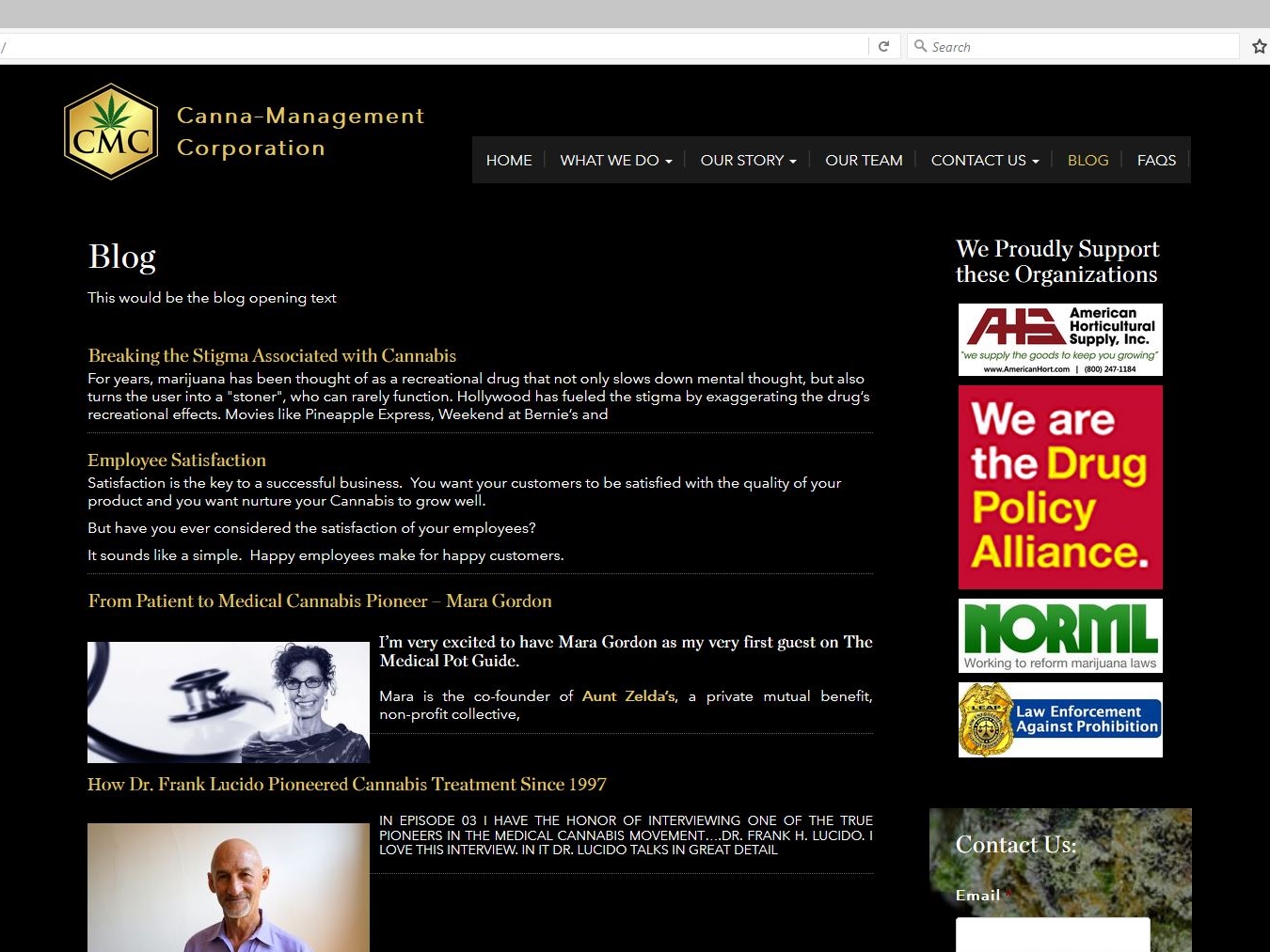
The home page features a slideshow of custom drawings that illustrate how CMC can help a cannabis company’s operation grow. The site’s clickable links on informational topics as well as drop down menus provide a fuller sense of what the requirements and considerations are for this type of business. The responsive design also features a blog with posted podcasts displaying what questions are answered by some of the leading experts on medical cannabis issues.
CMC’s site is also integrated with MailChimp along with a slide-in subscriber signup; and ads for several CMC-sponsored organizations who can provide even more insight and information on staying legal and growing.
MagicLamp subtly showcases John Mahoney Design’s creations with its various categories of home décor.
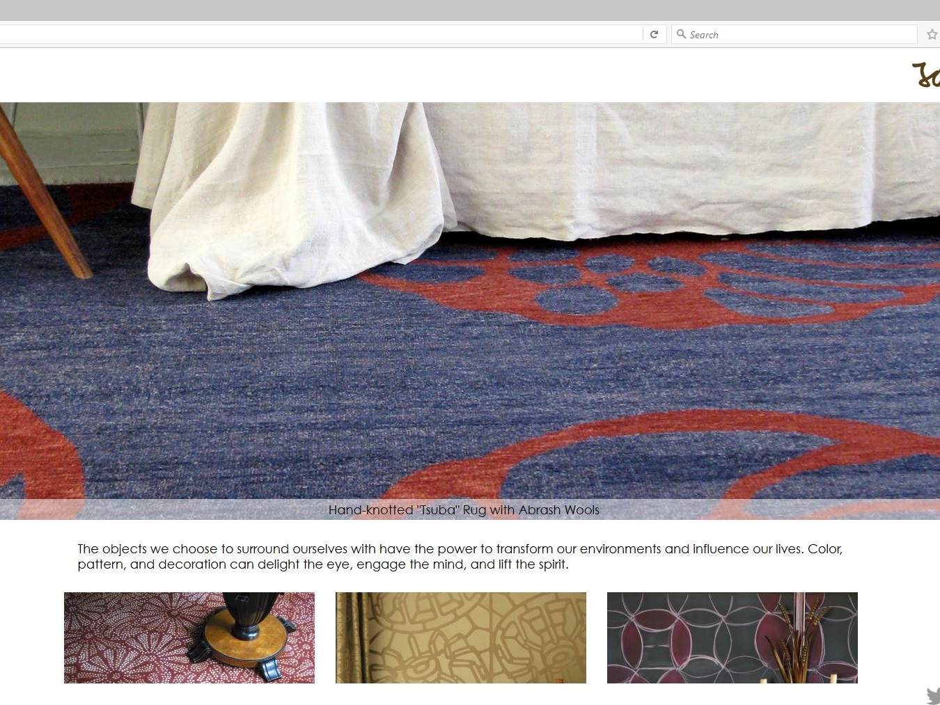
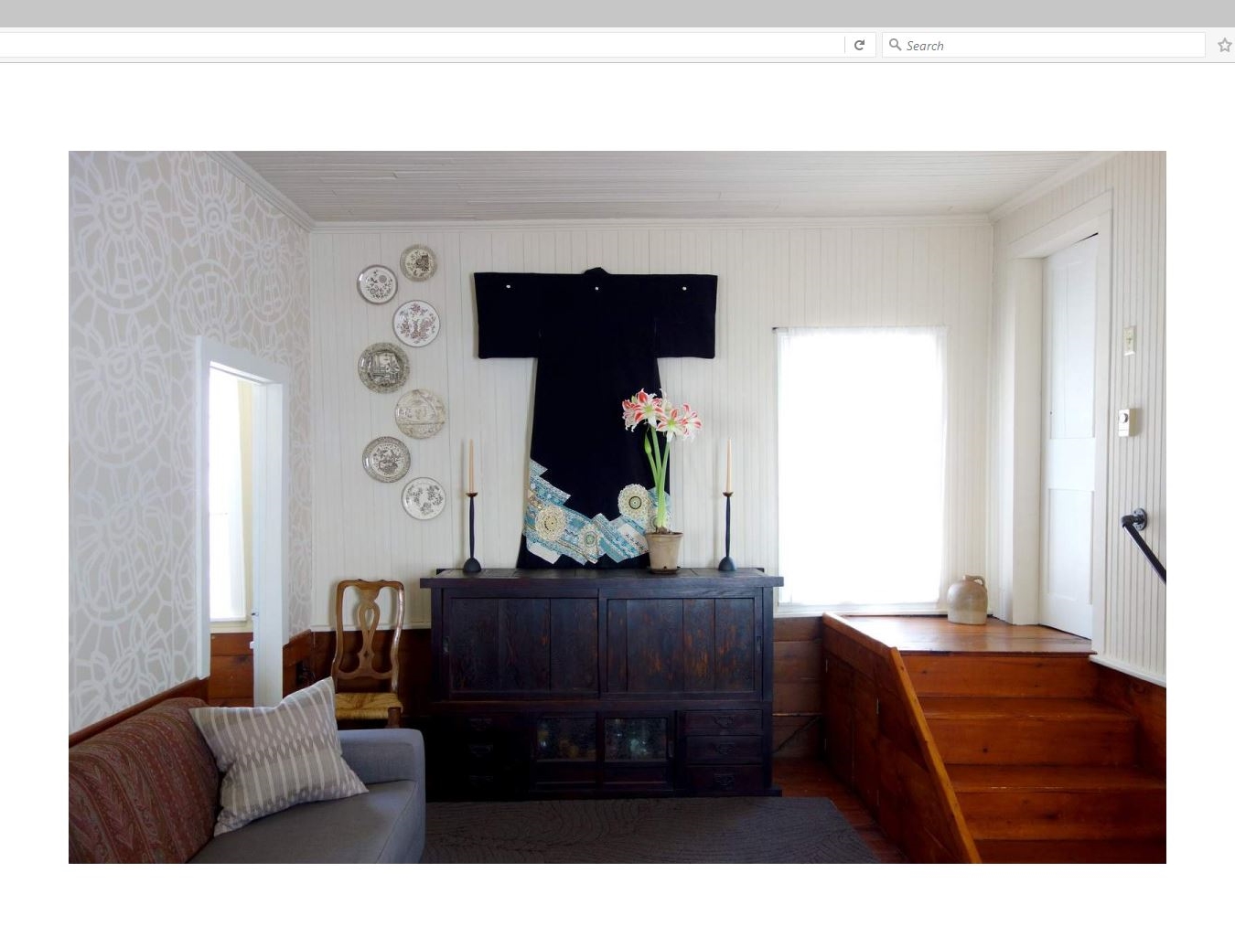
The responsive clean lines of this WordPress site introduce a slideshow dissolve of Mahoney’s Asian-themed rugs, wallpaper, linens, fashion and more. Just below it is featured a double row of clickable interactive tiles featuring galleries of his beautifully elegant work expressed in a portfolio of textiles, home accessories and one “wild card” entry of a re-imagined Tarot card deck called “The Tenebrae Tarot”.
Mahoney’s handmade and handcrafted décor items resonate with his philosophy: “The objects we choose to surround ourselves with have the power to transform our environments and influence our lives. Color, pattern, and decoration can delight the eye, engage the mind, and lift the spirit.”
MagicLamp’s uncluttered design allows Mahoney’s work to speak for itself with only sharing links for Instagram, LinkedIn, Twitter and Facebook added.

Digg.com is a social bookmarking site that allows users to share stories, videos, and digital photos with other users of Digg. It’s a great way to find out what’s happening in the world of technology, politics, science, sports, or just about any topic – particularly obscure stories the main stream news may not be pushing or covering.
Digg can be an excellent way to build buzz about a big news story, funny video, or hot technology. Here’s how Digg works. You register for Digg and “digg” stories. “Digging” a story is like voting on it. The more “diggs” or votes a story gets, the higher it moves up in the ranking. The goal is to get your submission on the front page. Front page stories typically have a minimum of several hundred “diggs”, sometimes even a thousand if the stories on the front page are hot enough. So, if a submitted story gets 300 “diggs” in one day, it can make the front page, where it gains even more exposure, which can in turn lead to more “diggs”. And exposure is the key to building your brand, right? In theory, yes, Digg seems like the perfect place to submit information about your company, be it press releases, brand videos, blogs, etc. Unfortunately it is not. Below are several reasons why Digg will not help you build your brand.
1. The Digg Network – The Digg network is vast, with hundreds of thousands of users. While on the surface that sounds fantastic, and in theory it is, those hundreds of thousands of users may not ever see your story because there are millions of stories, videos, and other items that they are being asked to look at. There is simply too much information for everyone to consume at one time.
2. Shout it out! – The only way to alert the Digg network to the story you have either submitted or would like to share with other Digg users is to send a “shout” to your mutual friends network. This is fine and dandy, however your mutual friends are also receiving shouts from their mutual friends, who are receiving shouts from their mutual friends, who are receiving… you get the picture. One could literally have a thousand “shouts” waiting in their inbox. That’s a lot of stories to read and “digg”. Plus, many times shouts go unheard simply because of the volume of shouts your mutual friends are getting. And even if your shout doesn’t go unheard, there’s no guarantee your mutual friends will “digg” it.
3. Friends – As I mentioned earlier, there are hundreds of thousands of users on Digg. Well, there is only one sure fire way to get people on Digg to “digg” your story and that’s to become a fan of another Digg user. Seems simple enough, so let’s try it. Let’s say you see lots of stories posted by a user that you like, so you decide to add them as a fan. That user then gets a message saying you have added them as a fan. They can either choose to reciprocate by adding you as a fan (which makes you mutual friends) or do nothing. Here’s the problem. If they do nothing, you are simply a fan of this person and you can’t share a story with them. Since you can’t share a story with that person, you can’t get them to “digg” your story, which means lost opportunity to get your submission on the front page. You could literally become a fan of hundreds of users and never be able to share your stories with them. What’s worse is out of all the hundreds of people you added as fans, only 30 or 40 might be a mutual friend. That is not nearly large enough to get the “diggs” you need to get your submission on the front page.
4. Cool Factor – You have built up a good network of mutual friends. You have a video you want to share with them that you think is cool. Well, cool is in the eye of the beholder. Your mutual friends may view your video and not like it enough to “digg” it. It really can be a crap shoot at times.
5. Multiple Submissions – Okay, so the stars have aligned and you have everything you need to get the story you are submitting to Digg on the front page. It’s a really cool video and you have hundreds of mutual friends that you know will “digg” it. Your set and ready to go. You submit the story and guess what? Someone has already submitted the story. Digg will always prompt users during the submission process to limit multiple story posts, but it doesn’t always stop people. Sure, you could turn around and simply “shout” the existing story to your friends network, but what if you’re trying to build brand for your company and there are several submissions? Well, on the positive side there have been several submissions with several “diggs” attached to each submission, but the negative side is those several submissions with several “diggs” each aren’t cumulative. So yes, a few dozen people may have “digg-ed” your story, but without the “diggs” being cumulative, you can’t build the ranking you need to get on the front page. And without you getting your submission on the front page, you’re not reaping the benefits of Digg.
I’m not hear to bash Digg. I love Digg! There is just so much random nonsense to read about and so many videos with insane stunts or bizarre antics to watch that I just can’t get enough. Plus there’s actually a ton of useful information too. It’s just not the place to build your brand. You are excited about your product, but the users of Digg are not. They don’t care about your blog. They don’t care about the technical achievements your company has discovered. Unless you work for a large company like Sony, Microsoft, or any other corporate giant that have highly sought after product that people will “digg” in a heart beat, your chances of success with Digg are slim to none.
2626Here is our compiled checklist from the book titled “Advertise, Promote and Market Your Business or Website” by Bruce C. Brown:


Ten Steps To A Profitable ECommerce Site
Mistakes To Avoid
Marketing
Repeat Customers / Customer Retention Online
Top Three Reasons for Going Online
Non-Traditional Types of Web Advertising
Five Ways to Improve Online Marketing
Increasing Website Traffic
Benefits of Database Marketing
Types of data in Database Marketing
Building A Marketing Database Plan
This article focuses on ways to address new and returning customers to encourage repeat business and loyalty. The ideas presented here are not new, but they are combined in such a way as to allow you to pick and choose which ones are most appropriate for your business, as well as generate ideas of your own for building online and offline relationships with your customers, clientele, or prospectives.
Email can be used effectively when treated with moderation. Resist the temptation to come up with 20 different email templates that should be sent to a customer and focus on getting the basics right instead. Four to five emails over the course of a month is very tolerable, especially when each email has a specific purpose. Take for example the order confirmation email that is generated when the customer places an order: it should be concise, short and easy to understand, which is that you got their order. It should include quick answers to common questions, but you shouldn’t waste space with advertising, save it for a future email. With that future email, thank them for their business and offer a repeat order discount or highlight featured items.
A reasonable email flow might look like:
Since you have mailing information for the customer, setup a calendar of direct mail postcards that go out to your entire customer database. Also setup a system for sending out direct mail with one-off address labels for brand new customers to get the repeat exposure in that critical time frame of the weeks following a good experience. Costs can range based on frequency, list size, and complexity of direct mailer(s) production. Keep it simple by having one-offs printed in advance and print labels as needed, and schedule new flyers to be mailed on a quarterly or monthly basis depending on how often your market changes or inventory fluctuates.
The days of catalogs are not necessarily numbered, as seen by the effectiveness of large direct order houses who have survived the transition online by using both channels to more effectively cater to the customer. You can take advantage of these dynamics by scaling down to a four or eight page catalog or even a one-sheet that uses web based calls-to-action. This is an expansion of the direct mail flyers idea, but has even more possibilities.
What do you include in shipments going out to the customer? Clearly, you have the obvious: product and packing slip, but what else could you be including? One example is a simple print-out on card stock that has your logo and a special promo code for their next (return) order? You could spin this as a Thank You or a Frequent Buyer program, or make it time-sensitive to get the repeat order sooner. The possibilities here are really close to endless: postcard or paper catalog, one-sheet on your company or highlight on the type of products you sell, or even a newsletter you recently printed. Look at your current marketing materials and look for potential re-use with no or simple modifications.
Providing an excellent customer service experience in each and every order processed on your site is the most direct way to building repeat business. There are a myriad of ways to address customer service during the order cycle, a few major ones could be:
Improving your customer service through better follow up, as well as implementing other customer service initiatives will pay dividends over two to three years, longer if new customer acquisition continues.
We are associated with this website only in that we buy office and art supplies from this website. Once you have placed an order, they send two emails, one to confirm the order and one to confirm shipment of the product. The package arrives with a postcard and paper catalog along with the nicely wrapped product and the packing slip, which is basic and easy to read. After two weeks or so they send out a postcard and a few more follow up emails thanking you for your business. This is a solid customer service experience with repeat exposure that educates us as to what other products they carry. We now are trained to go to their website first when looking for anything art or office related.
Above all, treat what you implement as research. Some ideas may have no effect at all (not all segments will respond to a paper catalog, as those segments will assume they can get the same information online and not want to deal with looking at or using the paper catalog). Measurement over periods of time will help guide you in figuring out what to ramp up and where to look next. Keep refining follow up initiatives that gain traction and learn from them. You will find channels and avenues to your customers that none of your competitors pick up on, which strengthens your position in the market and raises the barrier to entry.
I hope this article was valuable to you. MagicLamp offers this kind of advice and know-how to all of our clients on a daily basis. If you are interested in finding out more about what MagicLamp can do for you, contact us for a free consultation. If you are an existing client of MagicLamp and want to get started on any of these ideas or new ones you may have, email us or add a new task in the Change Management System.
As more and more companies start to explore their marketing options online, one obvious place to start is with e-mail campaigns. The first question is ostensibly “where do we get email addresses?”.
Option #1: Your internal database, CRM or customer lists. This is where most businesses will start that have an established business.
Option #2: Buy e-mail lists. Similar to direct mailers, there are hundreds of companies out there that will rent their vetted e-mail lists to you. Attention needs to be paid to the bottom line, as the list and services to send out the emails could be much higher than expected, and the focus needs to be conversions.
Option #3: Build your list on the website. This option takes time. Typically, websites will have a box for the visitor to enter their email address, and then click a subscribe button. Follow-up is key, inluding sending a confirmation email, thanking them for subscribing. Placement of the subscription box is also important. People are three times as likely to subscribe if: a) The box appears on every page; and b) the box is located above the “fold” or scroll line for the page.
A client designer recently requested that we put a site counter on one of their customer’s websites. I asked why the customer didn’t just use the web server logs with a web analytics tool to see what the traffic for the site was. The answer was first, no one had access to the raw log files, and the hosting provider used for this site in particular didn’t generate any type of web reports. It turns out the customer is paying $500 a month for web advertising, and has no idea if it is even helping.
Having a site counter can be misleading, especially if you are using it to decide if your web advertising campaign is worth it or not. Why?
1) Hit counters are incremented for anything that visits your site, including web crawlers like Googlebot, Yahoo! Slurp, and MSNBot. MSNBot has been hitting many sites like crazy, and so a hit counter could reflect 1000 hits in one day, but they are all from nobody, effectively.
2) Hit counters only show a small part of the picture when it comes to traffic. There are many other metrics that need to be considered. Examples are unique IP addresses, page views (impressions), and source of click-throughs are just the tip of the ice berg. Your traffic could be coming from many sources, and assuming that a hit counter showing a high level of traffic means your web advertising campaign must be working is flawed thinking and could lead to many wasted dollars.
3) Hit counters can be manipulated. If someone goes to your site and hits the refresh button in their browser 10 times, guess what? The hit counter goes up by 10. Not very useful.
So what is the solution?
All customers hosted by MagicLamp Networks have web reporting available to them as a small upgrade to their web hosting package. These web reports are generated by a tool called Wusage, and it by far one of the most extensive reporting tools available.
If you have access to your web logs, there is are several free tools available:
WebLog Expert Lite I use this tool from time to time, it’s numbers are a bit suspect, but if you stick with this as your primary tool, you can get reliable over-time statistics.
Analog Very basic, but provides the most crucial numbers about your traffic. Don’t expect to figure out things like where people are stopping in your shopping or lead generation process, but again, it will get you started.