New sites for Q2 2016 – Clean Web Designs and WordPress

HEARUSA and HEARCANADA


WordPress once again displays its flexibility in hosting a database-driven site, this time to serve the hearing challenged customer in both the USA and Canada.

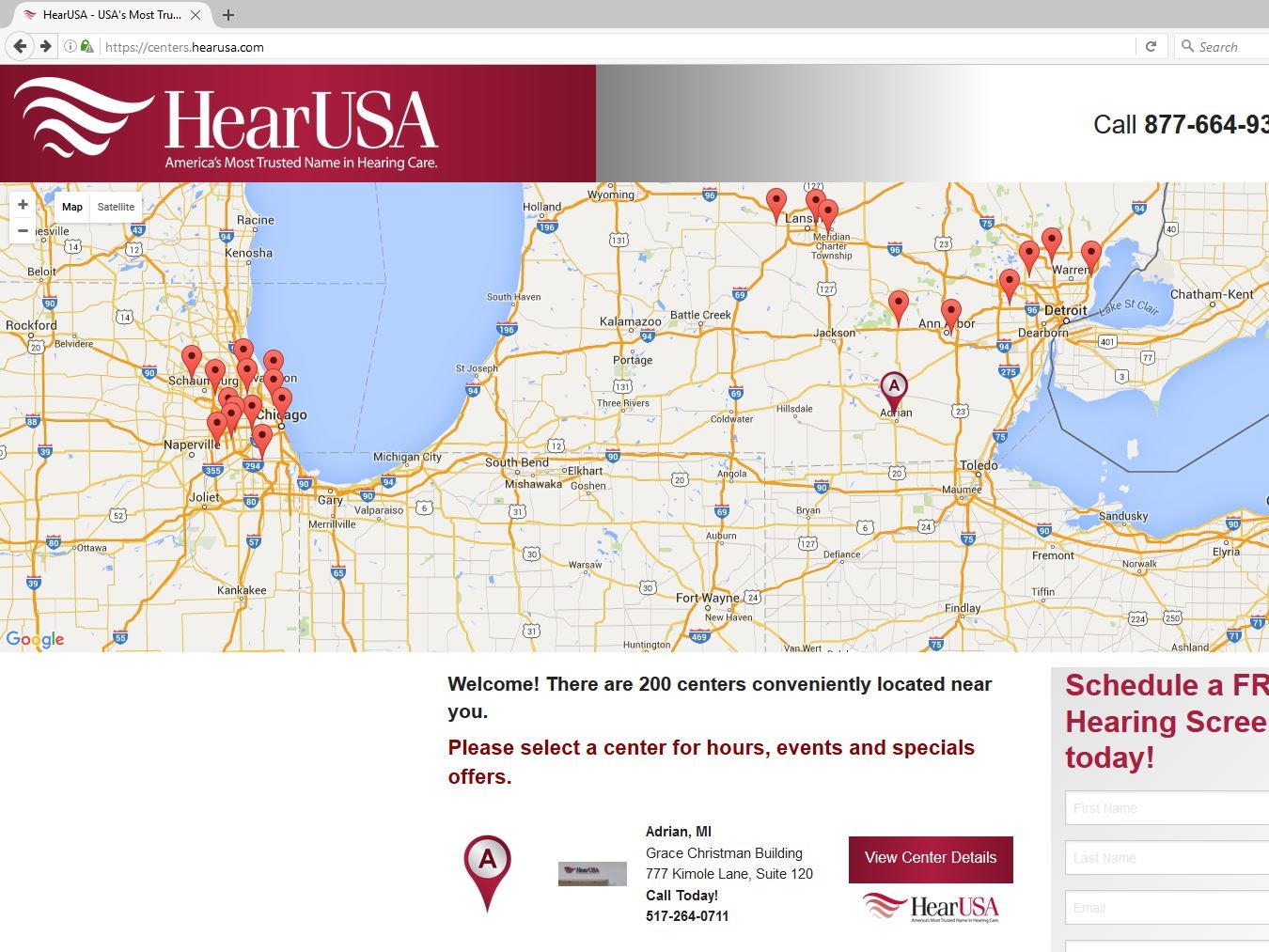
Through use of Google Maps and integrating the importable data in Microsoft Excel worksheets, MagicLamp has created a responsive, highly functional and updateable resource that can locate the office of a HearUSA or HearCanada provider as well as any surrounding services the customer might seek.

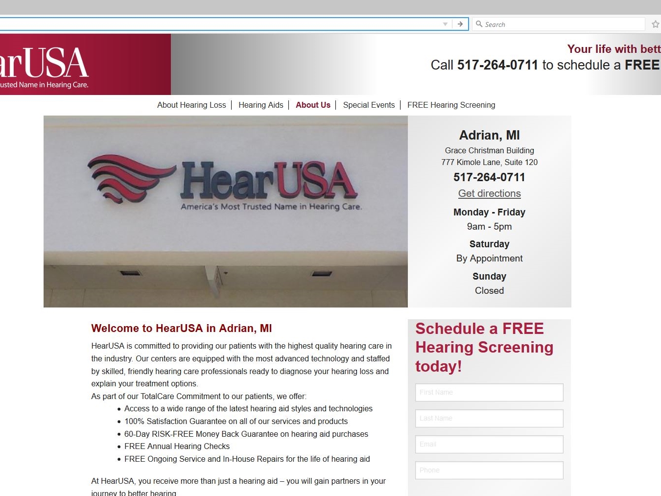
The Google map on the site’s home page displays a list of 200 providers searchable by clicking on the “View Center Details” link for the customer’s geographical location. There the customer can review the menu bar of options about hearing loss and hearing aids along with the customized content of that specific provider (i.e. provider’s profile, local special events, etc.).

The dual-skinned database can switch between both sides of a geographic border to provide the most accessible location for the customer seeking hearing services. MagicLamp has also given the customer the means to either sign up onsite or call for free hearing evaluation. Bottom of the home page features discount coupons for hearing aid purchases and services, as well as HearUSA and HearCanada’s accreditation.


CANNA-MANAGEMENT Corporation


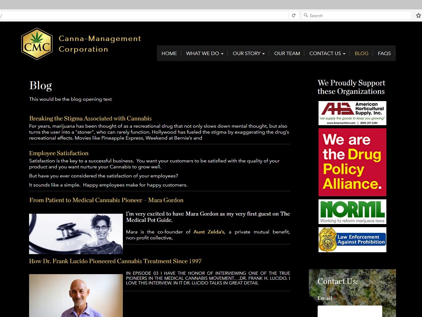
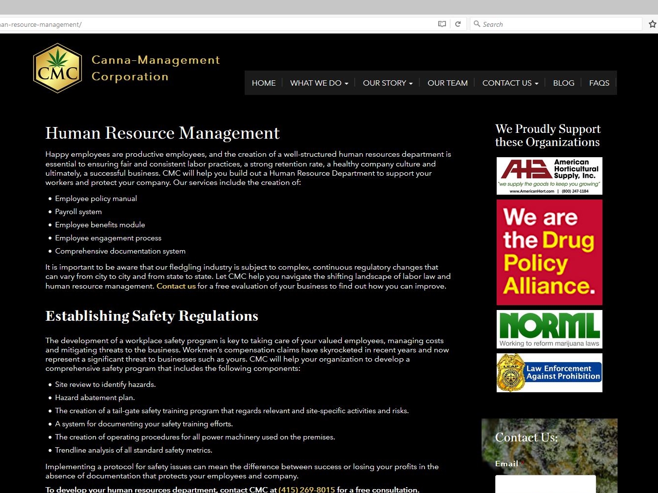
As legalization of medical marijuana becomes more mainstream, the need for governance and guidelines for the growing and processing of it leaves a void to be filled. Enter Canna-Management Corporation.

This authoritative WordPress site designed by MagicLamp reflects CMC’s masterful foresight in assembling a comprehensive resource of information and a knowledgeable support team to advise and guide businesses considering legal cannabis production.

The home page features a slideshow of custom drawings that illustrate how CMC can help a cannabis company’s operation grow. The site’s clickable links on informational topics as well as drop down menus provide a fuller sense of what the requirements and considerations are for this type of business. The responsive design also features a blog with posted podcasts displaying what questions are answered by some of the leading experts on medical cannabis issues.

CMC’s site is also integrated with MailChimp along with a slide-in subscriber signup; and ads for several CMC-sponsored organizations who can provide even more insight and information on staying legal and growing.

CannaManagement     CannaManagement     CannaManagement

www.canna-management.com


JOHN MAHONEY DESIGNS


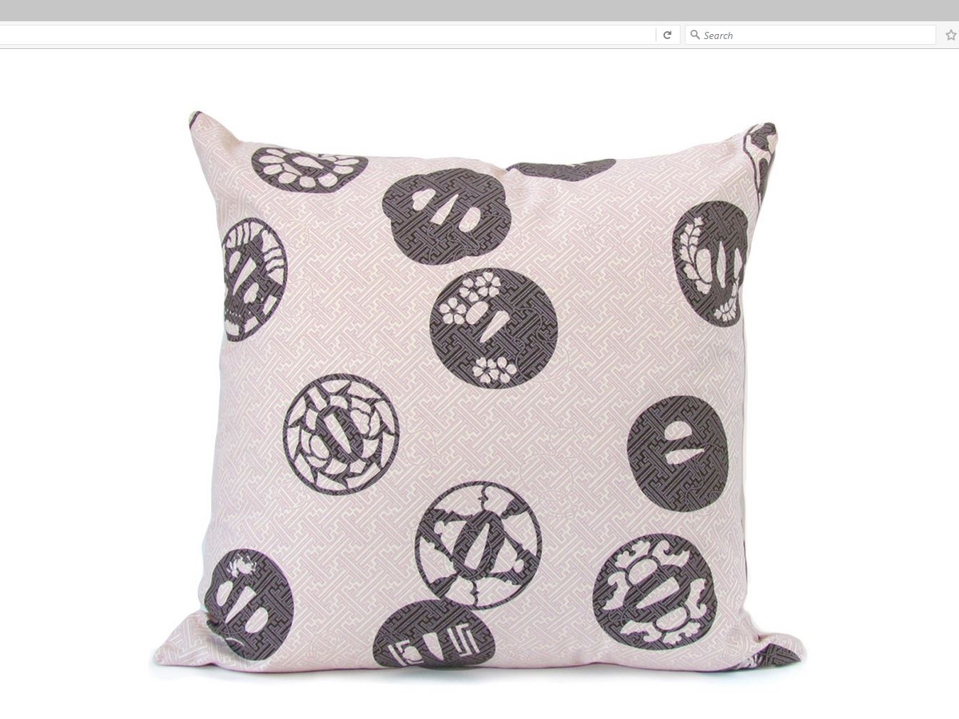
MagicLamp subtly showcases John Mahoney Design’s creations with its various categories of home décor.

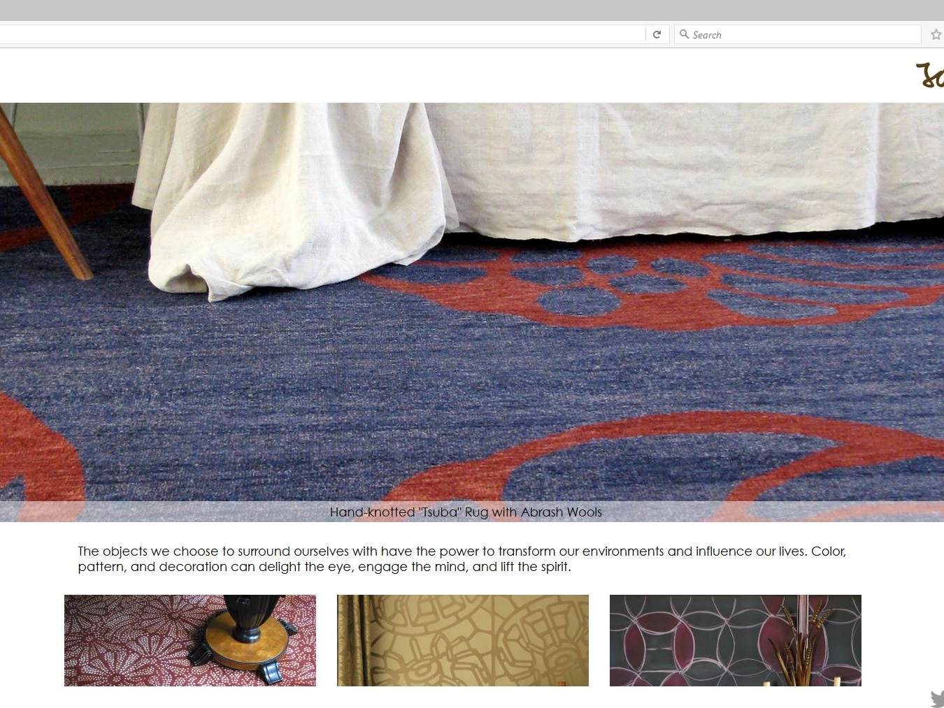
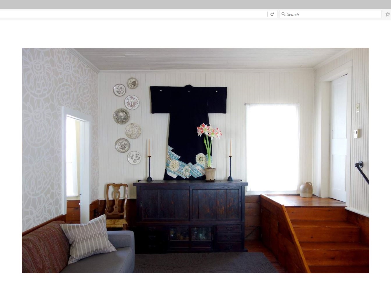
The responsive clean lines of this WordPress site introduce a slideshow dissolve of Mahoney’s Asian-themed rugs, wallpaper, linens, fashion and more. Just below it is featured a double row of clickable interactive tiles featuring galleries of his beautifully elegant work expressed in a portfolio of textiles, home accessories and one “wild card” entry of a re-imagined Tarot card deck called “The Tenebrae Tarot”.

Mahoney’s handmade and handcrafted décor items resonate with his philosophy: “The objects we choose to surround ourselves with have the power to transform our environments and influence our lives. Color, pattern, and decoration can delight the eye, engage the mind, and lift the spirit.”

MagicLamp’s uncluttered design allows Mahoney’s work to speak for itself with only sharing links for Instagram, LinkedIn, Twitter and Facebook added.
JohnMahoneyDesigns     JohnMahoneyDesigns     JohnMahoneyDesigns

www.johnmahoneydesigns.com


MagicLamp Sites Take Home Two Awards from Marie Claire!

UPDATED (March 2016): We’re on Racked too!

Marie Claire’s Annual 55 Best Online Shopping Sites has just been published, and MagicLamp has not one but two clients on the list!
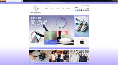
In Claire’s “definitive list of best online shopping destinations,” MagicLamp site Opening Ceremony was selected for the Fashion section of the list, joining upscale online clothiers like Net-a-Porter, STYLEBOB, and Pixie Market.

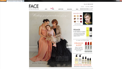
FACE Stockholm was included in the Beauty category and commended for their sophisticated cosmetics, all stylishly displayed on their bold, sleek, custom-designed user interface.FACE Stockholm

http://www.marieclaire.com/fashion/best-online-shopping?click=pp#slide-30

OC and FACE have been clients of MagicLamp for years now, and we’re proud to see them getting this recognition.


Opening Ceremony shows up on Racked.com’s Best Online Shopping Stores

Among others such as Anthropologie, Forever 21, H&M, J.Crew, Nasty Gal, Norstrom, and Zara, Opening Ceremony gets Racked.com’s vote for best online shopping stores:

Once simply a quirky boutique; now a fashion force to be reckoned with. Find brand new designers, niche lines from around the world, exclusives from big-name brands, and the store’s own in-house line in the expansive mix.

New Web Sites: Major Ecommerce Upgrade & Redesign with Locator Integration

HEARUSA

Amplifying a client’s content above the “noise” of its competitors is nothing new at MagicLamp. Hence the newly launched and multifaceted web design it recently created for HearUSA.
MagicLamp has blended features that include registering online for a free hearing test, and a hearing quiz to help the site’s visitor determine how much hearing assistance he or she needs. Alongside these tools is a fact sheet sharing the many reasons why it’s important to treat hearing loss and the social and psychological consequences for not doing so.
As for the tech side of things, MagicLamp has also integrated a Find a Provider database to locate the site visitor’s 15nearest audiologist. This includes a signup screen so the visitor can be contacted directly by that provider.
The total responsiveness of MagicLamp’s site design is upped another notch with Microsoft Dynamics’ software to oversee and monitor the HearUSA site’s CRM capabilities, making HearUSA’s value loud and clear.
ecommerce web design     ecommerce web design     ecommerce web design

www.hearusa.com

Graytex

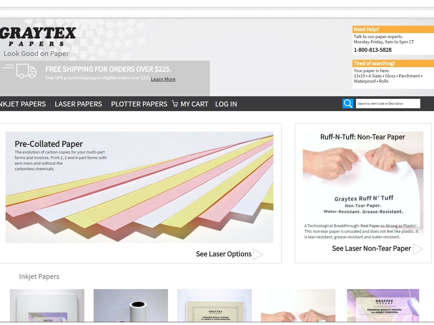
Sometimes being a trusted resource for quality paper products just isn’t enough. Sometimes you have to fluff and update your look. So with MagicLamp’s technical assistance, Graytex has now segued from its previous website’s functionality to a much more responsive web design.
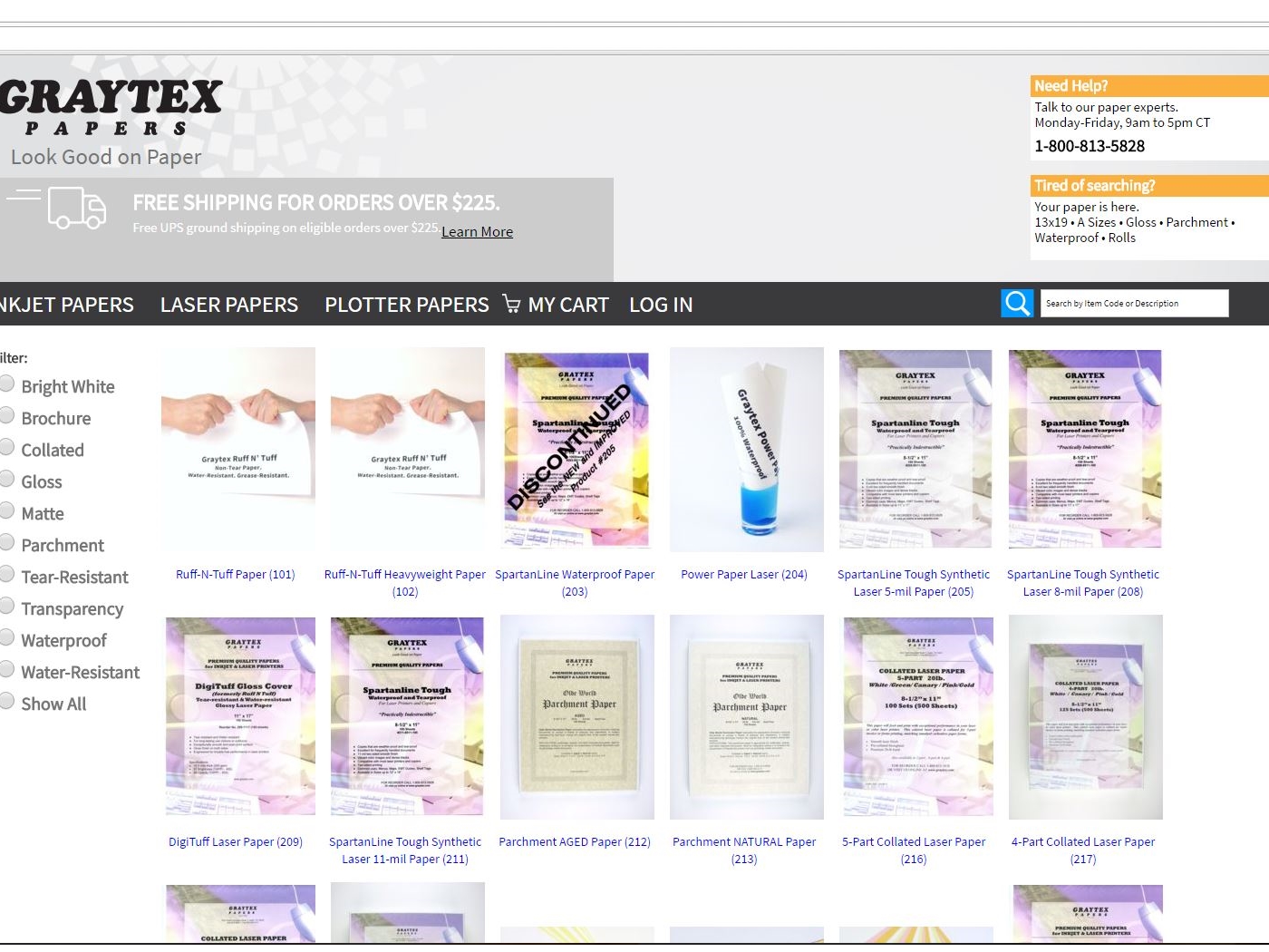
This required MagicLamp to import hundreds of Graytex’s paper products on about 50 pages from the old site, then re-organizing and creating multiple improved ways to browse those products. Now you can search for paper by category, size and finish as well as by description for each type of paper product. Quantity per pack, product code and individual properties of each paper type are searchable via an at-a-glance product catalog and a master table of elements.
The result has been an improvement in both Graytex’ ecommerce flow and its SEO ranking. Add to that the integration of MailChimp and a coupon code for new subscribers, and you’ve got Graytex moving to the top of the paper pile on the internet!
ecommerce web design     ecommerce web design width=     ecommerce web design

www.graytex.com

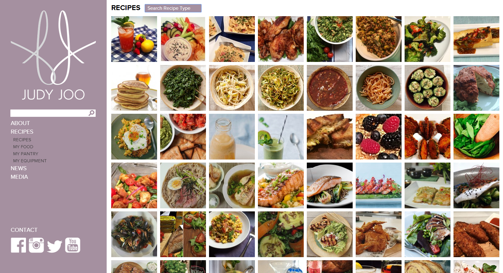
Judy Joo Online: What Can Responsive Design Do for You?

We were recently honored to develop the official website for celebrity chef and T.V. personality, Judy Joo. Joo is one of the four chefs on the Iron Chef UK cooking show, and she’s featured as a judge on The Food Network’s show The Next Iron Chef. Our team launched the site last month and we’re very pleased with how it came out!

We launched celebrity chef and resturanteur Judy Joo's official website this Summer.

Conceived by designer Wook Kim, the website showcases expansive, borderless images of Joo exploring culinary locales, pulling visitors into the homepage while rich, high-quality content keeps them clicking.

The site is completely WordPress powered, and features a recipe gallery with dozens of Judy Joo’s signature dishes, complete with mouthwatering photos. We built custom filters into the recipe page, giving visitors the option to call up recipes by type of dishe or main ingredients via a simple drop-down menu. Joo’s site administrators can upload new recipes in a snap with our easy content management system, and they do so regularly. The site even has Vimeo plug-ins so Joo can post videos that upload and play instantaneously.

JudyJoo.com is also equipped with responsive design: the entire site sizes automatically to your browser window. The responsivity doesn’t stop with desktop browsers, it works with any mobile device screen so viewers get consistent merchandising across the technology spectrum- desktops, laptops, tablets, smartphones, and more. You can play with the site’s auto-resize to see it yourself– just drag the corner of your browser window to make the page bigger and smaller, and watch the site resize itself just as quickly as you resize the window, with zero downtime and no reloading.

Judy Joo and her staff were so pleased with the website and their MagicLamp experience that they’ve asked us to be the developer for their next web project: the official site for Joo’s new London restaurant, Jinjuu, slated to open November, 2014, in the Soho district.


Opening Ceremony Gets A New Minimalist Look From MagicLamp

MagicLamp relaunched high fashion retailer Opening Ceremony’s site this week, unrolling a smart, contemporary minimalist design that sets all attention squarely on the products.

The new design features a layout that’s even more minimalist than OC’s previous look, stark typographic treatments, and a new integrated Twitter feed. We removed the pastel design accents and background color gradients, paring the site’s palette down to classic black and white. With the new look, all of the color is in the products, creating a crisp, impeccable aesthetic fitting for this hip cosmopolitan brand.
ecommerce web design
Photos on the new homepage nest together in a gridded javascript layout nicknamed “masonry,” a name reflecting how elements of different sizes are laid in and fitted together, much like fine stonework. Semi-opaque white overlays with descriptive text (we used Adobe’s typekit) appear over each photo as visitors roll over images.

Overall, the site’s new incarnation is much more visual, heavily emphasizing images over text. OC’s new blog in particular is a great example of this strategy: huge, crisp, color-saturated images you could practically fall into dominate the screen. Your eyes can’t help but soak up the visual feast. The effect is that readers actually associate entries with the image more directly than the title or text, resulting in quicker processing and response time and greater emotional engagement. The shift from text to image is a big movement in web design today as we discover more about the psychological primacy of images and the benefits of engaging the intuitive, image-responsive right brain in user experience.

Opening Ceremony made another big announcement this week: their MICA Smart Bracelet, a smartphone-like mobile device produced in partnership with Intel, was unveiled yesterday and will be available at OC stores for the 2014 holiday season. OC is in the vanguard of companies to enter the luxury tech wear market.

Kudos to our longtime partner Opening Ceremony on all of their exciting new developments!

Regency Vacations

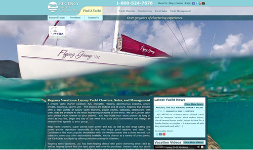
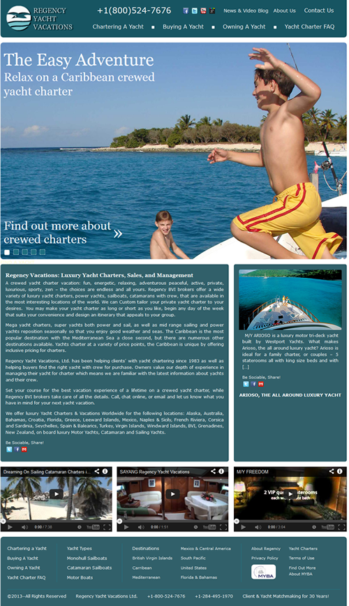
Magiclamp worked with Regency Vacations to come up with a redesign that is visually appealing, and better showcases their passion for Yacht Vacations. Whether it is an adventurous and energetic or peaceful and relaxing vacation you are looking for, the comprehensive search features allow you to find the perfect Yacht for your budget with over 20 destinations to choose from. In the new WordPress theme, Magiclamp included a slideshow with high definition images that give future Regency clients a small glimpse of what they will experience on their vacation. The simple design allows users to find the information they need easily, and quickly.

Before the Redesign

After the Redesign


Introducing Magic fCommerce for Facebook

MagicLamp Networks is in the process of perfecting their new Magic fCommerce web application: a suite of applications that will allow e-Commerce businesses to seamlessly integrate their product catalogs, promotional happenings and overall web platform with Facebook.  A longtime leader in the development and design of eCommerce websites, MagicLamp is now taking their expertise to Facebook. Magic fCommerce not only allows existing eCommerce companies to translate their shops to Facebook — it even gives new eCommerce shops a platform to set up a storefront on Facebook.

The primary application of Magic fCommerce is Magic fCatalog, which feeds an eCommerce company’s product catalog into their Facebook page, and allows their customers to browse and make purchases without leaving the page.  The Magic fCatalog’s features include a variety of HTML templates, Categories and Sub-Categories, Easy Product Management, Search and Browse Products, CSS-driven fonts and colors, and auto image “thumbnailing.”  It also includes a variety of Shopping Cart features, such as HTML templates, Real Time UPS Shipping Quotes, Credit Card Processing, Automated Email Confirmation, Order Status Checking, and more.

Magic fCatalog is so much more than throwing an eCommerce product catalog up on a tab of a company’s Facebook page.  fCatalog allows you to give your catalog a variety of personalized features within Facebook.  Using quick and simple tools provided by MagicLamp, you can let your customers zoom in on products, view products within lightboxes, and “like” individual products — all within Facebook!  And, of course, with every “like” a Facebook page or product receives, the eCommerce company is gaining more and more exposure in its social network.

According to Nielsen, a whopping 22% of people’s computer time is spent on Facebook.  Magic fCommerce gives you the opportunity to benefit from your potential customers’ growing Facebook usage, and allows your customers to purchase your products without having to leave Facebook at all.

Click over to our Facebook page to see a Magic fCatalog demonstration in action, and check back soon for updates on our newest fCommerce features — such as Magic fSweepstakes, Magic fPromo and more!


The In’s and Out’s of Digg

Digg.com is a social bookmarking site that allows users to share stories, videos, and digital photos with other users of Digg. It’s a great way to find out what’s happening in the world of technology, politics, science, sports, or just about any topic – particularly obscure stories the main stream news may not be pushing or covering.


Digg can be an excellent way to build buzz about a big news story, funny video, or hot technology. Here’s how Digg works. You register for Digg and “digg” stories. “Digging” a story is like voting on it. The more “diggs” or votes a story gets, the higher it moves up in the ranking. The goal is to get your submission on the front page. Front page stories typically have a minimum of several hundred “diggs”, sometimes even a thousand if the stories on the front page are hot enough. So, if a submitted story gets 300 “diggs” in one day, it can make the front page, where it gains even more exposure, which can in turn lead to more “diggs”. And exposure is the key to building your brand, right? In theory, yes, Digg seems like the perfect place to submit information about your company, be it press releases, brand videos, blogs, etc. Unfortunately it is not. Below are several reasons why Digg will not help you build your brand.


1. The Digg Network – The Digg network is vast, with hundreds of thousands of users. While on the surface that sounds fantastic, and in theory it is, those hundreds of thousands of users may not ever see your story because there are millions of stories, videos, and other items that they are being asked to look at. There is simply too much information for everyone to consume at one time.

2. Shout it out! – The only way to alert the Digg network to the story you have either submitted or would like to share with other Digg users is to send a “shout” to your mutual friends network. This is fine and dandy, however your mutual friends are also receiving shouts from their mutual friends, who are receiving shouts from their mutual friends, who are receiving… you get the picture. One could literally have a thousand “shouts” waiting in their inbox. That’s a lot of stories to read and “digg”. Plus, many times shouts go unheard simply because of the volume of shouts your mutual friends are getting. And even if your shout doesn’t go unheard, there’s no guarantee your mutual friends will “digg” it.

3. Friends – As I mentioned earlier, there are hundreds of thousands of users on Digg. Well, there is only one sure fire way to get people on Digg to “digg” your story and that’s to become a fan of another Digg user. Seems simple enough, so let’s try it. Let’s say you see lots of stories posted by a user that you like, so you decide to add them as a fan. That user then gets a message saying you have added them as a fan. They can either choose to reciprocate by adding you as a fan (which makes you mutual friends) or do nothing. Here’s the problem. If they do nothing, you are simply a fan of this person and you can’t share a story with them. Since you can’t share a story with that person, you can’t get them to “digg” your story, which means lost opportunity to get your submission on the front page. You could literally become a fan of hundreds of users and never be able to share your stories with them. What’s worse is out of all the hundreds of people you added as fans, only 30 or 40 might be a mutual friend. That is not nearly large enough to get the “diggs” you need to get your submission on the front page.

4. Cool Factor – You have built up a good network of mutual friends. You have a video you want to share with them that you think is cool. Well, cool is in the eye of the beholder. Your mutual friends may view your video and not like it enough to “digg” it. It really can be a crap shoot at times.

5. Multiple Submissions – Okay, so the stars have aligned and you have everything you need to get the story you are submitting to Digg on the front page. It’s a really cool video and you have hundreds of mutual friends that you know will “digg” it. Your set and ready to go. You submit the story and guess what? Someone has already submitted the story. Digg will always prompt users during the submission process to limit multiple story posts, but it doesn’t always stop people. Sure, you could turn around and simply “shout” the existing story to your friends network, but what if you’re trying to build brand for your company and there are several submissions? Well, on the positive side there have been several submissions with several “diggs” attached to each submission, but the negative side is those several submissions with several “diggs” each aren’t cumulative. So yes, a few dozen people may have “digg-ed” your story, but without the “diggs” being cumulative, you can’t build the ranking you need to get on the front page. And without you getting your submission on the front page, you’re not reaping the benefits of Digg.


I’m not hear to bash Digg. I love Digg! There is just so much random nonsense to read about and so many videos with insane stunts or bizarre antics to watch that I just can’t get enough. Plus there’s actually a ton of useful information too. It’s just not the place to build your brand. You are excited about your product, but the users of Digg are not. They don’t care about your blog. They don’t care about the technical achievements your company has discovered. Unless you work for a large company like Sony, Microsoft, or any other corporate giant that have highly sought after product that people will “digg” in a heart beat, your chances of success with Digg are slim to none.