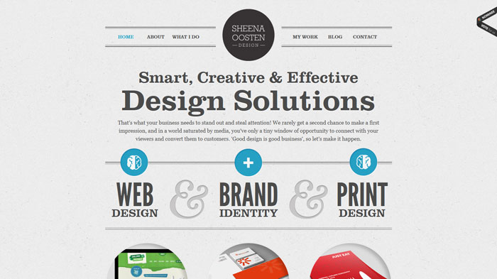
 Back in 2010, Google made big news by releasing their own open source web fonts. Starting with just 19 typefaces, it was a huge improvement for developers and designers who’d been stuck with the same 9-10 web safe typefaces for their font stacks. By 2012, Google Web Fonts (since renamed Google Fonts) had grown to over 500 font families. Adobe typekit became popular around the same time, offering even more web type options. Web creators were no longer limited to a handful of body text fonts, and we all basked in the happy glow of digital progress. Unfortunately, there was a hitch. Most web designers work on Macs, known for their pristine graphic rendering. While the new fonts were looking great on designers’ Mac screens, the letters appeared very differently on the average user’s PC: they were highly
 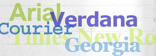 pixilated, blurry at the edges, and “crunchy-looking.” Once developers realized they should be testing the sites on PCs, they were shocked to see their new typefaces looked, frankly, awful.
The problem wasn’t with the fonts themselves- PC browsers just weren’t advanced enough to display the new typefaces cleanly. Internet Explorer was the first to optimize character rendering; soon, open source fonts looked better in IE than any other browser. This still wasn’t very crisp, but it was better than everything else out there. Firefox quickly followed suit and improved HTML text appearance even further. The rendering you see in Firefox today is the standard that set the bar for text rendering over the last few years. Chrome’s text looked jagged and pixilated in comparison until just this August, when Google’s Chrome 37 update raised the ante again. The update came with DirectWrite support for Windows, which transformed HTML characters into something crisper and cleaner than PC users had ever seen before.


Same Fonts, Different Browsers: Firefox and Chrome’s text rendering.
(Firefox: Left, Chrome: Right)
Looking at these Chrome and Firefox text displays side-by-side, you can see how Chrome text is distinctly crisper and more resolved, looking a lot like the rendering on a Macintosh, in fact. Chrome’s new super high-resolution type display is a a huge leap for browser technology. Suddenly, all fonts look incredible, no matter who’s supplying them.
We offer the complete inventories of Google Fonts, Adobe Typekit, and Fonts.com for our clients’ web projects. The foundry previews are real HTML, not bitmaps, and they show you exactly how your fonts will look. The right type sends a cohesive message about your company to customers, telling them exactly what “personality” your business has. We also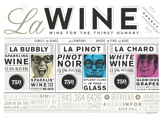 offer expert font selection advice if you’re having trouble deciding or want a second opinion. Between these resources, you get an incredibly broad typeface selection- a tool that gives you a fresher-looking site that stands out from the rest.
Graphics and Iconography with Open Source Glyphs
The evolution of typeface display technology actually gives us a powerful opportunity for rendering graphic elements, too. Recently, we’ve actually started replacing traditional graphic elements with HTML glyphs, using characters from font sets as symbols, graphics, or even images. You see glyphs like the TM and copyright symbols implemented this way traditionally, but the level of clarity in web text display now opens up a whole new world of possibilities.
Advantages of HTML Typeface Characters as Graphics:
- Web font characters come ready to go as live, linkable text.
- Faster loading than traditional JPG images.
- Completely resizable as pixel-perfect vector entities.
- They don’t require any special coding structures, like image files.
- HTML glyphs are searchable by engines for SEM keyword optimization and visitor queries.
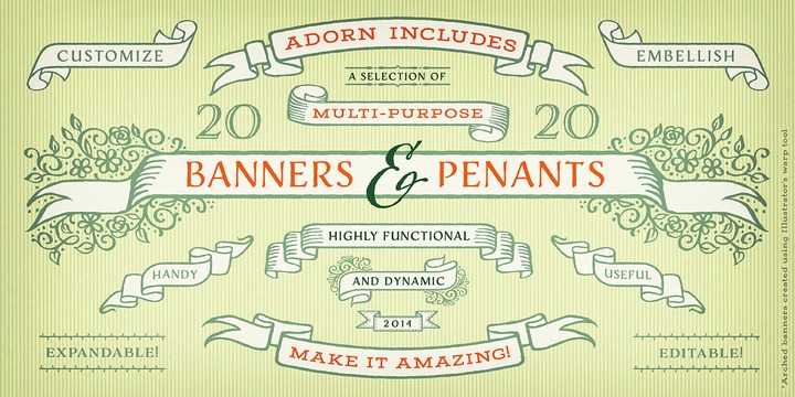
- Many font packages are specifically designed to use as icons or ornamental elements, targeted to specific graphic styles, like the Adorn typefaces.
- Now that browser technology has caught up, font-based graphics look just as sharp as any traditional graphic.
- They cut design time and costs down significantly.

We can also create HTML iconography through typeface packages now. Whether you’re developing a web app, branding a new product line, or want some simple icons for your homepage navigation, we can offer you a whole new playground to experiment with.
These techniques not only open up possibilities for designers and creatives, they also empower developers, who can now use typography instead of graphics to stylize web apps, create brand identities, and unroll fresher-looking sites. Having access to all of these symbols opens up a whole new field programmatically. Instead of designing a graphic, resizing it to optimize loading times, coding it for html, and uploading it, programmers can literally just hit one key, paste in a character that’s already an html entity, and keep on trucking.
.png)
We’ve come a long way since Wingdings!
Interested in updating your site’s typefaces? Want to see what we can do for your icons and graphic elements? We would be happy to give you a free consultation.
Contact us today.
