Portraying Professionalism with a Custom WordPress Theme

If Airtec Global LLC were to be described in one word, that word would undoubtedly be “expertise.” Within the air compression systems field, the guys at Airtec are the consummate professionals. They know just about everything there is to know about compression systems of all sizes and brands.  AirTec is nothing if not dedicated to their craft.

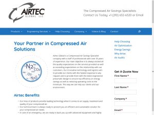
Portraying the level of expertise represented by Airtec was a challenge MagicLamp was ready to meet, so we worked hard to gain an understanding of their business in order to build them a complete web presence that matched their values and ideals. Through WordPress, we were able to create a custom site that serves to show the expertise that Airtec brings to the table.

WordPress

What better way to show off professionalism than through one of the most professional website creation services? WordPress’ impressive array of tools and services allowed MagicLamp to build a website that operates reliably while visually steering visitors where they need to go. The site contains product information, information on the services Airtec offers, a blog section for company and product updates as well as improving SEO, and contact forms that allow visitors to get a free quote. The new Airtec site is sleek, navigable, and performs fantastically.

Copywriting

The new Airtec website received a complete rewrite with a great deal of input and advice from the experts at Airtec . The new copy had to be informative, search engine optimized, and understandable to the average visitor. We were able to write helpful content that helps Airtec register as a search result, increasing their reach. MagicLamp wrote a great deal of varied product descriptions while referring to the level of skill and talent present at Airtec . We made sure to consider Airtec’s mission statement of bringing efficiency to compression systems worldwide while the writing the content and were able to portray this idea to visitors.

Web Design

Just a little bit of design flavor can go a long way in retaining visitors. The Airtec site received a ground-up redesign aimed at bringing their message of efficiency and expertise to everyone that comes across their site. Airtec’s new site is simple, clean-cut, and easy to navigate, and draws attention to the most important parts of the site for visitors to view. The pages are full of information without seeming cluttered and without sacrificing visibility. The site uses high quality graphics that lend additional credibility, further improving AirTec’s image.

Though MagicLamp may have built Airtec’s web presence, we simply built a representation of what was already there. AirTec represents some of the best in their industry, so we built a website that shows off their unparalleled capabilities. We used copy to inform visitors on air compression systems and how their needs can best be met by Airtec , and we used site design to showcase Airtec’s proficiency and steer visitors in the right direction. MagicLamp’s WordPress design will go on to help AirTec grow and find new business while showing the wonderful qualities present in their business.
Creating a Modern Web Presence for a Local Bank: PointBank

There are few things more gratifying than helping out your local community. PointBank’s been doing it over 100 years, and now MagicLamp can proudly say that we’ve partnered with them in their efforts. In creating a modern and fully integrated website for PointBank, we’ve been able to take part in building them a web presence that shows off just how much they care about their community on a personal level.

WordPress

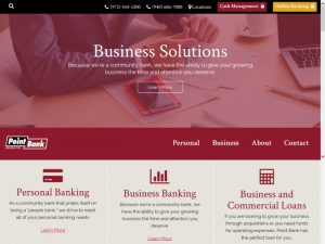
Our new site design for PointBank was completed in WordPress, allowing us to use the numerous tools and plugins WordPress offers to create the perfect site for PointBank. Our WordPress design included a useful mobile design, a Loan Calculator widget aimed at making the loan process a bit more approachable, SEO optimized copywriting, a custom locations widget with all bank locations mapped out, and WCAG 2.0 AAA compliance levels, all on a custom theme we created specifically for PointBank.

Mobile Web Design

Probably the best way for a local business to ensure it has a good relationship with its surrounding community is through accessibility and good communication. With this in mind, MagicLamp created a new, user-friendly mobile platform to ensure that mobile viewers land on comfortable, easily-navigated site. The new mobile site allows viewers to get a very clear view of how much PointBank cares for its community, carefully demonstrating that it is indeed a “people bank.”

Custom WordPress Theme

As both PointBank and MagicLamp know, every business is unique. While PointBank acknowledges this through their flexibility and desire to help local businesses succeed, we show it by designing not just a custom website, but a custom theme to create a truly distinct web presence that showcases PointBank’s dedication to their customers.

Loan Calculator Widget

Let’s face it, going online to figure out loan specifics can be more than a little bit difficult and certainly a bit intimidating. PointBank recognized this and asked us to design a loan calculator widget that would enable their visitors to figure out at least the basics of their loan. This makes the loan process a good deal more accessible and less daunting by showing some real figures so viewers can have an idea of what expect before entering into the loan process.

Locations Widget

The locations widget plays a key role in crafting PointBank’s online image.  At the bottom of each page, the widget simply and clearly shows off the various PointBank branches, their hours, and contact information. It even shows which branch is closest to the visitor. The locations widget allows visitors to see that PointBank has branches across much of Denton County and is viable banking option for anyone living in that area.

SEO Content Writing

What good is even the best web design if it doesn’t show up in Google search results? Through search engine optimized content, we were able to secure PointBank’s position as a top search result without sacrificing the usefulness good content writing affords.

WCAG 2.0 Compliance

You don’t have to take us at our word when we call the new PointBank site user-friendly. The World Wide Web Consortium (W3C) has certified the PointBank with the highest possible rating of AAA according to the Web Content Accessibility Guidelines (WCAG 2.0), meaning that the site flawlessly demonstrates all the key characteristics of a functional, well-designed website.

MagicLamp is proud to be partnered with PointBank in their community-oriented approach to banking, and we thoroughly enjoyed getting to work with a business that cares so deeply about the people around it. We can’t wait to see what the future holds for our relationship with PointBank!

Bringing Simplicity to Complex Subject Matter: Radiography CE

Between X-rays, CT scans, MRIs, and all the technology that makes them possible , radiography is a fairly complicated field. Couple the natural nuances of radiography with massive technological advancements caused by digitization, and the result is a need to educate radiographers in the new and upcoming developments in their field. Radiography CE, a program created by Digital Imaging Consultants, is designed to help practicing technologists and educational programs fully transition to digital imaging technology.

At MagicLamp, we specialize in building websites that complement their owners, so we worked closely with Radiography CE to find the best way to construct their web presence. As radiography education is nuanced enough on its own, Radiography CE required a useful streamlining of their web design. Through our work in WordPress, we were able to set them up with a site that simplifies the process of beginning an education.

WordPress

Radiography CE was something of a unique development case for MagicLamp. Prior to working with us, Radiography CE was working with another who partially created the site but was unable to see it through. Fortunately, we were able to help them get the site back on track. Our WordPress experts worked not only to get the website up and running, but to complete Radiography CE’s entire web presence by finishing out the small details that can make a difference in retaining visitors. The fully finished site is straightforward and allows visitors to quickly find information and customers easy access to learning materials. The website contains the standard Home, About, and Contact pages as well as a customized Learning Management System for customers.

WooCommerce

While working in WordPress, there’s no better way to build and ecommerce presence than WooCommerce. MagicLamp uses it for nearly every ecommerce project we undertake, as we believe it is the best and most versatile tool for the job. Radiography CE’s business model is a testament for such versatility. They required an online store that could link directly to their Learning Management System, and through WooCommerce, MagicLamp was able to deliver. The online store operates simply and intuitively, allowing customers to focus on their lessons first and foremost.

Learning Management System

Considering the specific nature of radiography as a field, Radiography CE required a custom educational system in order to properly utilize the time of their customers. By working closely with Radiography CE, MagicLamp designed a Learning Management System (LMS) built to ensure that students get the most out of their experience. The LMS MagicLamp created for Radiography CE featured use of videos, online quizzes, and other educational resources to help customers take in and retain the information they learn. Additionally, LMS users can receive certification via the online program, further simplifying their education process and ensuring they can focus exclusively on the materials. Through use of our custom designed LMS, Radiography CE is able to see the progress they want to see in their customers.

Working with Radiography CE has been a particularly rewarding experience for all of us at MagicLamp. When we started this project, Radiography CE was stuck with an unfinished project, and now, they have a fully functional website, ecommerce presence, and educational system working as well as it can. At MagicLamp, we pride ourselves in giving our clients the best possible service whatever their situation, and we thoroughly enjoyed helping and working with Radiography CE to improve their web presence.

Building a New Type of Shopping Experience: Intnt

Though the world of online shopping has drastically improved and is more far reaching than ever before, there are still all kinds of unexplored possibilities waiting to be discovered. Intnt is one of those businesses that are built solidly on innovative ideas, like their Text to Shop service. Intnt allows its users to send text messages out asking for advice on retail purchases, and then links the users directly to retailers who make recommendations based on what they asked for.

The prospect of working with such a forward-thinking business was exciting for all of us at MagicLamp. Considering Intnt’s tech-based business model, we were thrilled to work with them to fulfill their unique needs, so we designed a custom website and mobile design to fit their one-of-a-kind personality.

WordPress

With a product as technology-heavy as Intnt’s Text to Shop, a healthy web presence is incredibly important. While a solid web presence is necessary to support such a product, it’s also instrumental in inspiring confidence in visitors and customers. WordPress was once again the perfect platform to develop an ideal web presence.

MagicLamp crafted a simple but informative site that shows visitors what Intnt is and how to use it. The site is completely inviting and draws visitors in with clear explanations and friendly graphics. Simplicity works to Intnt’s advantage, effortlessly explaining such new concepts as shopping by text. MagicLamp’s WordPress design features a home page, an overview, and extremely useful FAQs page, a page to connect with retailers, and a sign-up for the Beta. This site is just another example of how our efforts are always well spent working in WordPress.

Web Design

When working with a brand new idea, making sure the website that represents it is cutting edge in appearance is almost as important as the product itself, especially to visitors. We kept this idea prominently in mind while creating the website, and we are quite happy with how the visuals turned out! The most important parts of the website are easily accessible and each visual component is designed to draw the eye the proper place. The modern aspect of Intnt is represented well by our design, making sure visitors are comfortable and free from the frustration of difficult navigation.

Mobile Friendly

Considering that Intnt’s system is called Text to Shop, a mobile friendly site is certainly a pretty important part of their business, and though mobile friendly sites are increasingly necessary, they can still sometimes be hard to come by. We at MagicLamp are committed to creating the perfect web presence for our clients, and for businesses like Intnt, a big part of that is the mobile design. Our mobile design allows visitors to easily view and navigate every part of Intnt’s site with ease. It transfers the intuitive design of the desktop site seamlessly into the mobile format.

Working with innovators like Intnt is always a pleasure, as is getting to play part in new products and services like Text to Shop. We found it to be a rewarding and fascinating experience, and we look forward to our partnership with Intnt as they continue to grow.

MagicLamp Launches 3 New Sites – Including WooCommerce!

COWBOY CHARCOAL

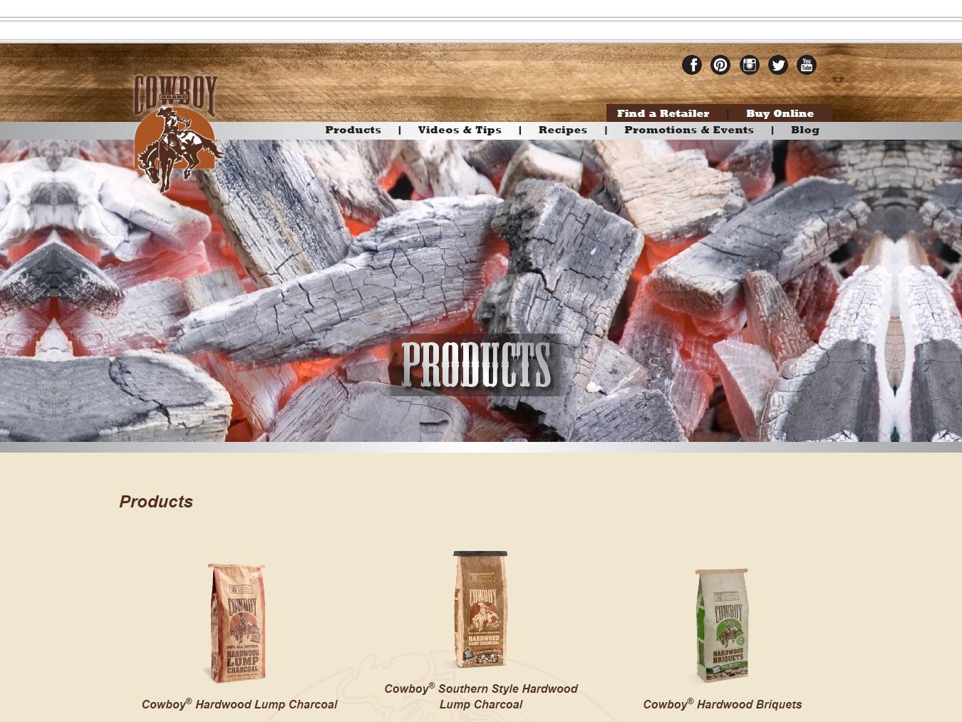
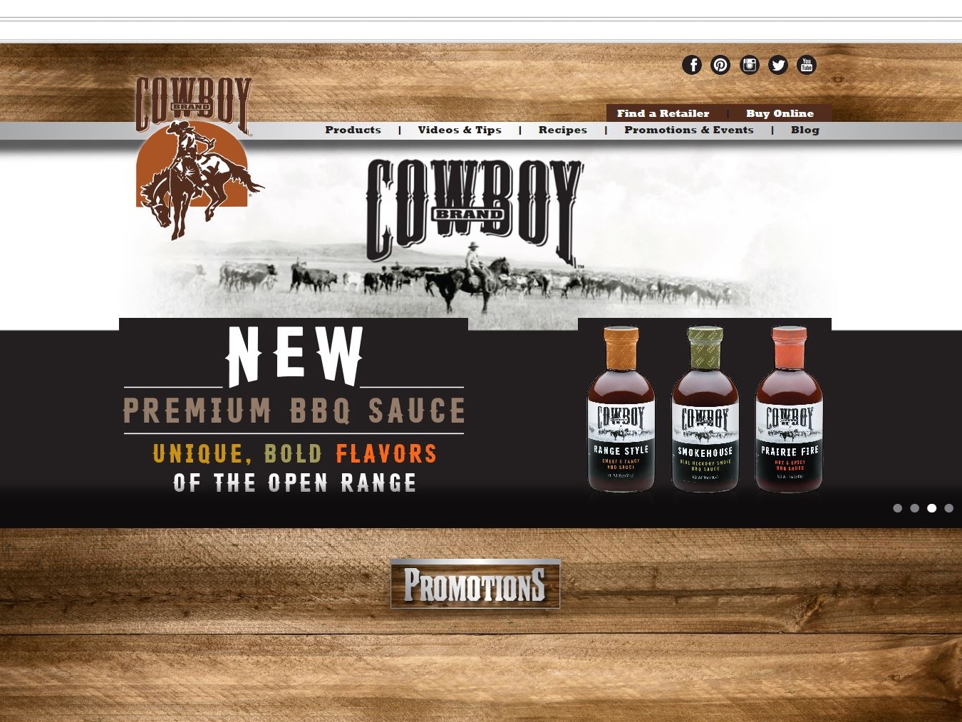
MagicLamp’s site design for Cowboy Charcoal is grilling on all burners. This WordPress site features barbecue photos so real, you can smell the beef! The responsive design introduces you to a readily explorable site.
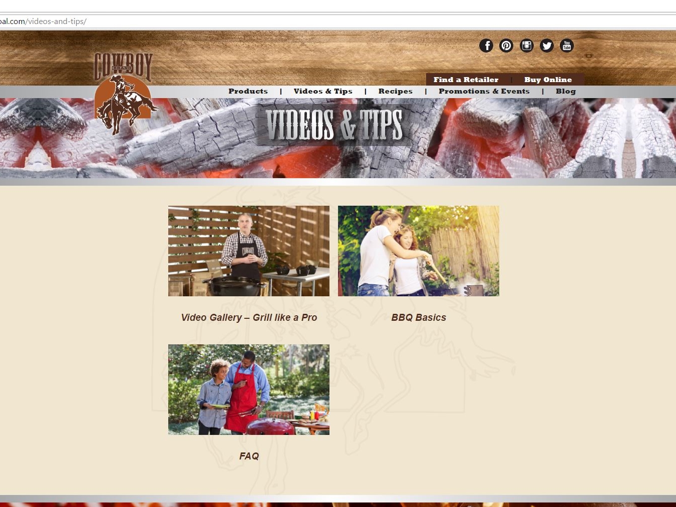
First up is a side scrolling display that sumptuously showcases Cowboy’s Roundup recipe blog, events and products just below a menu bar to help locate retailers and buy online. Also featured are drop down menus listing all products, how-to videos, recipes, events and blog options. The bottom half of the page provides an integrated link to Cowboy’s YouTube channel with videos on grilling’s best practices and charcoal selection, and a newsletter signup.
Cowboy’s Roundup blog with its frequently posted on-the-fly barbecue menu ideas as well as a trove of entrée, side dish, dessert and drink recipes provides a clickable print option next to the name of each dish. The blog also has categories that include products for purchase and gift selections for the family grillmaster.
As if all of this weren’t tasty enough, Cowboy’s site also has share links with Facebook, Twitter, Pinterest, YouTube, Google + and Instagram icons featured on the top right of each page. Instagram also has a presence of clickable foodie tiles on the Roundup blog.
Cowboy Charcoal is a division of Duraflame, Inc. and, as you’ll discover on its product page, is also home to Stubb’s barbecue products. Come and get it!
ecommerce web design     ecommerce web design     ecommerce web design

www.cowboycharcoal.com

APTARE

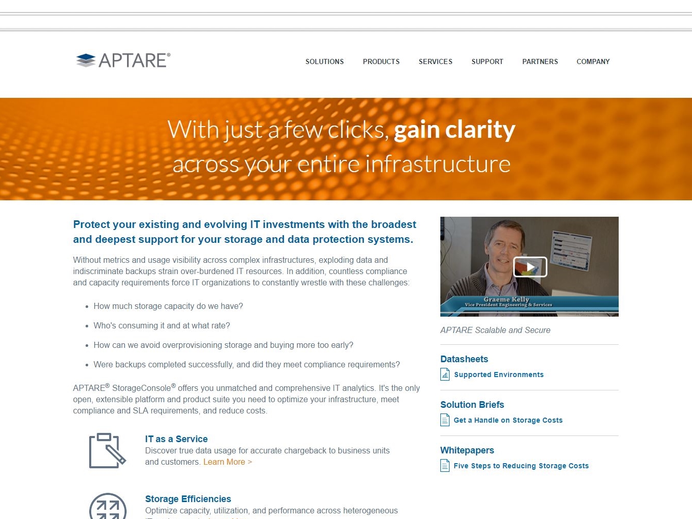
Next up is APTARE, a Fortune 50 company who now has a website that efficiently showcases its StorageConsole 10, “the industry’s only independent, open and extensible IT analytics platform”. MagicLamp’s web design reflects that uniqueness through its successful application of parallax scrolling effects and video backgrounds on APTARE’s home page.
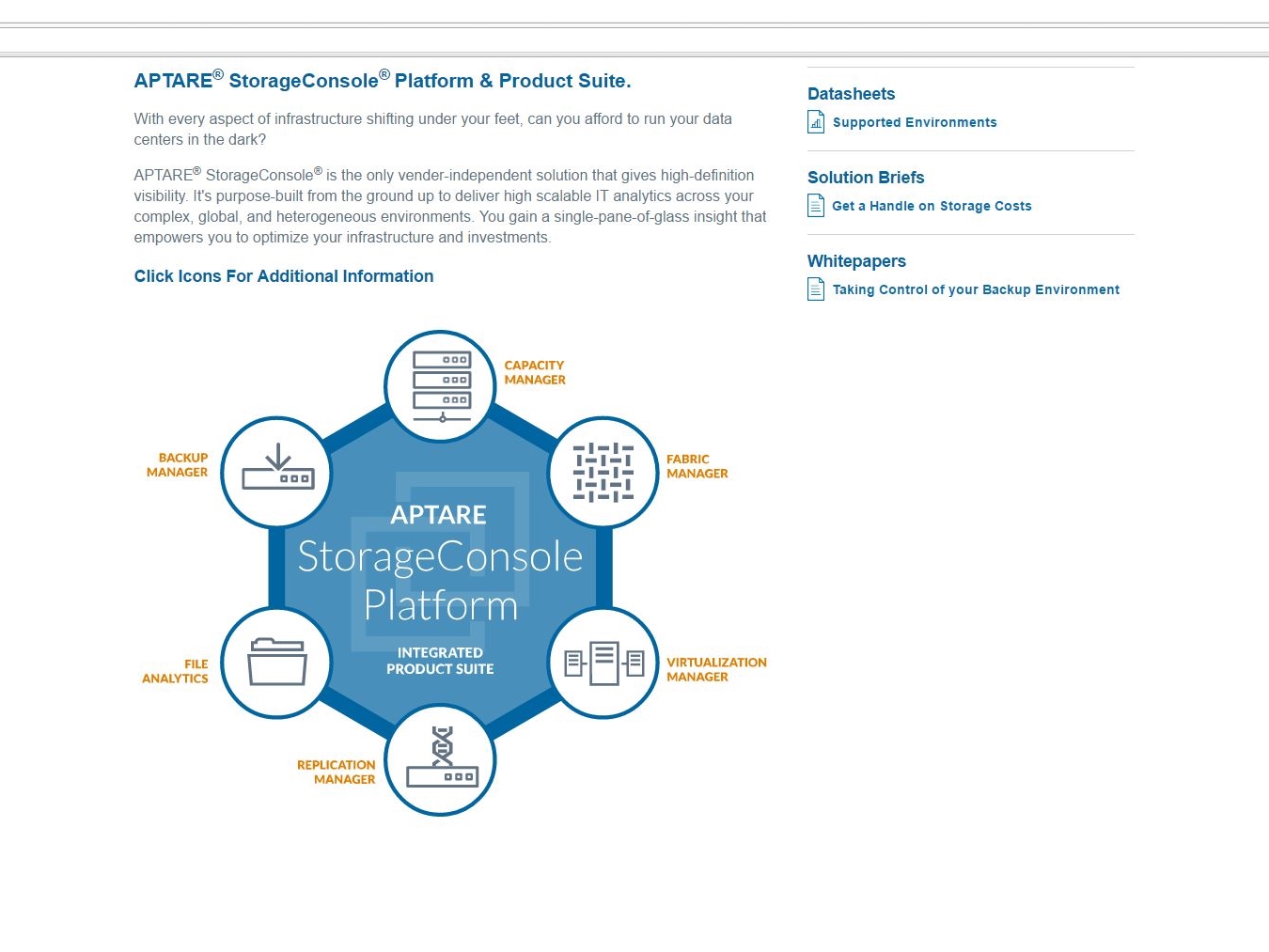
APTARE tracks raw, assigned and used storage across its customer platforms, securing data to be integrated accurately within billing systems.
With MagicLamp’s web development for APTARE, information on these capabilities and the responsiveness of APTARE’s B2B/IT analytic infrastructure flow seamlessly throughout the site. Use of key terms like backup management, data storage, etc. make APTARE’s site easily found by search engines for customers seeking these services.
This ease of use includes accessing the site via mobile devices where the scroll of information shifts from horizontal to vertical without forfeiting any key elements, even retaining access to peripheral content like white papers and data sheets. The user interface and screens – featuring the use of big beautiful lightboxes on screenshots – provide a detailed breakdown of not just what APTARE offers its customers, but how those customers can optimize the StorageConsole 10’s capabilities and customize it to their specific data and storage needs as well as that of their own customers.
APTARE services now support software-defined storage, Open Stack, Flash and hybrid infrastructures, making it an enterprise-ready platform to meet your company’s IT data backup, storage and real-time access needs.
MagicLamp completed APTARE’s byzantine site in only 45 days.
ecommerce web design     ecommerce web design     ecommerce web design

www.aptare.com

GREI

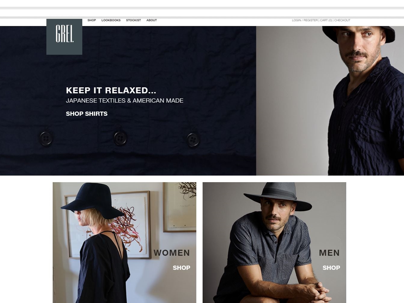
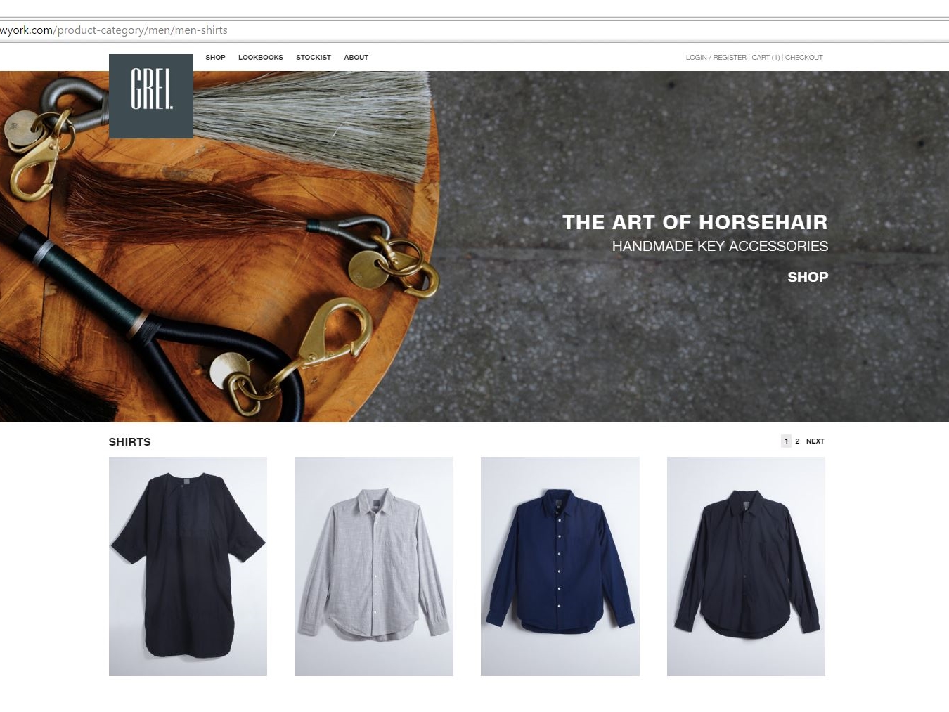
Fashion is key at GREI of New York where handmade horsehair fobs and keychains greet your eyes upon landing.
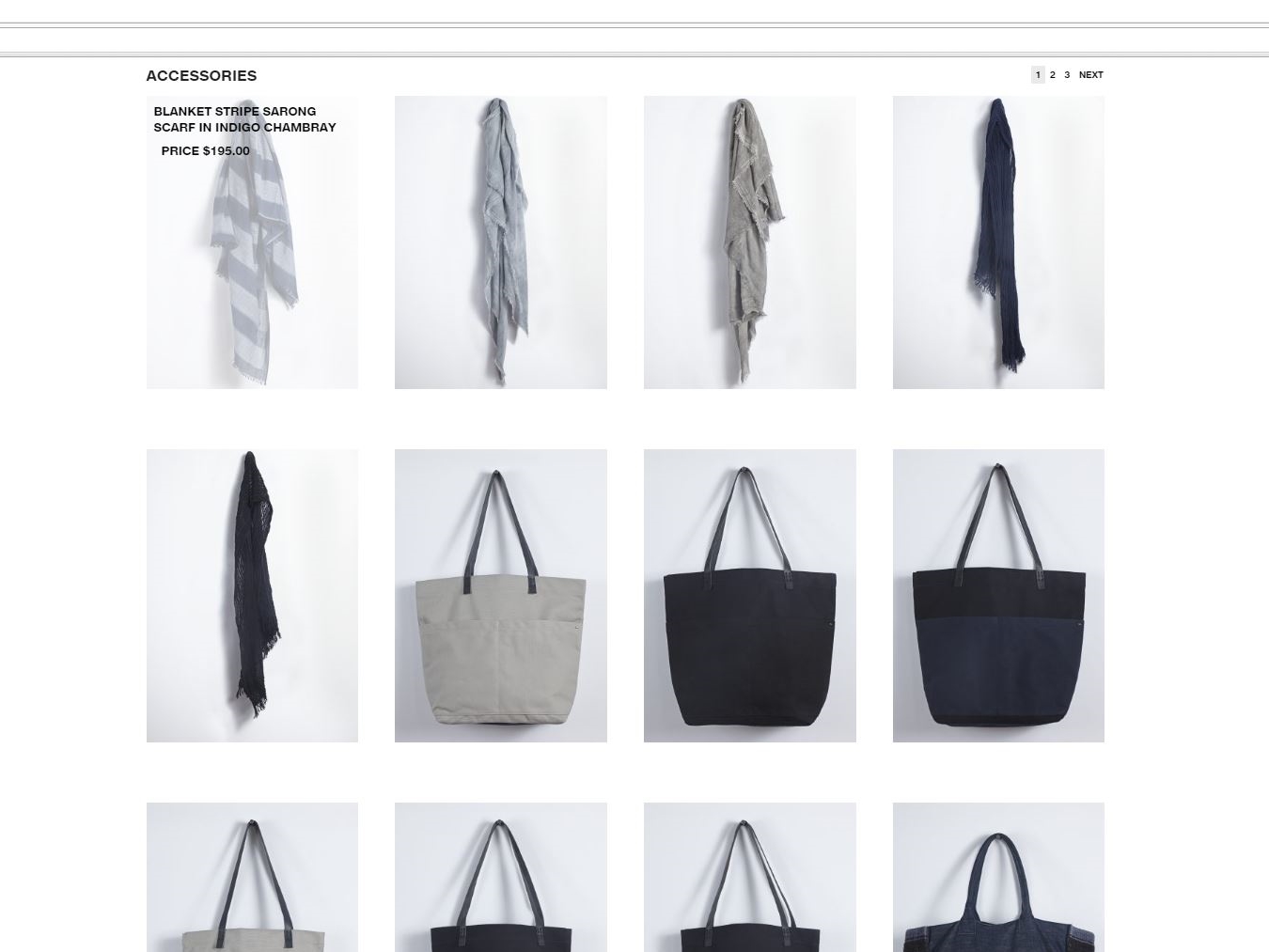
That’s just the first offering shown at GREI’s new website created by Magic Lamp. The WooCommerce site, MagicLamp’s first use of the platform, provides flexibility and compatibility in accessing and ordering any item from its handcrafted inventory of scarves, robes, shirts and more.
The beautifully tactile, rich selection of hand-dyed gray and indigo fashion items float effortlessly between the tabs under each category of apparel. You can display all items under women’s or men’s apparel collectively or review each category by clothing item.
MagicLamp’s web design facilitates the purchase of GREI’s catalog of items online as well as from a select group of stores located in a few key American cities as well as Japan where the fabrics originate. Add to that the ability to customize and even override WordPress features to make use of WooCommerce’s open source platform with its hundreds of options for tracking, buying and selling of merchandise.  It even lets you know how many of an item are left in stock. MagicLamp’s exit intent pop-ups for cart at checkout include a discount offer on your order from GREI as well as one on any future order. There are also share buttons for Instagram and Pinterest to show off what was purchased.
MagicLamp has enhanced GREI’s website further with a tight integration of MailChimp and email marketing with slide-in signups to capture more subscribers, and custom email notifications for order statuses. UPS label printing is also made available onsite for easier fulfillment.

Yes, It’s easy to understand why WooCommerce powers 37% of online stores, and now GREI’s website further distinguishes those offerings.

ecommerce web design     ecommerce web design     ecommerce web design

www.greinewyork.com

New sites for Q2 2016 – Clean Web Designs and WordPress

HEARUSA and HEARCANADA


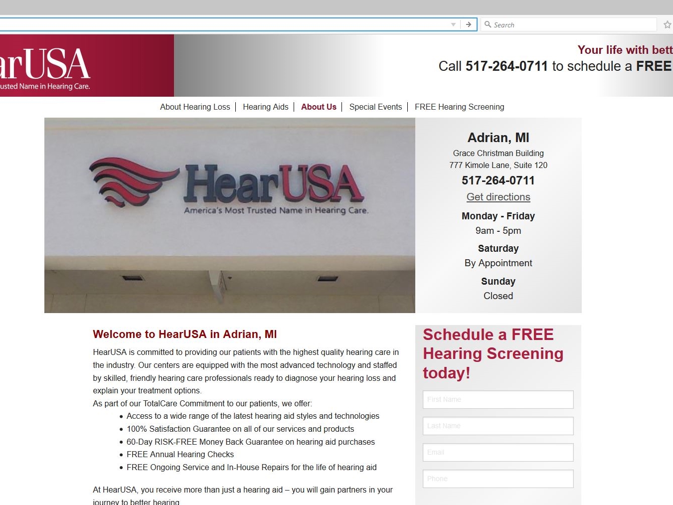
WordPress once again displays its flexibility in hosting a database-driven site, this time to serve the hearing challenged customer in both the USA and Canada.

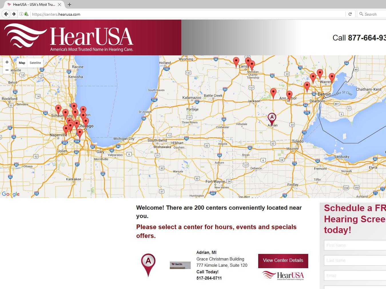
Through use of Google Maps and integrating the importable data in Microsoft Excel worksheets, MagicLamp has created a responsive, highly functional and updateable resource that can locate the office of a HearUSA or HearCanada provider as well as any surrounding services the customer might seek.

The Google map on the site’s home page displays a list of 200 providers searchable by clicking on the “View Center Details” link for the customer’s geographical location. There the customer can review the menu bar of options about hearing loss and hearing aids along with the customized content of that specific provider (i.e. provider’s profile, local special events, etc.).

The dual-skinned database can switch between both sides of a geographic border to provide the most accessible location for the customer seeking hearing services. MagicLamp has also given the customer the means to either sign up onsite or call for free hearing evaluation. Bottom of the home page features discount coupons for hearing aid purchases and services, as well as HearUSA and HearCanada’s accreditation.


CANNA-MANAGEMENT Corporation


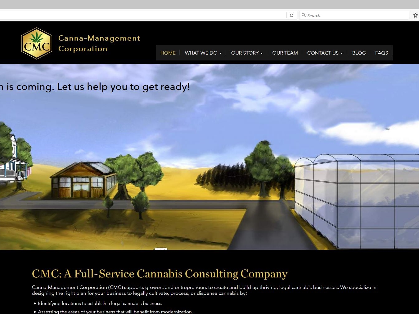
As legalization of medical marijuana becomes more mainstream, the need for governance and guidelines for the growing and processing of it leaves a void to be filled. Enter Canna-Management Corporation.

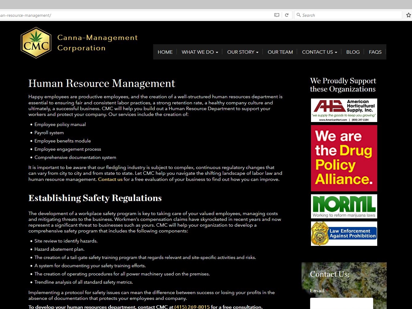
This authoritative WordPress site designed by MagicLamp reflects CMC’s masterful foresight in assembling a comprehensive resource of information and a knowledgeable support team to advise and guide businesses considering legal cannabis production.

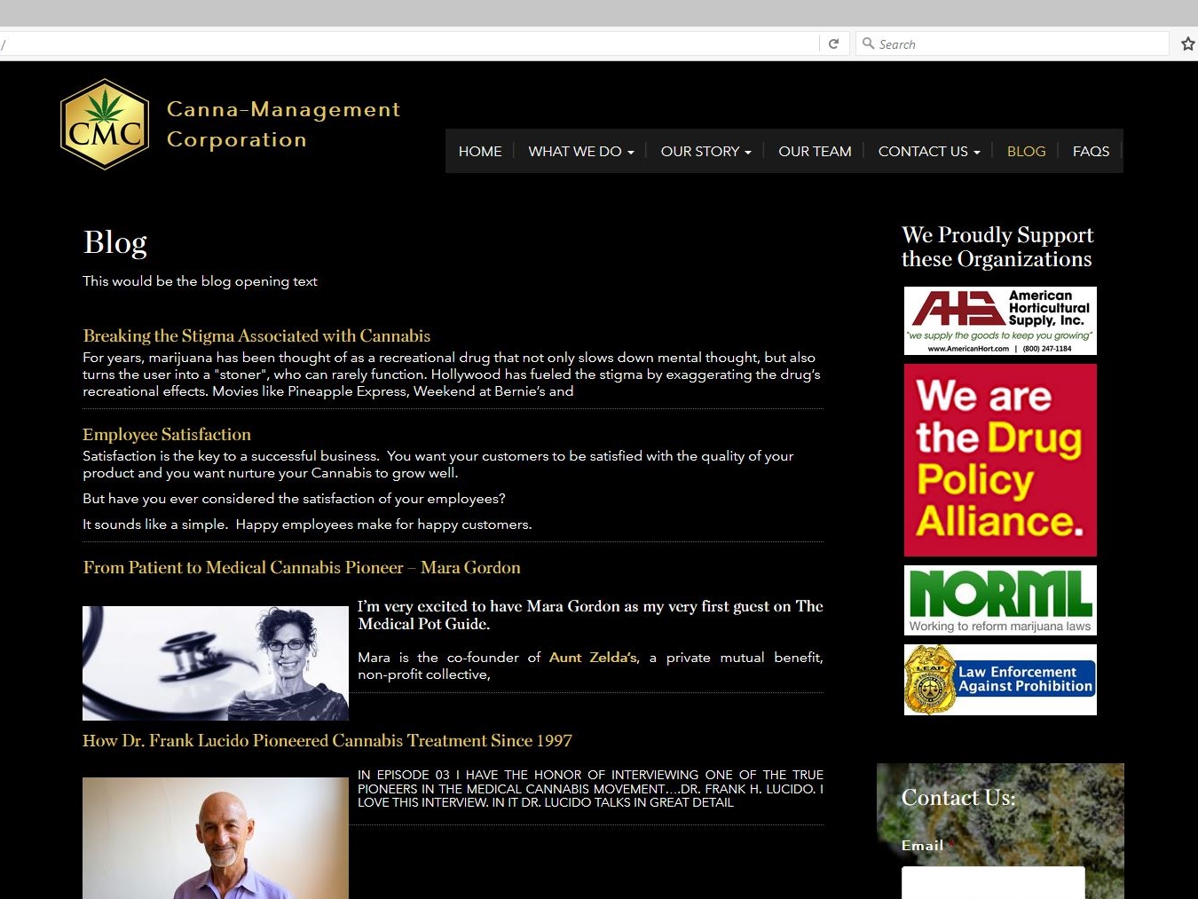
The home page features a slideshow of custom drawings that illustrate how CMC can help a cannabis company’s operation grow. The site’s clickable links on informational topics as well as drop down menus provide a fuller sense of what the requirements and considerations are for this type of business. The responsive design also features a blog with posted podcasts displaying what questions are answered by some of the leading experts on medical cannabis issues.

CMC’s site is also integrated with MailChimp along with a slide-in subscriber signup; and ads for several CMC-sponsored organizations who can provide even more insight and information on staying legal and growing.

CannaManagement     CannaManagement     CannaManagement

www.canna-management.com


JOHN MAHONEY DESIGNS


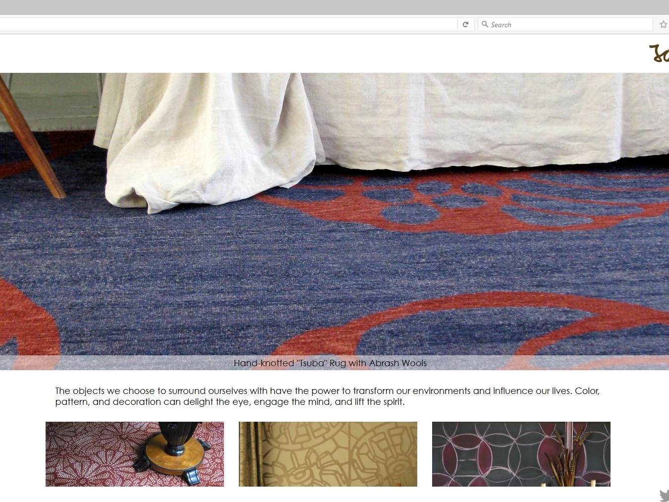
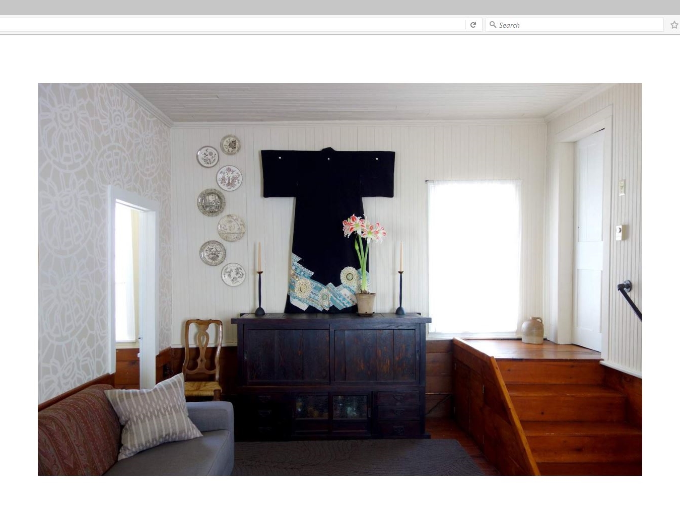
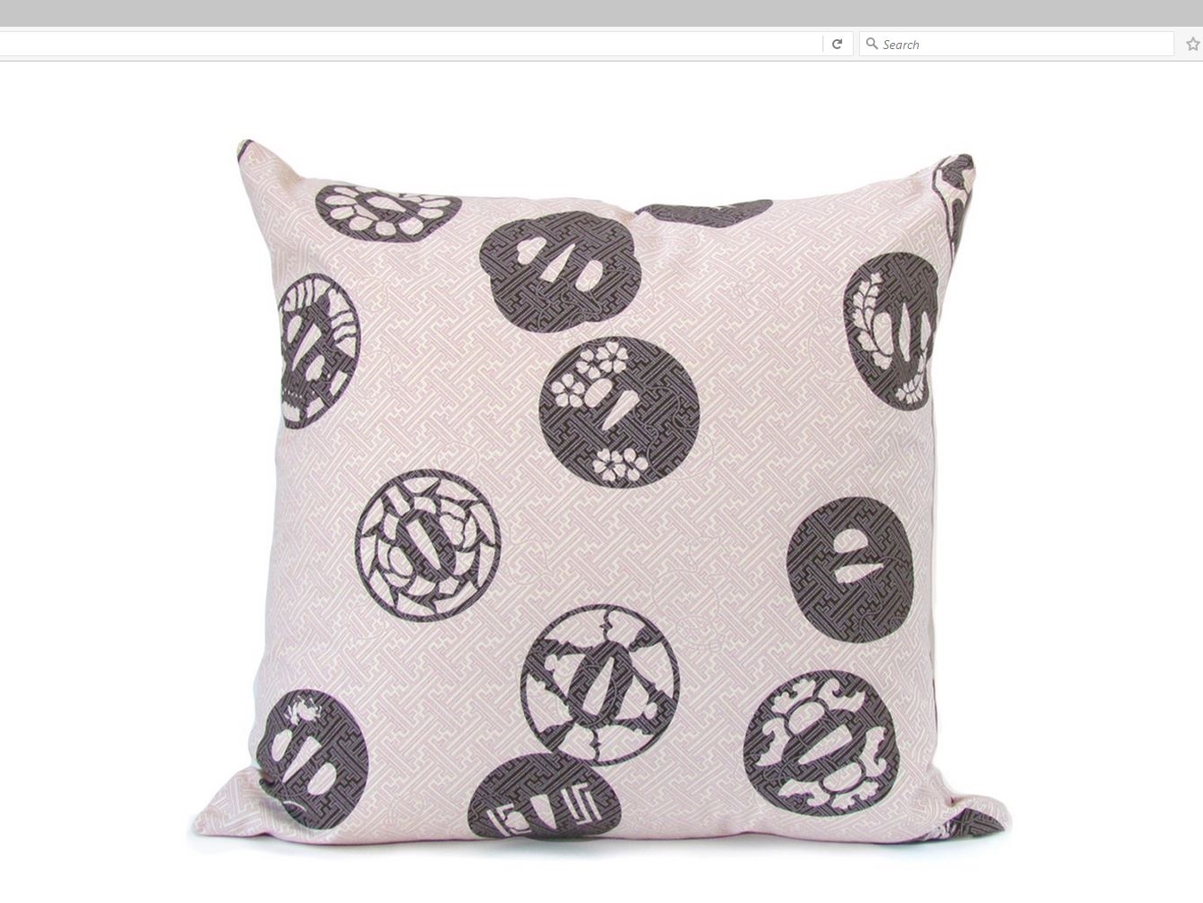
MagicLamp subtly showcases John Mahoney Design’s creations with its various categories of home décor.

The responsive clean lines of this WordPress site introduce a slideshow dissolve of Mahoney’s Asian-themed rugs, wallpaper, linens, fashion and more. Just below it is featured a double row of clickable interactive tiles featuring galleries of his beautifully elegant work expressed in a portfolio of textiles, home accessories and one “wild card” entry of a re-imagined Tarot card deck called “The Tenebrae Tarot”.

Mahoney’s handmade and handcrafted décor items resonate with his philosophy: “The objects we choose to surround ourselves with have the power to transform our environments and influence our lives. Color, pattern, and decoration can delight the eye, engage the mind, and lift the spirit.”

MagicLamp’s uncluttered design allows Mahoney’s work to speak for itself with only sharing links for Instagram, LinkedIn, Twitter and Facebook added.

JohnMahoneyDesigns     JohnMahoneyDesigns     JohnMahoneyDesigns

www.johnmahoneydesigns.com


Judy Joo Online: What Can Responsive Design Do for You?

We were recently honored to develop the official website for celebrity chef and T.V. personality, Judy Joo. Joo is one of the four chefs on the Iron Chef UK cooking show, and she’s featured as a judge on The Food Network’s show The Next Iron Chef. Our team launched the site last month and we’re very pleased with how it came out!

We launched celebrity chef and resturanteur Judy Joo's official website this Summer.

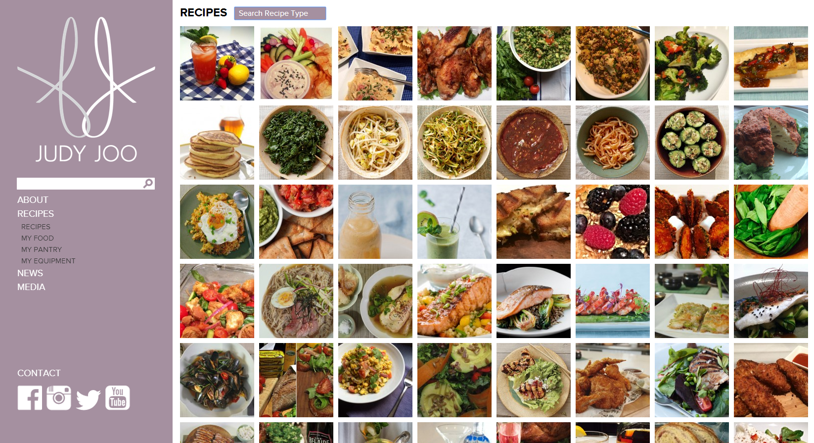
Conceived by designer Wook Kim, the website showcases expansive, borderless images of Joo exploring culinary locales, pulling visitors into the homepage while rich, high-quality content keeps them clicking.

The site is completely WordPress powered, and features a recipe gallery with dozens of Judy Joo’s signature dishes, complete with mouthwatering photos. We built custom filters into the recipe page, giving visitors the option to call up recipes by type of dishe or main ingredients via a simple drop-down menu. Joo’s site administrators can upload new recipes in a snap with our easy content management system, and they do so regularly. The site even has Vimeo plug-ins so Joo can post videos that upload and play instantaneously.

JudyJoo.com is also equipped with responsive design: the entire site sizes automatically to your browser window. The responsivity doesn’t stop with desktop browsers, it works with any mobile device screen so viewers get consistent merchandising across the technology spectrum- desktops, laptops, tablets, smartphones, and more. You can play with the site’s auto-resize to see it yourself– just drag the corner of your browser window to make the page bigger and smaller, and watch the site resize itself just as quickly as you resize the window, with zero downtime and no reloading.

Judy Joo and her staff were so pleased with the website and their MagicLamp experience that they’ve asked us to be the developer for their next web project: the official site for Joo’s new London restaurant, Jinjuu, slated to open November, 2014, in the Soho district.


Regency Vacations

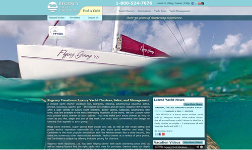
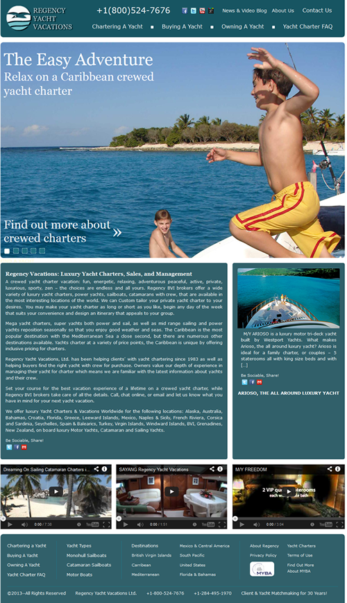
Magiclamp worked with Regency Vacations to come up with a redesign that is visually appealing, and better showcases their passion for Yacht Vacations. Whether it is an adventurous and energetic or peaceful and relaxing vacation you are looking for, the comprehensive search features allow you to find the perfect Yacht for your budget with over 20 destinations to choose from. In the new WordPress theme, Magiclamp included a slideshow with high definition images that give future Regency clients a small glimpse of what they will experience on their vacation. The simple design allows users to find the information they need easily, and quickly.

Before the Redesign

After the Redesign