Email Marketing & Click Bots

Many corporate email systems now employ software (what I am calling click bots) that analyzes the links in any given email to determine if the email violates rules or policies, in addition to whether the email might be spam. Part of that analysis is visiting any/all links in an email and looking at the content living at the URL. This means that when we send out marketing emails, the click bots effectively look like a real person clicking through on the link in the email.

This is why we see the large numbers of clicks for links like privacy policy that are usually in email marketing templates. The click bots are effective enough to execute javascript, which means we can’t rely on Google Analytics to weed out the click bot traffic. This is a very deep topic and I could keep going, but that gives you the gist.

Please note that while this isn’t prevalent in consumer type email systems, it is becoming more and more ubiquitous.


> Thank you Jason but how do we weed this out to find the true interested parties?

This is what we asked Pardot and they didn’t have an answer. Marketo does have answers in the form of best-practices for how to setup automation (and where not to automate), but no one in the industry has really solved this problem. I’ve been thinking about this issue for weeks now to try to come up with a way to solve this, as it would be a new business 😉

Some of the areas that Pardot said they were working to try to solve this:

  1. Click timing
  2. IP address blocking

    and some of my own ideas

  3. Clicks marked as different users coming from the same IP address
  4. Clicks without email open (this is tricky though, high false positive potential)
  5. Multiple Analytics correlation (using Pardot AND Google AND others)
  6. Redirects

Building a Reliable, Optimized, and Customized Site: LeanData

When building any website, creating actionable solutions is of the utmost importance. At MagicLamp, we like to focus on uncovering our clients’ unique needs and pain points to build a site that complements their business instead of attempting to redefine it. This became especially important when working with LeanData, who specialize in creating actionable, data-driven solutions for their own clients. With this in mind, we began to build site featuring many custom elements with the goal of creating a site that fully conveys the benefits their products offer. Through custom plugin optimization, vibrant WordPress design, and our team’s experience, we were able to build a site that exceeded all expectation!

Sleek WordPress Design

If ever there was a project that required the myriad of options offered by WordPress, this was the one! LeanData supports a vast quantity of go-to-market strategies, including account-based marketing, account-based sales development, and geo-based territories. Their collection and application of data for sales is extremely precise, so we wanted to capitalize on that precision and use the site to promote it.

The resulting website has a clean look with plenty of space to showcase each unique benefit and solution. Due to the vast quantity of benefits offered by LeanData, we carefully delineated each part in a clear and concise way. We wanted everything to appear as accessible as possible to help potential customers fully grasp LeanData’s products.

Custom Plugins Galore!

LeanData’s unique business model required an accordingly unique web presence, so we worked hard to build it for them. MagicLamp designed custom plugins for LeanData to help them convey the benefits of their products. LeanData specializes in tracking and generating sales leads, but their platform has many moving parts, necessitating custom plugins to ensure constant high performance.

Our custom plugins are fully integrated into the LeanData WordPress design, allowing for a more completely customized web presence.

Plugin and Load Time Optimization

With any custom site, performance reliability can be something of a challenge, so we thoroughly combed through the site to ensure optimal performance on every single page. Each landing page is totally optimized for load time, ensuring a higher visitor retention rate and creating new customers.

Due to the number of customized plugins present in LeanData’s site, plugin optimization also had a high priority. We focused on making certain that each plugin works at its highest capacity, giving the website a unique and functional look and feel.

Support for Landing Pages and Email Templates

Additionally, the LeanData site offers support for both Unbounce and Marketo for landing pages and marketing emails, respectively. Unbounce gave us the power to optimize each individual landing page, while Marketo provided LeanData with a number of marketing email insights and automation tools. Both of these adaptable tools will certainly come in handy with any future updates to the site!

MagicLamp

LeanData provided us with an opportunity to create a unique site that functions in a unique way. We were able to use our creative side to build a site truly like no other, and we enjoyed every step of the process!

DragonFly Designs: Where Creativity Meets Fun

The people at DragonFly Designs believe that there are few experiences more rewarding than helping kids explore their creative side. They spend a great deal of time sharing their love of the arts with kids of all ages by teaching new artistic skills in classes, private events, camps, and parties.

DragonFly Designs started as a small jewelry business before its owner, Stacee Gillelen, realized that she enjoyed sharing and teaching her skills and began offering classes. What started as a few jewelry making classes rapidly gained traction and now, DragonFly Designs offer classes in disciplines as wide-ranging as painting, textiles, dance, yoga, and even organic gardening in English, Spanish, and Mandarin. In addition to the classes, DragonFly Designs began offering camps to help kids learn about new artistic pursuits.

While DragonFly Designs tells a true success story, rapid growth can be challenging to manage. With increased popularity comes the need for quick and easy booking and a web presence that inspires confidence and is easily navigable. We at MagicLamp were able to provide all of these and more to DragonFly Designs, helping them manage their impressive rate of growth while continuing to grow.

WordPress and WooCommerce for Booking Management

At MagicLamp, we work hard to tailor each web design to meet the specific needs of the client. In this case, we used the WordPress design to evoke a sense of fun and lightheartedness, matching the DragonFly Designs’ ideals and values. The site includes many photos and testimonials, all geared toward showing how beneficial the arts can be for children.

Because of DragonFly Designs large quantity of different classes, camps, and private events, reliable Ecommerce is a must-have, especially because a mistake in booking could lead to some pretty big inconveniences for potential customers or even lost business. In order to mitigate any problems, MagicLamp custom-built DragonFly Designs’ party, class, and camp registration system with WooCommerce to ensure that it operated within the specific parameters that they required. As one of the tope Ecommerce platforms in the world, WooCommerce is fully integrated with WordPress, which makes for a seamless transition from browsing to shopping. By using WooCommerce for booking, we were also able to set it up in the same Ecommerce system as the rest of DragonFly Designs’ products, allowing customers to purchase products, sign up for classes, and check-out all in one place.

Add-Ons, Upgrades, and Bundles

Because of the custom, single check-out system we enacted through WooCommerce, we were able to include a feature that offers suggested purchases upon check-out. This minor addition increases DragonFly Designs’ sales by helping customers discover additional products they might be interested in and offering them at the point of purchase.

At MagicLamp, we’re always grateful when we get to partner with an organization as caring and kindhearted as DragonFly Designs, and we love helping them meet their incredibly important goals. Taking part in the introduction of the arts to people’s lives is an immensely rewarding experience that we deeply enjoyed.

Keeping an Ear to the Ground: AARP Hearing Care Website

Hearing loss is no small problem to tackle. According to AARP Hearing Care, some 40 million Americans of all ages suffer from some degree of hearing loss, but many cases go unidentified. With this relatively common problem in mind, MagicLamp knew we had our work cut out for us. We were tasked with creating a website that used a visually-engaging design style to draw in viewers as well as craft a successful ecommerce presence. We chose to work through WordPress and WooCommerce to help the AARP Hearing Care Program reach their audience and spread their important message of healthy hearing as far as it would go.

WordPress

When creating professional but aesthetic sites, there really is no better web creation tool than WordPress. There are plugins for just about any purpose and a great deal of freedom when it comes to design options. MagicLamp believes WordPress is truly the best tool for the job, so we use it as frequently as we can when developing new sites.

Our WordPress design for AARP Hearing Care is colorful and lively, but doesn’t sacrifice usability. We designed the site to bring a bit of lightheartedness to the idea of aural health through use of vibrant images, colors, and banners. The site includes pages on hearing health, hearing aids, various hearing products, and news regarding advances within aural care. MagicLamp’s WordPress design uses inviting visuals to draw in visitors and easy navigation to direct them where they need to go.

WooCommerce

While the WordPress design is of the utmost importance in order to retain visitors, another factor that can’t be overlooked is the value of functional ecommerce. Having an online store that works quickly, simply, and securely is an invaluable part of any successful online business, so MagicLamp worked to create an ecommerce presence that fulfilled these parameters.

When crafting an online store, we find that the best tool for the job is WordPress’ WooCommerce tool. It’s one of the most widely used ecommerce tools for good reason, as it can be used to build just about any type of online store. Our WooCommerce design was able to accommodate and organize AARP Hearing Care’s wide array of products, allowing for a seamless purchase experience for customers. Through use of the many WooCommerce tools and plugins, MagicLamp was able to create an online store that is fully integrated with AARP Hearing Care’s web presence.

At MagicLamp, we devote our energy to crafting the perfect website for our clients’ often unique needs. AARP Hearing Care required an engaging site design with an ecommerce presence to match. Through our years of experience in WordPress and WooCommerce, we were able to build a site that ensures all visitors enjoy their experience and return for further information and purchases.

Getting to work with AARP Hearing Care to help improve aural health nationwide was privilege that we at MagicLamp truly enjoyed. We work hard to use our web development skills to showcase the best qualities of our clients, and creating a site for a business that offers services as important as hearing care was an exciting and rewarding experience.

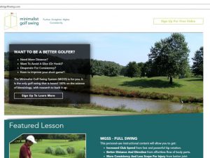
A Clean Look to Match Minimalist Golf Swing

ecommerce web design

The people behind Minimalist Golf Swing have truly thought of everything. Their program, the Minimalist Golf Swing System, is a merger of decades of professional-level golf experience, advanced kinesiology, and technology that intuitively instructs users on how to drastically improve their golf game. Needless to say, creating an online face for a company with such complexities as Minimalist Golf swing presented a unique challenge for MagicLamp, a challenge we were happy to meet. Through WordPress, were able to build the perfect website for Minimalist Golf Swing, and by using web design and WordPress plugins, we were able reveal some of the qualities that make Minimalist Golf Swing such a unique business.

WordPress

WordPress remains our top choice for developing and designing custom websites. Through its wide array of tools and its easy customization, MagicLamp is able to build websites that seamlessly function as an extension of an existing business. Minimalist Golf Swing was no exception.

The Minimalist Golf Swing WordPress design is simple and, appropriately, minimal. Despite the minimalist design, the site is full of useful information and helpful diagrams, allowing visitors to get a taste of the Minimalist Golf Swing System. Using the online store to purchase learning materials is quite easy. The site contains an About page, the online store, testimonials, a blog full of tips and interesting information, and a News page. Our WordPress design truly captures the essence that Minimalist Golf Swing works to cultivate.

WooCommerce

When creating online stores, there’s no better tool than WordPress’ WooCommerce platform. WooCommerce is the most widely-used ecommerce platform in the world, powering 39% of all online stores. Minimalist Golf Swing offers a very specific selection of online lessons, and WooCommerce was the perfect way to build their store. With the versatility offered by WooCommerce, we were able to build a simple and intuitive online store that showcases Minimalist Golf Swing’s products and makes it easy for visitors to make purchases.

Learning Management System

As an educational resource, Minimalist Golf Swing required their website to be able to support some rather unique functions. MagicLamp was able to work with them and design a Learning Management System for their customers. A Learning Management System is an aggregation of videos and online quizzes aimed at ensuring the success of Minimalist Golf Swing’s customers. Through the Learning Management System, Minimalist Golf Swing is able to ensure their materials are understood, making sure that the customers see the progress that they desire.

MagicLamp thrives on the success of our clients. Through our WordPress design, WooCommerce expertise, and meticulously crafted Learning Management System, we were able to help Minimalist Golf Swing attain the level of ecommerce they desired while ensuring that their website has a professional and modern appearance. MagicLamp’s WordPress design was built with visitors in mind. It is clear and simple, and materials are quickly and easily accessed with no hassle whatsoever. This visitor-minded design makes certain that visitors to Minimalist Golf Swing can find exactly what they’re looking for, ultimately increasing their amount of ecommerce and further establishing their business.


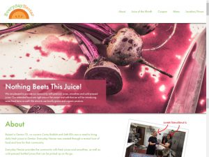
Fresh Juice, Fresh Online Face: Everyday Nectar

Everyday Nectar is a dream come true for every juice enthusiast, healthy living fan, or appreciator of all things delicious. They use local, organic ingredients to make a wide variety of delicious juices, smoothies, and juice shots, and are conveniently located in downtown Denton, TX. When they asked MagicLamp if we could help them craft a web presence to show off their products, we happily obliged. After all, who doesn’t love fresh-squeezed juice?

WordPress

The new site MagicLamp built for Everyday Nectar was designed in WordPress, affording us all of the tools and plugins we could possibly need. Though the site has a professional appearance and is easily navigated, we made sure that it doesn’t lose Everyday Nectar’s friendly and down-to-earth nature. The WordPress site features and About page, an updateable Juice of the Month feature, a clear and navigable Menu to show off their drinks, and one pager to give visitors a quick rundown of Everyday Nectar. Through our WordPress design, we were able to build a site that effectively demonstrated Everyday Nectar’s values and dedication to freshness.

Custom Theme

With a business as unique and vibrant as Everyday Nectar, a templated website simply wouldn’t do. MagicLamp worked to create a website structure that would complement the presence Everyday Nectar worked hard to build in its Downtown Denton destination. Through our creation of a custom theme, we were able to accomplish just that. The WordPress custom theme was designed with visitors in mind, giving them a sense of Everyday Nectar’s atmosphere without having to search too much. The website is designed to be as clear, concise, and visually-appealing as possible.

One Pager

In order to make the website as clear as possible, we made use of a one pager. The one pager was designed to draw the eye of visitors and included information about Everyday Nectar, the Juice of the Month, a coupon, and their menu. By adding a one pager, we made certain that the information Everyday Nectar wanted their online visitors to see is easily accessible and easily viewed.

Full Menu of Juices

Everyday Nectar has a large number of distinct juices and smoothies, all made of many different fresh ingredients. MagicLamp was able to build an area on their site that allowed them to display their juices all in one place. Each juice, from Pear-fect to Tropic Thunder, has every ingredient listed. The different types of drinks even have their own sections, such as Fresh Juice, Smoothies, Shots, or Cold-Pressed juice.

Optimized for Local Searches

Everyday Nectar has some truly delicious juice, and we want as many people to know as possible. As a local business however, it wouldn’t do them much good to heard of by juice fans from across the globe. In order to maximize their traffic, we had to focus search engine optimization very specifically to draw in local business.

This was a thoroughly enjoyable project for all of us at MagicLamp. We enjoy nothing more than helping small businesses see the level of success they want, and we so loved spreading the word of Everyday Nectar even further. Because again, who doesn’t love fresh-squeezed juice?

Portraying Professionalism with a Custom WordPress Theme

If Airtec Global LLC were to be described in one word, that word would undoubtedly be “expertise.” Within the air compression systems field, the guys at Airtec are the consummate professionals. They know just about everything there is to know about compression systems of all sizes and brands.  AirTec is nothing if not dedicated to their craft.

Portraying the level of expertise represented by Airtec was a challenge MagicLamp was ready to meet, so we worked hard to gain an understanding of their business in order to build them a complete web presence that matched their values and ideals. Through WordPress, we were able to create a custom site that serves to show the expertise that Airtec brings to the table.

WordPress

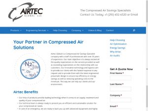
What better way to show off professionalism than through one of the most professional website creation services? WordPress’ impressive array of tools and services allowed MagicLamp to build a website that operates reliably while visually steering visitors where they need to go. The site contains product information, information on the services Airtec offers, a blog section for company and product updates as well as improving SEO, and contact forms that allow visitors to get a free quote. The new Airtec site is sleek, navigable, and performs fantastically.

Copywriting

The new Airtec website received a complete rewrite with a great deal of input and advice from the experts at Airtec . The new copy had to be informative, search engine optimized, and understandable to the average visitor. We were able to write helpful content that helps Airtec register as a search result, increasing their reach. MagicLamp wrote a great deal of varied product descriptions while referring to the level of skill and talent present at Airtec . We made sure to consider Airtec’s mission statement of bringing efficiency to compression systems worldwide while the writing the content and were able to portray this idea to visitors.

Web Design

Just a little bit of design flavor can go a long way in retaining visitors. The Airtec site received a ground-up redesign aimed at bringing their message of efficiency and expertise to everyone that comes across their site. Airtec’s new site is simple, clean-cut, and easy to navigate, and draws attention to the most important parts of the site for visitors to view. The pages are full of information without seeming cluttered and without sacrificing visibility. The site uses high quality graphics that lend additional credibility, further improving AirTec’s image.

Though MagicLamp may have built Airtec’s web presence, we simply built a representation of what was already there. AirTec represents some of the best in their industry, so we built a website that shows off their unparalleled capabilities. We used copy to inform visitors on air compression systems and how their needs can best be met by Airtec , and we used site design to showcase Airtec’s proficiency and steer visitors in the right direction. MagicLamp’s WordPress design will go on to help AirTec grow and find new business while showing the wonderful qualities present in their business.

Creating a Modern Web Presence for a Local Bank: PointBank

There are few things more gratifying than helping out your local community. PointBank’s been doing it over 100 years, and now MagicLamp can proudly say that we’ve partnered with them in their efforts. In creating a modern and fully integrated website for PointBank, we’ve been able to take part in building them a web presence that shows off just how much they care about their community on a personal level.

WordPress

Our new site design for PointBank was completed in WordPress, allowing us to use the numerous tools and plugins WordPress offers to create the perfect site for PointBank. Our WordPress design included a useful mobile design, a Loan Calculator widget aimed at making the loan process a bit more approachable, SEO optimized copywriting, a custom locations widget with all bank locations mapped out, and WCAG 2.0 AAA compliance levels, all on a custom theme we created specifically for PointBank.

Mobile Web Design

Probably the best way for a local business to ensure it has a good relationship with its surrounding community is through accessibility and good communication. With this in mind, MagicLamp created a new, user-friendly mobile platform to ensure that mobile viewers land on comfortable, easily-navigated site. The new mobile site allows viewers to get a very clear view of how much PointBank cares for its community, carefully demonstrating that it is indeed a “people bank.”

Custom WordPress Theme

As both PointBank and MagicLamp know, every business is unique. While PointBank acknowledges this through their flexibility and desire to help local businesses succeed, we show it by designing not just a custom website, but a custom theme to create a truly distinct web presence that showcases PointBank’s dedication to their customers.

Loan Calculator Widget

Let’s face it, going online to figure out loan specifics can be more than a little bit difficult and certainly a bit intimidating. PointBank recognized this and asked us to design a loan calculator widget that would enable their visitors to figure out at least the basics of their loan. This makes the loan process a good deal more accessible and less daunting by showing some real figures so viewers can have an idea of what expect before entering into the loan process.

Locations Widget

The locations widget plays a key role in crafting PointBank’s online image.  At the bottom of each page, the widget simply and clearly shows off the various PointBank branches, their hours, and contact information. It even shows which branch is closest to the visitor. The locations widget allows visitors to see that PointBank has branches across much of Denton County and is viable banking option for anyone living in that area.

SEO Content Writing

What good is even the best web design if it doesn’t show up in Google search results? Through search engine optimized content, we were able to secure PointBank’s position as a top search result without sacrificing the usefulness good content writing affords.

WCAG 2.0 Compliance

You don’t have to take us at our word when we call the new PointBank site user-friendly. The World Wide Web Consortium (W3C) has certified the PointBank with the highest possible rating of AAA according to the Web Content Accessibility Guidelines (WCAG 2.0), meaning that the site flawlessly demonstrates all the key characteristics of a functional, well-designed website.

MagicLamp is proud to be partnered with PointBank in their community-oriented approach to banking, and we thoroughly enjoyed getting to work with a business that cares so deeply about the people around it. We can’t wait to see what the future holds for our relationship with PointBank!

Building a New Type of Shopping Experience: Intnt

Though the world of online shopping has drastically improved and is more far reaching than ever before, there are still all kinds of unexplored possibilities waiting to be discovered. Intnt is one of those businesses that are built solidly on innovative ideas, like their Text to Shop service. Intnt allows its users to send text messages out asking for advice on retail purchases, and then links the users directly to retailers who make recommendations based on what they asked for.

The prospect of working with such a forward-thinking business was exciting for all of us at MagicLamp. Considering Intnt’s tech-based business model, we were thrilled to work with them to fulfill their unique needs, so we designed a custom website and mobile design to fit their one-of-a-kind personality.

WordPress

With a product as technology-heavy as Intnt’s Text to Shop, a healthy web presence is incredibly important. While a solid web presence is necessary to support such a product, it’s also instrumental in inspiring confidence in visitors and customers. WordPress was once again the perfect platform to develop an ideal web presence.

MagicLamp crafted a simple but informative site that shows visitors what Intnt is and how to use it. The site is completely inviting and draws visitors in with clear explanations and friendly graphics. Simplicity works to Intnt’s advantage, effortlessly explaining such new concepts as shopping by text. MagicLamp’s WordPress design features a home page, an overview, and extremely useful FAQs page, a page to connect with retailers, and a sign-up for the Beta. This site is just another example of how our efforts are always well spent working in WordPress.

Web Design

When working with a brand new idea, making sure the website that represents it is cutting edge in appearance is almost as important as the product itself, especially to visitors. We kept this idea prominently in mind while creating the website, and we are quite happy with how the visuals turned out! The most important parts of the website are easily accessible and each visual component is designed to draw the eye the proper place. The modern aspect of Intnt is represented well by our design, making sure visitors are comfortable and free from the frustration of difficult navigation.

Mobile Friendly

Considering that Intnt’s system is called Text to Shop, a mobile friendly site is certainly a pretty important part of their business, and though mobile friendly sites are increasingly necessary, they can still sometimes be hard to come by. We at MagicLamp are committed to creating the perfect web presence for our clients, and for businesses like Intnt, a big part of that is the mobile design. Our mobile design allows visitors to easily view and navigate every part of Intnt’s site with ease. It transfers the intuitive design of the desktop site seamlessly into the mobile format.

Working with innovators like Intnt is always a pleasure, as is getting to play part in new products and services like Text to Shop. We found it to be a rewarding and fascinating experience, and we look forward to our partnership with Intnt as they continue to grow.

MagicLamp Launches 3 New Sites – Including WooCommerce!

COWBOY CHARCOAL

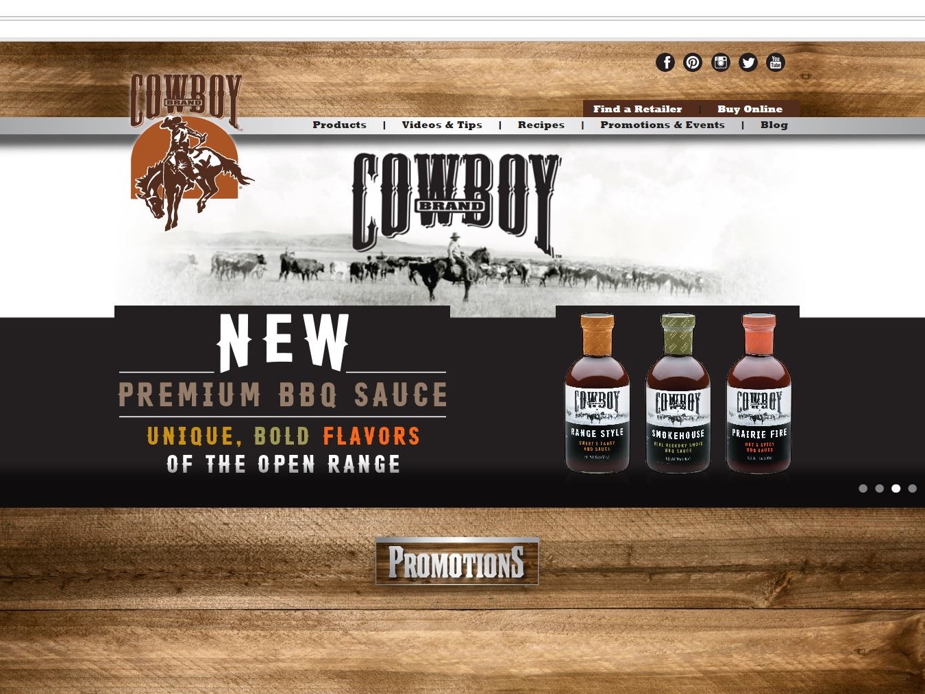
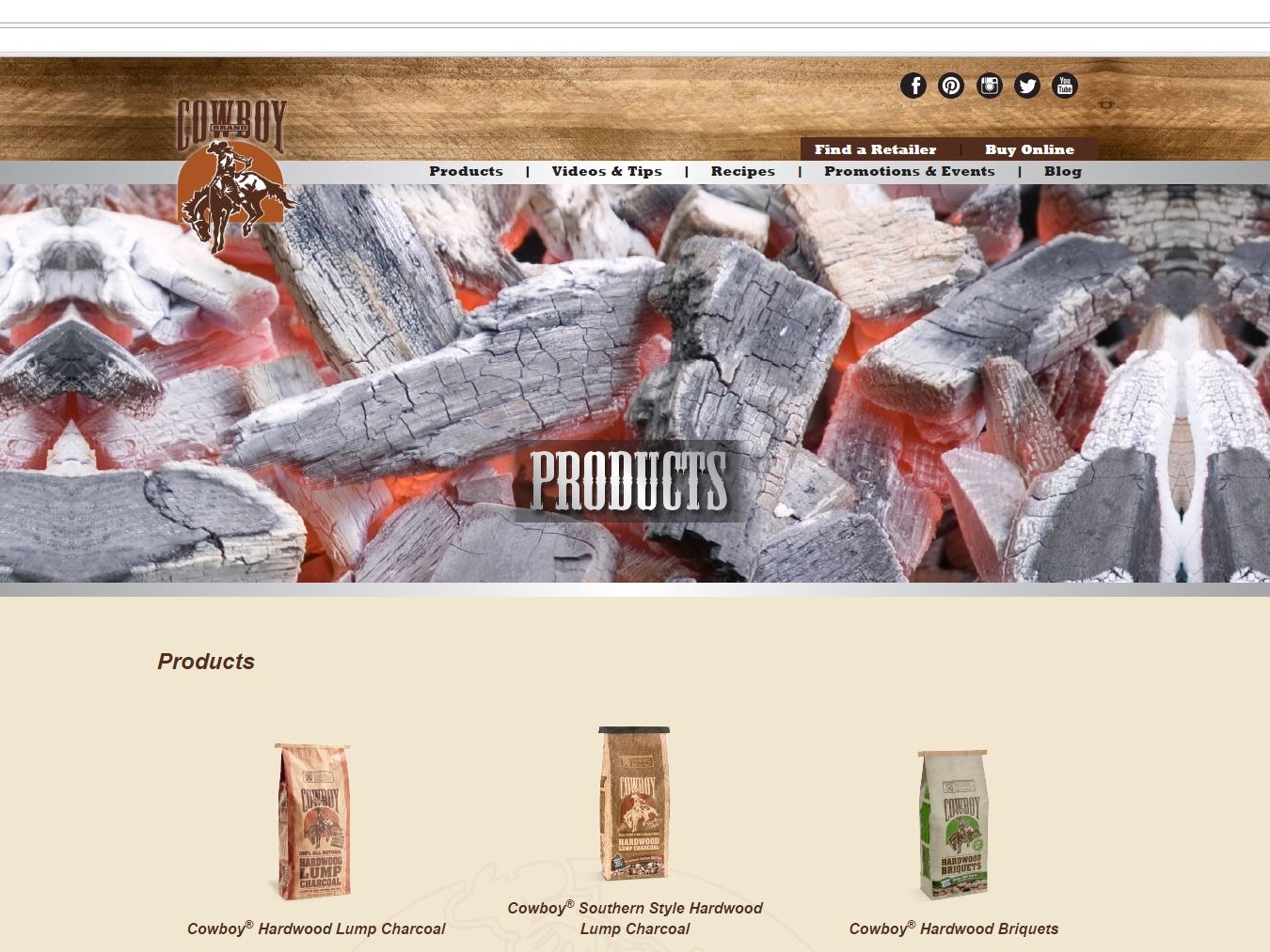
MagicLamp’s site design for Cowboy Charcoal is grilling on all burners. This WordPress site features barbecue photos so real, you can smell the beef! The responsive design introduces you to a readily explorable site.
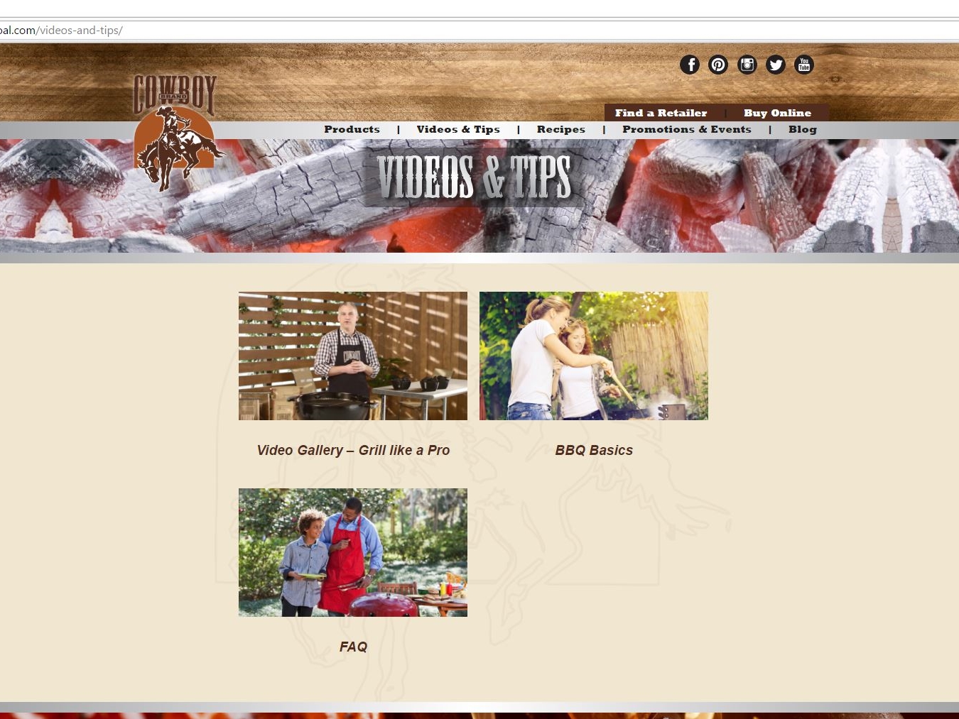
First up is a side scrolling display that sumptuously showcases Cowboy’s Roundup recipe blog, events and products just below a menu bar to help locate retailers and buy online. Also featured are drop down menus listing all products, how-to videos, recipes, events and blog options. The bottom half of the page provides an integrated link to Cowboy’s YouTube channel with videos on grilling’s best practices and charcoal selection, and a newsletter signup.
Cowboy’s Roundup blog with its frequently posted on-the-fly barbecue menu ideas as well as a trove of entrée, side dish, dessert and drink recipes provides a clickable print option next to the name of each dish. The blog also has categories that include products for purchase and gift selections for the family grillmaster.
As if all of this weren’t tasty enough, Cowboy’s site also has share links with Facebook, Twitter, Pinterest, YouTube, Google + and Instagram icons featured on the top right of each page. Instagram also has a presence of clickable foodie tiles on the Roundup blog.
Cowboy Charcoal is a division of Duraflame, Inc. and, as you’ll discover on its product page, is also home to Stubb’s barbecue products. Come and get it!
ecommerce web design     ecommerce web design     ecommerce web design

www.cowboycharcoal.com

APTARE

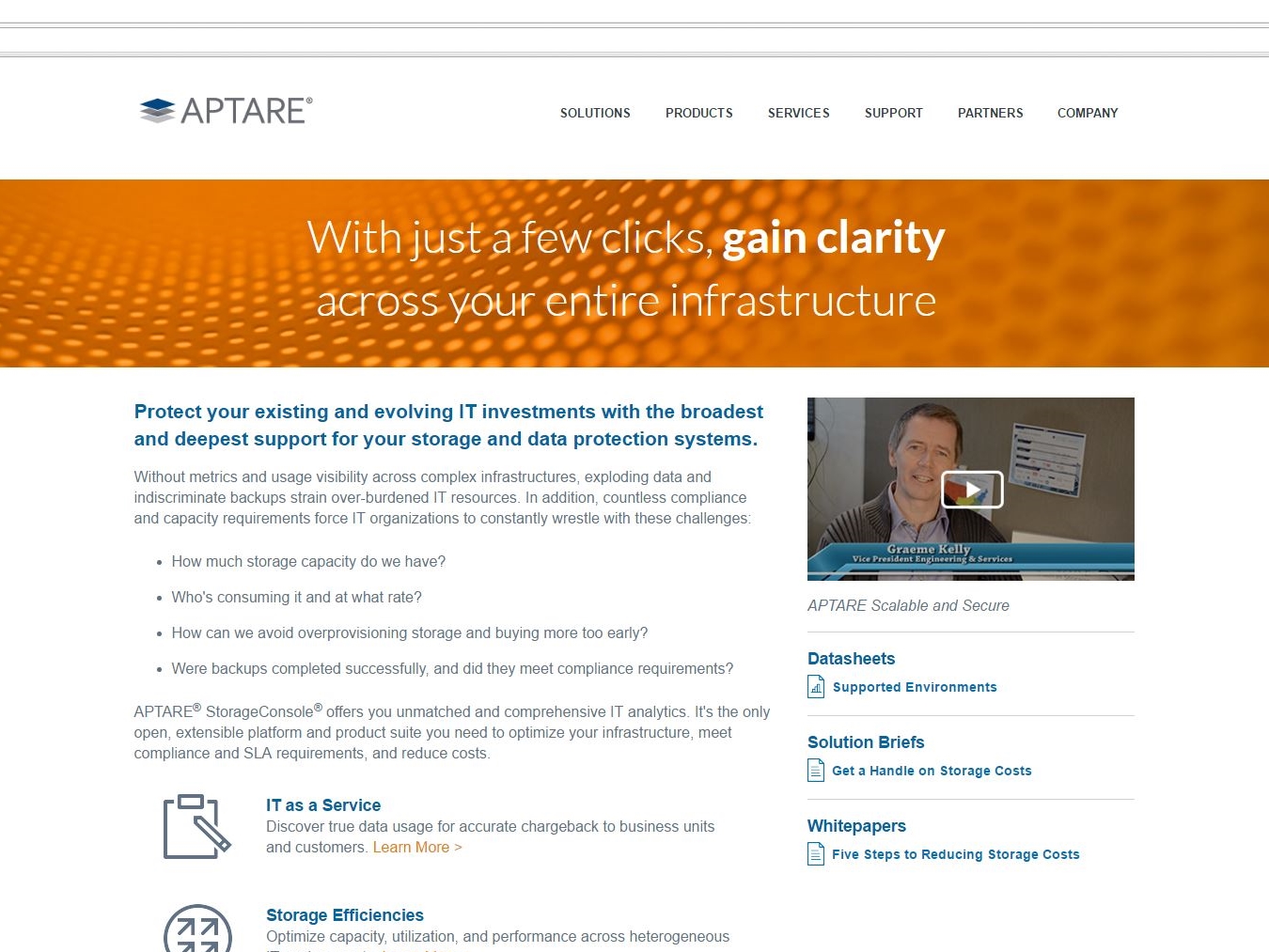
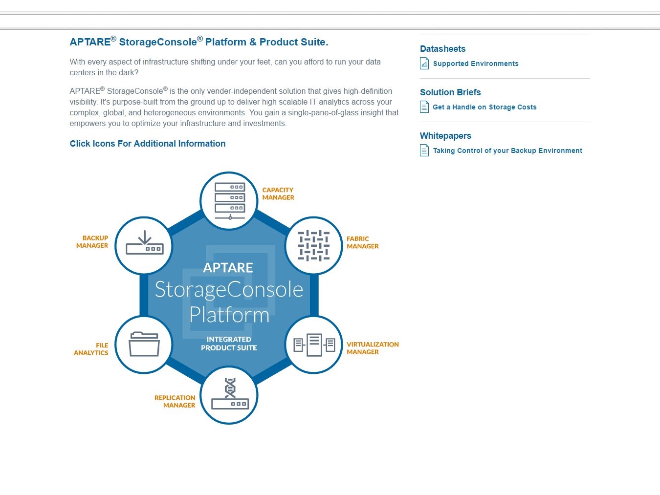
Next up is APTARE, a Fortune 50 company who now has a website that efficiently showcases its StorageConsole 10, “the industry’s only independent, open and extensible IT analytics platform”. MagicLamp’s web design reflects that uniqueness through its successful application of parallax scrolling effects and video backgrounds on APTARE’s home page.
APTARE tracks raw, assigned and used storage across its customer platforms, securing data to be integrated accurately within billing systems.
With MagicLamp’s web development for APTARE, information on these capabilities and the responsiveness of APTARE’s B2B/IT analytic infrastructure flow seamlessly throughout the site. Use of key terms like backup management, data storage, etc. make APTARE’s site easily found by search engines for customers seeking these services.
This ease of use includes accessing the site via mobile devices where the scroll of information shifts from horizontal to vertical without forfeiting any key elements, even retaining access to peripheral content like white papers and data sheets. The user interface and screens – featuring the use of big beautiful lightboxes on screenshots – provide a detailed breakdown of not just what APTARE offers its customers, but how those customers can optimize the StorageConsole 10’s capabilities and customize it to their specific data and storage needs as well as that of their own customers.
APTARE services now support software-defined storage, Open Stack, Flash and hybrid infrastructures, making it an enterprise-ready platform to meet your company’s IT data backup, storage and real-time access needs.
MagicLamp completed APTARE’s byzantine site in only 45 days.
ecommerce web design     ecommerce web design     ecommerce web design

www.aptare.com

GREI

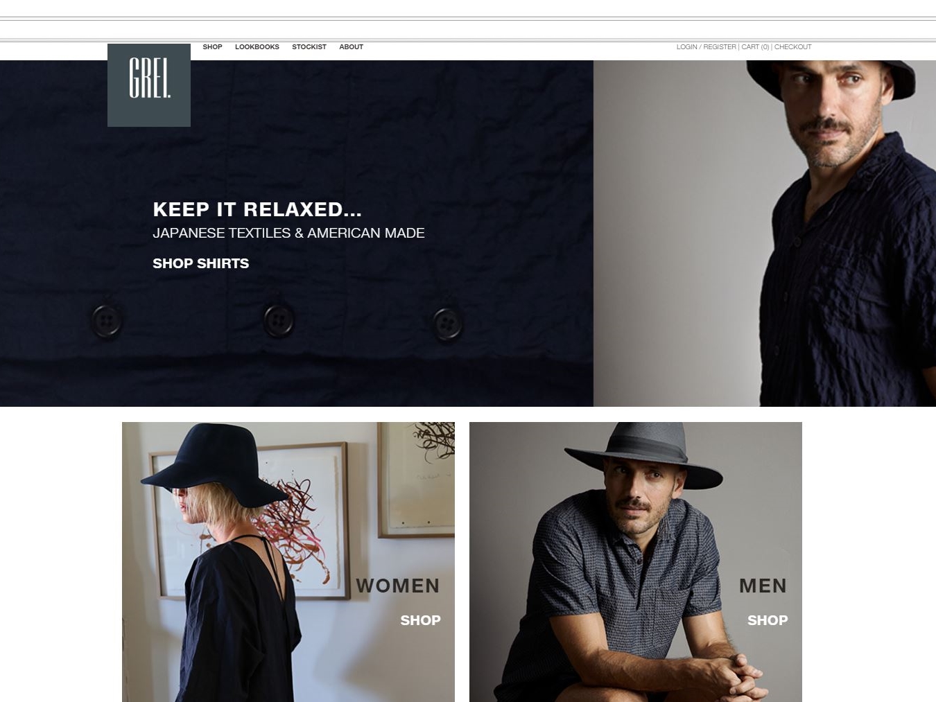
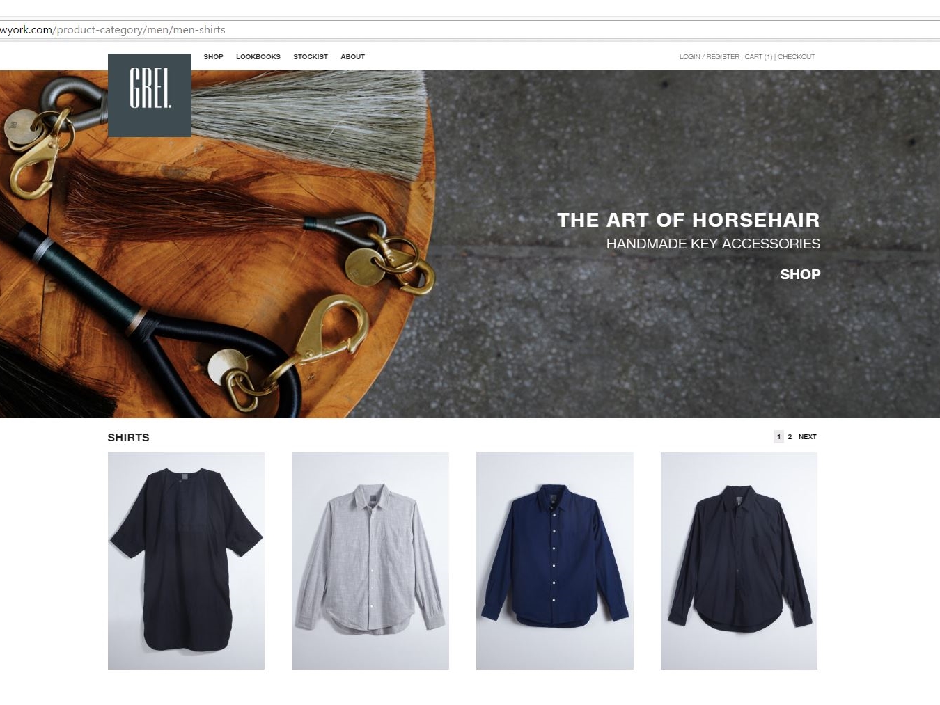
Fashion is key at GREI of New York where handmade horsehair fobs and keychains greet your eyes upon landing.
That’s just the first offering shown at GREI’s new website created by Magic Lamp. The WooCommerce site, MagicLamp’s first use of the platform, provides flexibility and compatibility in accessing and ordering any item from its handcrafted inventory of scarves, robes, shirts and more.
The beautifully tactile, rich selection of hand-dyed gray and indigo fashion items float effortlessly between the tabs under each category of apparel. You can display all items under women’s or men’s apparel collectively or review each category by clothing item.
MagicLamp’s web design facilitates the purchase of GREI’s catalog of items online as well as from a select group of stores located in a few key American cities as well as Japan where the fabrics originate. Add to that the ability to customize and even override WordPress features to make use of WooCommerce’s open source platform with its hundreds of options for tracking, buying and selling of merchandise.  It even lets you know how many of an item are left in stock. MagicLamp’s exit intent pop-ups for cart at checkout include a discount offer on your order from GREI as well as one on any future order. There are also share buttons for Instagram and Pinterest to show off what was purchased.
MagicLamp has enhanced GREI’s website further with a tight integration of MailChimp and email marketing with slide-in signups to capture more subscribers, and custom email notifications for order statuses. UPS label printing is also made available onsite for easier fulfillment.

Yes, It’s easy to understand why WooCommerce powers 37% of online stores, and now GREI’s website further distinguishes those offerings.

ecommerce web design     ecommerce web design     ecommerce web design

www.greinewyork.com