COWBOY CHARCOAL
APTARE
GREI
Yes, It’s easy to understand why WooCommerce powers 37% of online stores, and now GREI’s website further distinguishes those offerings.
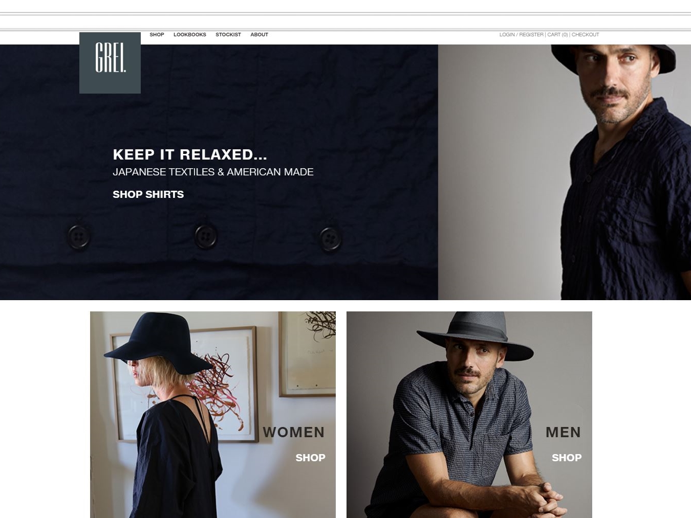
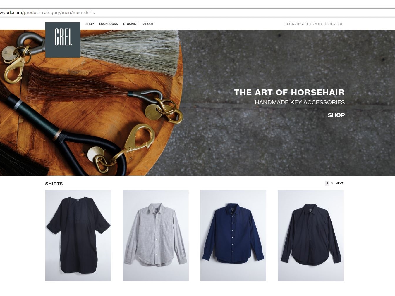

Yes, It’s easy to understand why WooCommerce powers 37% of online stores, and now GREI’s website further distinguishes those offerings.


WordPress once again displays its flexibility in hosting a database-driven site, this time to serve the hearing challenged customer in both the USA and Canada.
Through use of Google Maps and integrating the importable data in Microsoft Excel worksheets, MagicLamp has created a responsive, highly functional and updateable resource that can locate the office of a HearUSA or HearCanada provider as well as any surrounding services the customer might seek.
The Google map on the site’s home page displays a list of 200 providers searchable by clicking on the “View Center Details” link for the customer’s geographical location. There the customer can review the menu bar of options about hearing loss and hearing aids along with the customized content of that specific provider (i.e. provider’s profile, local special events, etc.).
The dual-skinned database can switch between both sides of a geographic border to provide the most accessible location for the customer seeking hearing services. MagicLamp has also given the customer the means to either sign up onsite or call for free hearing evaluation. Bottom of the home page features discount coupons for hearing aid purchases and services, as well as HearUSA and HearCanada’s accreditation.
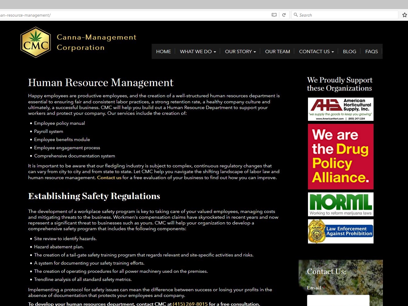
As legalization of medical marijuana becomes more mainstream, the need for governance and guidelines for the growing and processing of it leaves a void to be filled. Enter Canna-Management Corporation.
This authoritative WordPress site designed by MagicLamp reflects CMC’s masterful foresight in assembling a comprehensive resource of information and a knowledgeable support team to advise and guide businesses considering legal cannabis production.
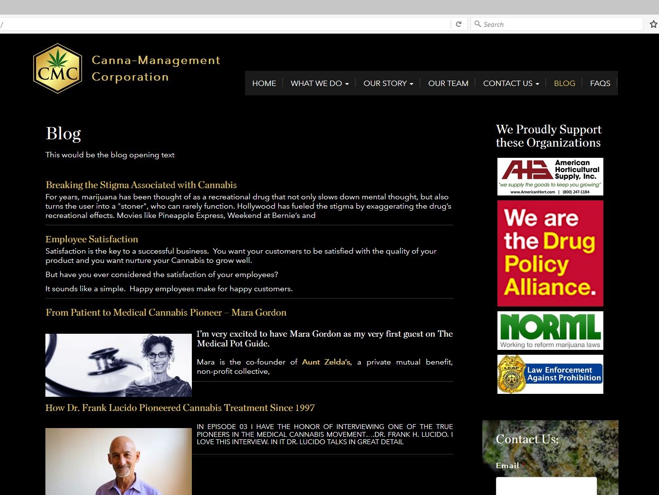
The home page features a slideshow of custom drawings that illustrate how CMC can help a cannabis company’s operation grow. The site’s clickable links on informational topics as well as drop down menus provide a fuller sense of what the requirements and considerations are for this type of business. The responsive design also features a blog with posted podcasts displaying what questions are answered by some of the leading experts on medical cannabis issues.
CMC’s site is also integrated with MailChimp along with a slide-in subscriber signup; and ads for several CMC-sponsored organizations who can provide even more insight and information on staying legal and growing.

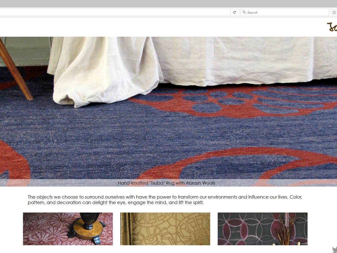
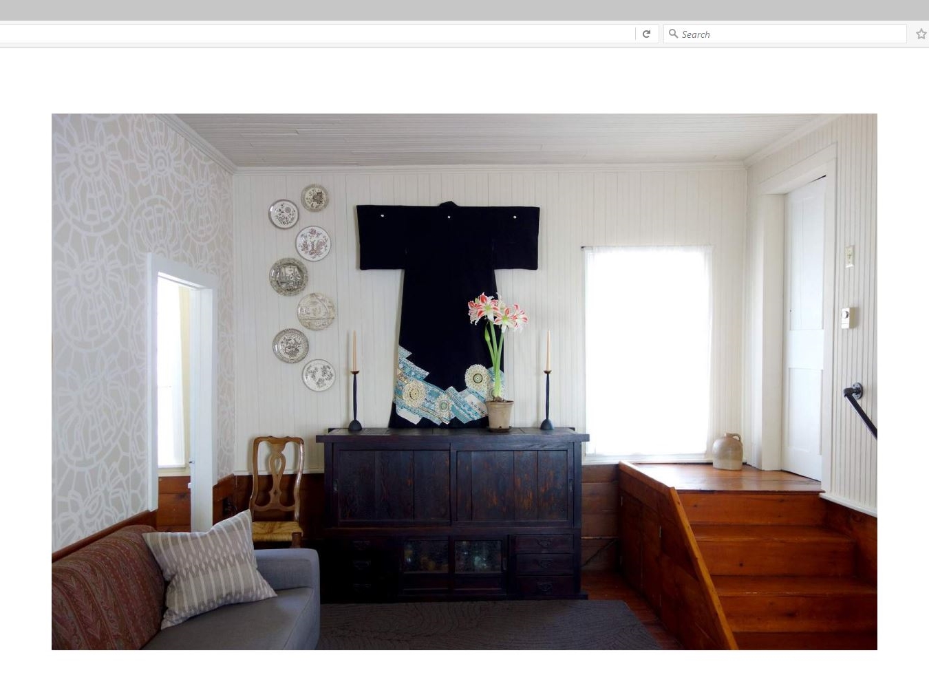
MagicLamp subtly showcases John Mahoney Design’s creations with its various categories of home décor.
The responsive clean lines of this WordPress site introduce a slideshow dissolve of Mahoney’s Asian-themed rugs, wallpaper, linens, fashion and more. Just below it is featured a double row of clickable interactive tiles featuring galleries of his beautifully elegant work expressed in a portfolio of textiles, home accessories and one “wild card” entry of a re-imagined Tarot card deck called “The Tenebrae Tarot”.
Mahoney’s handmade and handcrafted décor items resonate with his philosophy: “The objects we choose to surround ourselves with have the power to transform our environments and influence our lives. Color, pattern, and decoration can delight the eye, engage the mind, and lift the spirit.”
MagicLamp’s uncluttered design allows Mahoney’s work to speak for itself with only sharing links for Instagram, LinkedIn, Twitter and Facebook added.

Orange, Water-Resistant, Small, USA Made, Remote-Controlled…
Every quality of an item is something we call a facet. How do you organize all that information?
.png)
Faceted Classification is something we build into every one of our eCommerce sites. It’s a powerful feature that makes it very easy for your customers to find exactly what they’re looking for on your site in a way no other system can. Products aren’t just organized by category, or sorted according to one attribute, like color, for example. Instead, each item is coded for every attribute, or facet, that a visitor might be interested in.
If you’re an online hat retailer, this means your customers can not only look for blue hats using a search based on a color facet, but simultaneously search for hats according to style, materials, level of sun or wind protection, or even sizes current in your inventory. They can also search with any combination of these facets to find just the right hat. They can include or exclude any qualities they like. If a large, blue, cotton, US-made, waterproof hat with a brim is what they want, they can look for those exact features with a few clicks on the filter categories. Our faceted classification organizes your site like department stores organize merchandise. Customers can navigate inventory effortlessly and intuitively.
In a brick-and-mortar retail store, every item has certain qualities or attributes- color, name, size, SKU number, function, price, or manufacturer, for example. Coding these facets into our eCommerce sites makes a big difference in what both you and your customers can do on the site. If you walked into that retail store, you’d find things grouped together in a way that makes it easy to find them. Websites can do the same thing, but what happens when you have some items a customer might expect to find in two or more areas of the store? In a physical shop, you could simply place the product in both areas. On the web, it can be trickier. One of the first problems developers run into is code that only allows each product to be placed in one category, or virtual “bucket.”
Our way of implementing faceted classification gets your products cross-indexed so you and your customers don’t miss a thing. If a customer searches for a V-neck shirt, for instance, you want your site to show them all of the V-neck shirts in your inventory. If you have one blue-colored V-neck that gets coded for the facet “blue,” but not the facet “V-neck,” your customer is probably going to miss it in their search, and so will you when you need to bring up those styles for administrative tasks. With our system, the shirt would be indexed in both categories and any others that applied, basically “cross-listing” it, so it would be sure to come up in a search for any of its facets.
< An example of detailed
faceted classification for hats
on Amazon.com
On the FACE Stockholm site, we designed a product catalog where customers can browse with a broad range of sorting options. Here’s how faceted classification works in the Nail Polish section of FACE:
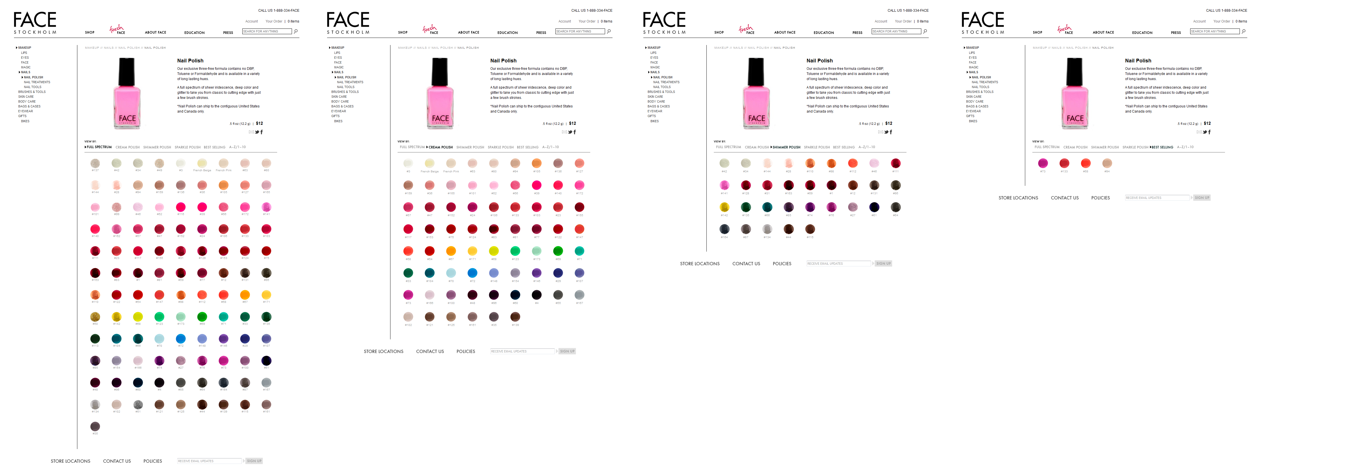
Visitors can see the complete polish inventory in the “Full Spectrum” view, sort polishes by finish (Cream, Shimmer, Sparkle), organize them in order of popularity, or simply list them in alphabetical order.
How many times have you felt perplexed in front of a huge shelf of products in a store? When displays don’t seem to be organized in any particular order, it’s hard to find what we want. A website with well-implemented faceted classification is actually easier to navigate than a physical retail store!
In the online world, the less time and energy your customers have to spend navigating your site, the happier they will be. A site without our kind of faceted classification is frustrating- shoppers have to invest extra attention sifting through more of your inventory than they want to. Whether or not your site has a clear, effective organization structure can easily mark the difference between a site customers return to and one they’ll avoid!
Esqueleto is a shop located in Oakland, CA, which offers a collection of art and jewelery curated by owner Lauren Wolf. After designing the Esqueleto website, Wolf chose MagicLamp Networks to develop the eCommerce site. While it was important to find a website development firm that could properly convert her clean, simple website design into a fully-functioning eCommerce site, it was also important that the eCommerce website development firm could provide a site with features such as backend Content Management System integration and a customer account portal, which would allow Esqueleto to optimize its customer service by streamlining its logistics and customer communications.
Magiclamp Networks’ Magic Shopping Cart was an optimal choice for Esqueleto.  Magiclamp fully integrated the design of the Esqueleto brand with the needed modern function of the Magic Shopping Cart, which includes integration with the custom Content Management System. The result is a beautiful and minimalistic website whose real appeal lies in the speed and functionality delivered by MagicLamp’s custom JavaScript programming and image-based scripting. MagicLamp integrated a custom Zoom feature into the product pages, so Esqueleto’s website visitors are offered a comprehensive view of the objects, jewelry and art of the shop.
Furthermore, Magiclamp’s Content Management System provides Esqueleto with the ability to edit content on the website in a straightforward and real-time manner while maintaining proper Search Engine Optimization and web compatibility. Click here to learn more about MagicLamp’s Content Management System.
The Esqueleto website has a completely custom appeal. Initially, one notices the minimal design and the simple menu selections. Along with the product display grid, the visitor can view all products within a single category without switching page views or waiting for images to load. Images load immediately and the design is maintained across browsers, platforms and devices, including iOS mobile devices.
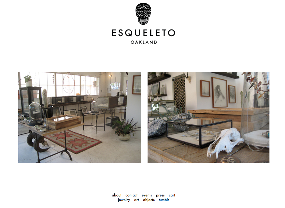 The Esqueleto website provides its visitor with a very strong impression of quality and value. In an global eCommerce environment where aesthetics and value attribution are increasingly important, Magiclamp Networks delivers a product that raises the bar in eCommerce and custom web development. The simple, clean aesthetic of Esqueleto.com allows the website to virtually disappear from the viewers mind, so all that is left to see are the unique imperfections of handcrafted art.
Click here to view MagicLamp’s complete Web Development Portfolio.
MagicLamp Networks is in the process of perfecting their new Magic fCommerce web application: a suite of applications that will allow e-Commerce businesses to seamlessly integrate their product catalogs, promotional happenings and overall web platform with Facebook. A longtime leader in the development and design of eCommerce websites, MagicLamp is now taking their expertise to Facebook. Magic fCommerce not only allows existing eCommerce companies to translate their shops to Facebook — it even gives new eCommerce shops a platform to set up a storefront on Facebook.
The primary application of Magic fCommerce is Magic fCatalog, which feeds an eCommerce company’s product catalog into their Facebook page, and allows their customers to browse and make purchases without leaving the page. The Magic fCatalog’s features include a variety of HTML templates, Categories and Sub-Categories, Easy Product Management, Search and Browse Products, CSS-driven fonts and colors, and auto image “thumbnailing.” It also includes a variety of Shopping Cart features, such as HTML templates, Real Time UPS Shipping Quotes, Credit Card Processing, Automated Email Confirmation, Order Status Checking, and more.
Magic fCatalog is so much more than throwing an eCommerce product catalog up on a tab of a company’s Facebook page. fCatalog allows you to give your catalog a variety of personalized features within Facebook. Using quick and simple tools provided by MagicLamp, you can let your customers zoom in on products, view products within lightboxes, and “like” individual products — all within Facebook! And, of course, with every “like” a Facebook page or product receives, the eCommerce company is gaining more and more exposure in its social network.
According to Nielsen, a whopping 22% of people’s computer time is spent on Facebook. Magic fCommerce gives you the opportunity to benefit from your potential customers’ growing Facebook usage, and allows your customers to purchase your products without having to leave Facebook at all.
Click over to our Facebook page to see a Magic fCatalog demonstration in action, and check back soon for updates on our newest fCommerce features — such as Magic fSweepstakes, Magic fPromo and more!
2626Here is our compiled checklist from the book titled “Advertise, Promote and Market Your Business or Website” by Bruce C. Brown:


Ten Steps To A Profitable ECommerce Site
Mistakes To Avoid
Marketing
Repeat Customers / Customer Retention Online
Top Three Reasons for Going Online
Non-Traditional Types of Web Advertising
Five Ways to Improve Online Marketing
Increasing Website Traffic
Benefits of Database Marketing
Types of data in Database Marketing
Building A Marketing Database Plan
When looking at your current website or considering a plan for a new website, there are many site behaviors, features, or potential visitor actions that effect conversion rates. The following checklist is a summary of features or additions that you should consider. Note that this is beyond the basic list of must-have’s for any shopping system.
Web Design Garage is an easy to follow book that walks the reader through many of the challenges web designers face everyday, with solutions that are elegant and easy to implement. While I highly recommend it for novice designers, it is also a good read for experienced designers who are looking for new ways to approach usability problems or design constraints. The book covers a broad range of topics, and helps move the reader from the old way of doing things (HTML 3) to CSS and HTML 4 and XHTML. The single most important part of this book is getting the reader to pay more attention to CSS and how it can be used to
Another topic which stands out is how to properly format pages using standard HTML markup such that readers, web crawlers, and special accessability programs can all read and understand the page. Heavy use of < h X > tags are a good example.
Links for this book:
If you are reading posts about “Google’s Duplicate Content Penalty” in reference to sites that your site could be reached at www.mydomain.com and mydomain.com, with the common remedy of using a 301-redirect, but run your site on IIS, this article is for you. The 301 code cited was undoubtedly Apache-targeted, in the form of a sample htaccess file and which isn’t really applicable to you.
In terms of options for 301-redirects on IIS, what I found on the web was interesting:
1) Pure IIS based redirects (via the IIS MMC Snap-in and the metabase)
2) ISAPI Redirect Filters – seemless integration into the webserver itself
3) ASP (woohoo!)
For IIS based redirects, the problem (if you don’t want to pay for an ISAPI filter) is that not only do you need admin-access-with-GUi-shell to the server, but you also had to create a separate instantiation of each site, one with the 301-redirect, and then another with the real site. Doubling up the instantiations could press the limits of the metabase on 200+ domain servers (and this is for 2GHz 1GB RAM machines). We could solve the admin-access-with-GUi-shell with some swift ADSi code, but why bother?
In walked the solution:
http://evolvedcode.net/content/code_relocated/
This website is trully a resource for people doing ASP code, and highly recommend reading through his other articles. Evolved Code’s samples will need som extensions for proper 301 redirects if you are handling more than one page that needs this functionality, but it will definitely get you started.
Another site with good example code for .NET is:
http://www.kevinleitch.co.uk/wp/?p=218
Happy Redirecting!