MagicLamp relaunched high fashion retailer Opening Ceremony’s site this week, unrolling a smart, contemporary minimalist design that sets all attention squarely on the products.
The new design features a layout that’s even more minimalist than OC’s previous look, stark typographic treatments, and a new integrated Twitter feed. We removed the pastel design accents and background color gradients, paring the site’s palette down to classic black and white. With the new look, all of the color is in the products, creating a crisp, impeccable aesthetic fitting for this hip cosmopolitan brand.
Photos on the new homepage nest together in a gridded javascript layout nicknamed “masonry,” a name reflecting how elements of different sizes are laid in and fitted together, much like fine stonework. Semi-opaque white overlays with descriptive text (we used Adobe’s typekit) appear over each photo as visitors roll over images.
Overall, the site’s new incarnation is much more visual, heavily emphasizing images over text. OC’s new blog in particular is a great example of this strategy: huge, crisp, color-saturated images you could practically fall into dominate the screen. Your eyes can’t help but soak up the visual feast. The effect is that readers actually associate entries with the image more directly than the title or text, resulting in quicker processing and response time and greater emotional engagement. The shift from text to image is a big movement in web design today as we discover more about the psychological primacy of images and the benefits of engaging the intuitive, image-responsive right brain in user experience.
Opening Ceremony made another big announcement this week: their MICA Smart Bracelet, a smartphone-like mobile device produced in partnership with Intel, was unveiled yesterday and will be available at OC stores for the 2014 holiday season. OC is in the vanguard of companies to enter the luxury tech wear market.
Kudos to our longtime partner Opening Ceremony on all of their exciting new developments!
Faceted classification will transform your site into an experience visitors love, but it can achieve even greater feats in the hands of business owners and site administrators.
Faceted classification isn’t just about a polished presentation for your guests- it’s also about what you want to do as a merchandiser. On top of making searches quick and easy for customers, faceted classification opens up a world of possibilities for you. The more ways you can slice and dice your product catalog, the more power you have to implement persuasive, exciting merchandising strategies. Just like customers can filter in or filter out particular facets, you and you staff can use the same system to filter items for promotional codes, new ad campaigns, clearance sales, individual discount expirations and more. With a few clicks, you could group your summer inventory on a special page, offer a discount on all items from a certain designer, set up a limited-time coupon code for any of your starter kits, or whatever makes sense for your company’s objectives at the time. When products are organized and classified this way, you have the freedom to merchandise in virtually endless ways.
Faceted classification certainly improves the user experience at the front end, but it also gives you tremendous power to merchandise effectively from the back end using the same built-in structure of information. MagicLamp builds this system into your website, letting you take advantage of the simple elegance of effective web architecture. This kind of merchandising is actually more flexible and precise than traditional storefront selling!
Want to experience MagicLamp’s faceted classification firsthand? Contact us today to set up a demo.
There’s more than just one kind of faceted classification. In the world of blogs, authors use labels called tags you’ll see in a list or “cloud.” Tags are actually another form of faceted classification. Bloggers tag each article with words that describe the subject, making it easy to bring up posts with shared themes together. Tags can be very useful, but they’re also free-form entries, which means bloggers type in each tag by hand. This can create problems if the tags deviate accidentally, even slightly. Tagging one blog post under “pet snake” and tagging a related post “pet snakes,” for example, will break down the integrity of the site’s organization. If you have multiple authors working on the same blog, things can get even trickier. For the system to work right, everyone has to tag facets with exactly the same word or phrase, otherwise it’s very easy to lose standardization, which prevents reliable navigation.
MagicLamp doesn’t suffer from these problems because of the way we implement our systems. For our eCommerce framework, we use pre-defined labels instead of free-form fields. Users simply click on the filters they want to apply, leaving no room for keystroke errors or mislabeling.
Our faceted classification systems also work faster than others. When you look at the way platforms like WordPress and Magento implement faceted classification through tags, you can see how the limitations of those system will slow down processing more and more as you develop your site and the data grows. Click a tag for “widgets,” for example, and WordPress does a search across all of your blog entries in the text field called tags for any instances of the word “widgets.” Even for a computer, going through every single blog entry word-for-word can take a long time if you have a lot of information there! The same thing can happen with eCommerce if your product information is organized like a Magento site. MagicLamp sites are different. Since we pre-index every facet, they all become independent vectors, making searches instantaneous. Heavy user traffic is no problem at all.
Accuracy of Classification = Integrity of Navigation.
Your web developer should be able to pick the best style of information architecture for you- one that makes the most sense for your particular business’ merchandising goals and style. At MagicLamp, we’re careful to select the systems that fit best for your type of inventory, giving you the power for optimum results!
Orange, Water-Resistant, Small, USA Made, Remote-Controlled…
Every quality of an item is something we call a facet. How do you organize all that information?
Faceted Classification is something we build into every one of our eCommerce sites. It’s a powerful feature that makes it very easy for your customers to find exactly what they’re looking for on your site in a way no other system can. Products aren’t just organized by category, or sorted according to one attribute, like color, for example. Instead, each item is coded for every attribute, or facet, that a visitor might be interested in.
If you’re an online hat retailer, this means your customers can not only look for blue hats using a search based on a color facet, but simultaneously search for hats according to style, materials, level of sun or wind protection, or even sizes current in your inventory. They can also search with any combination of these facets to find just the right hat. They can include or exclude any qualities they like. If a large, blue, cotton, US-made, waterproof hat with a brim is what they want, they can look for those exact features with a few clicks on the filter categories. Our faceted classification organizes your site like department stores organize merchandise. Customers can navigate inventory effortlessly and intuitively.
In a brick-and-mortar retail store, every item has certain qualities or attributes- color, name, size, SKU number, function, price, or manufacturer, for example. Coding these facets into our eCommerce sites makes a big difference in what both you and your customers can do on the site. If you walked into that retail store, you’d find things grouped together in a way that makes it easy to find them. Websites can do the same thing, but what happens when you have some items a customer might expect to find in two or more areas of the store? In a physical shop, you could simply place the product in both areas. On the web, it can be trickier. One of the first problems developers run into is code that only allows each product to be placed in one category, or virtual “bucket.”
Our way of implementing faceted classification gets your products cross-indexed so you and your customers don’t miss a thing. If a customer searches for a V-neck shirt, for instance, you want your site to show them all of the V-neck shirts in your inventory. If you have one blue-colored V-neck that gets coded for the facet “blue,” but not the facet “V-neck,” your customer is probably going to miss it in their search, and so will you when you need to bring up those styles for administrative tasks. With our system, the shirt would be indexed in both categories and any others that applied, basically “cross-listing” it, so it would be sure to come up in a search for any of its facets.
< An example of detailed
faceted classification for hats
on Amazon.com
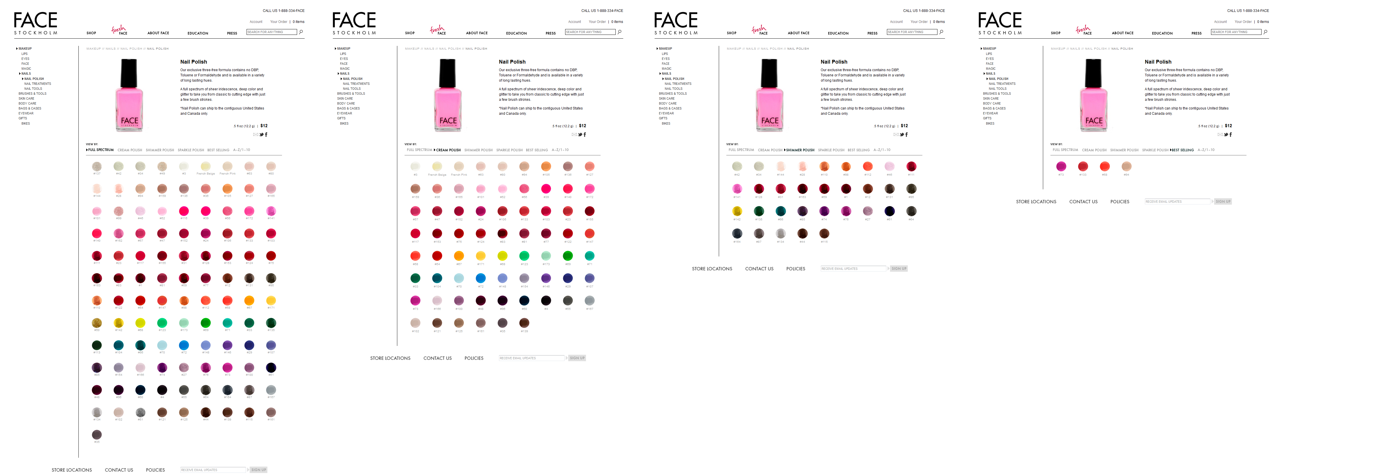
On the FACE Stockholm site, we designed a product catalog where customers can browse with a broad range of sorting options. Here’s how faceted classification works in the Nail Polish section of FACE:
Visitors can see the complete polish inventory in the “Full Spectrum” view, sort polishes by finish (Cream, Shimmer, Sparkle), organize them in order of popularity, or simply list them in alphabetical order.
“The less time and energy your
customers have to spend navigating
your site, the happier they will be.”
How many times have you felt perplexed in front of a huge shelf of products in a store? When displays don’t seem to be organized in any particular order, it’s hard to find what we want. A website with well-implemented faceted classification is actually easier to navigate than a physical retail store!
In the online world, the less time and energy your customers have to spend navigating your site, the happier they will be. A site without our kind of faceted classification is frustrating- shoppers have to invest extra attention sifting through more of your inventory than they want to. Whether or not your site has a clear, effective organization structure can easily mark the difference between a site customers return to and one they’ll avoid!
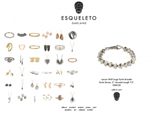
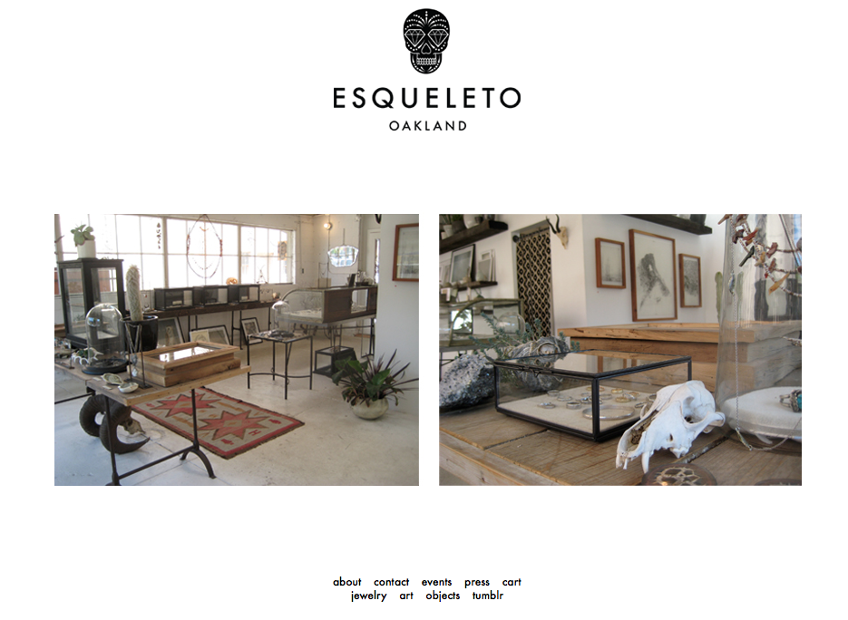
Esqueleto is a shop located in Oakland, CA, which offers a collection of art and jewelery curated by owner Lauren Wolf. After designing the Esqueleto website, Wolf chose MagicLamp Networks to develop the eCommerce site. While it was important to find a website development firm that could properly convert her clean, simple website design into a fully-functioning eCommerce site, it was also important that the eCommerce website development firm could provide a site with features such as backend Content Management System integration and a customer account portal, which would allow Esqueleto to optimize its customer service by streamlining its logistics and customer communications.
Magiclamp Networks’ Magic Shopping Cart was an optimal choice for Esqueleto. Magiclamp fully integrated the design of the Esqueleto brand with the needed modern function of the Magic Shopping Cart, which includes integration with the custom Content Management System. The result is a beautiful and minimalistic website whose real appeal lies in the speed and functionality delivered by MagicLamp’s custom JavaScript programming and image-based scripting. MagicLamp integrated a custom Zoom feature into the product pages, so Esqueleto’s website visitors are offered a comprehensive view of the objects, jewelry and art of the shop.
Furthermore, Magiclamp’s Content Management System provides Esqueleto with the ability to edit content on the website in a straightforward and real-time manner while maintaining proper Search Engine Optimization and web compatibility. Click here to learn more about MagicLamp’s Content Management System.
The Esqueleto website has a completely custom appeal. Initially, one notices the minimal design and the simple menu selections. Along with the product display grid, the visitor can view all products within a single category without switching page views or waiting for images to load. Images load immediately and the design is maintained across browsers, platforms and devices, including iOS mobile devices.
The Esqueleto website provides its visitor with a very strong impression of quality and value. In an global eCommerce environment where aesthetics and value attribution are increasingly important, Magiclamp Networks delivers a product that raises the bar in eCommerce and custom web development. The simple, clean aesthetic of Esqueleto.com allows the website to virtually disappear from the viewers mind, so all that is left to see are the unique imperfections of handcrafted art.
Click here to view MagicLamp’s complete Web Development Portfolio.
In modern web design, the more streamlined, focused experience you can give your visitors, the better your results. Far from a niche style, Minimalism is actually key to any good professional website today.
Web design is all about appealing to your customer’s eye and drawing them back again and again to your site. In eCommerce design, the ultimate goal is getting your product purchased. A well thought-out, appealing design will keep your viewer engaged, while supporting the credibility of your product, site, and business as a whole.
As web designers, we have seen many designs become overworked, under-planned and simply unfocused. An experienced web designer learns to balance design versus functionality and simplicity versus gimmicks. While staying at the forefront of web trends is a goal for any site, an e-commerce site’s main focus has to be getting the consumer to purchase the product.
Remember websites in the early 90’s? Busy, info-packed layouts with bright flashing colors that lit up your screen like a disco ball? Although we find those early designers’ “more is more” enthusiasm for the brand-new online world a little endearing, web design has come a long way since. Research shows us that less really is more when it comes to engaging visitor attention, and success online is all about how your site shapes people’s focus. Caption: If your site still looks like this, it’s time for an upgrade!
Minimalist aesthetics are a popular design strategy in e-commerce today. The style directs customer focus to the product immediately, eliminating any clutter that would distract the viewer. Minimalist design allows the product to become the focal point of the site. By breaking a design down to the bare essentials, you can produce a clean, but very functional site. A good minimalist designer knows how to use white space, create balance and contrast, and precisely focus the content. These types of designs guide the viewer’s eye- not to flashy ephemeral web trends, but the clear-cut star of the site, the product.
Companies sometimes shy away from minimalist designs for fear they might look unfinished or too simple, but when they’re done right, minimalist designs are some of the most beautiful, classic and engaging sites on the web.
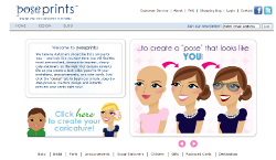
One great example of minimalist design is MagicLamp site Odin New York. By simply showcasing their products through high quality imagery, Odin created a storefront that exudes the high class, fashion forward image it’s known for. With simple lines, clean typography, generous white space and outstanding product photography, Odin uses clean, minimal design to focus on what their site is for: selling their products. Another excellent example of using minimalist design to focus on the end goal is PosePrints. PosePrints created a cohesive site aesthetic with careful use of white space that draws the eye to the product focal point. Using a simple monochromatic color scheme, the only flashy items on this site are the products themselves. The stationary card images are the color and the “pop” that stand out on this site. PosePrints’ design gives the customers a sense of style without distracting them from the product itself.
When it comes to web design and minimalism, remember “less is more” and sometimes less can bring you more…revenue.
MagicLamp Networks is in the process of perfecting their new Magic fCommerce web application: a suite of applications that will allow e-Commerce businesses to seamlessly integrate their product catalogs, promotional happenings and overall web platform with Facebook. A longtime leader in the development and design of eCommerce websites, MagicLamp is now taking their expertise to Facebook. Magic fCommerce not only allows existing eCommerce companies to translate their shops to Facebook — it even gives new eCommerce shops a platform to set up a storefront on Facebook.
The primary application of Magic fCommerce is Magic fCatalog, which feeds an eCommerce company’s product catalog into their Facebook page, and allows their customers to browse and make purchases without leaving the page. The Magic fCatalog’s features include a variety of HTML templates, Categories and Sub-Categories, Easy Product Management, Search and Browse Products, CSS-driven fonts and colors, and auto image “thumbnailing.” It also includes a variety of Shopping Cart features, such as HTML templates, Real Time UPS Shipping Quotes, Credit Card Processing, Automated Email Confirmation, Order Status Checking, and more.
Magic fCatalog is so much more than throwing an eCommerce product catalog up on a tab of a company’s Facebook page. fCatalog allows you to give your catalog a variety of personalized features within Facebook. Using quick and simple tools provided by MagicLamp, you can let your customers zoom in on products, view products within lightboxes, and “like” individual products — all within Facebook! And, of course, with every “like” a Facebook page or product receives, the eCommerce company is gaining more and more exposure in its social network.
According to Nielsen, a whopping 22% of people’s computer time is spent on Facebook. Magic fCommerce gives you the opportunity to benefit from your potential customers’ growing Facebook usage, and allows your customers to purchase your products without having to leave Facebook at all.
Click over to our Facebook page to see a Magic fCatalog demonstration in action, and check back soon for updates on our newest fCommerce features — such as Magic fSweepstakes, Magic fPromo and more!
If you have all of the inventory physically in-stock, designate it as such. Backed up by a garuntee that the item(s) will be in the hands of the shipping carrier within one business day or less, and your visitors a lot about how you run your business. You don’t stock less popular or potentially lower quality product, and only sell what you have. This assures the customer that they will receive their order quickly with no processing delays. To be more specific, if they order early enough one day, they literally could have it the next. I see many online shops take weeks to deliver, but generally they are upfront about, and thus manage expectations.
Some businesses can extend their reach where delivery times are longer by managing expectations at a finer level. NewEgg’s new feature that allows you to be notified when an item is back in-stock could take conversions to a new level for several reasons: another excuse for customer contact; less thinking involved to get back to the shopping cart; and it’s completely automated which means you can acheive 100% exposure.
Using PayPal for addressing an international market: chances are that getting your credit card processing system setup for accepting Visa or MasterCard world-wide is fraught with problems: higher rates and potentially more fraud. Adding PayPal to your site bypasses the fraud through international banks (which can take 60 days to find out about). It can cost more that your regular processor, but the additional revenue and growth make this a good bet. You also offer another way domestic customers can pay as well.
When looking at your current website or considering a plan for a new website, there are many site behaviors, features, or potential visitor actions that effect conversion rates. The following checklist is a summary of features or additions that you should consider. Note that this is beyond the basic list of must-have’s for any shopping system.
Shopping Cart Life Span: How soon does your shopping cart expire for anonymous users? More than a few shopping systems use Session variables for tracking cart items, and expire within hours, especially for users behind prozies that change IP addresses often, thus rendering the current Session invalid (think AOL). Several studies point to the fact that customers will wait as long as 4 days before deciding to buy, and if the item they were looking at is still in their shopping cart, you just saved them several steps and increased the possibility of conversion substantially.
Solid and Flexible Product Navigation: this is a subject that could go on for ever. Our recommendation is that you look at new ways to extend product and site navigation based on current user actions and possibly experiments you run with users. If you don’t currently have a search feature, ask some users whether it would be a substantial gain to have one. Look at different ways to categorize product and build new filters. Then look at how they get used, and make further changes based on those results. You may end of up with something that not only makes it easier for your customers to find the products they are looking for, but a significant differentiation over your competition.
Product Shots: Starting out with great product shots is always nice, but it doesn’t always happen for a variety of reasons. Think about getting or taking better pictures, as well as optimizing old and new pictures for the best display and fastest download. Batch converters get better over time, and you may find that you can keep high quality while reducing file sizes by 50% or more.
Clear & Concise: Make sure your policies regarding Shipping, Returns, Conditions, and Terms are readily available and clear to customers. Make it easy for potential customers to do business with you by providing steps and contact point (phone, email, or online forms) for dealing with different situations (ordering offline, exchanging a products, et al).
Clear & Concise Part 2: Product descriptions can be a wealth of information for your customers about your product. It also has the added benefit of helping you with Search Engine Optimization. New products should not necessarily get all of the copy-writing time. Consider re-working existing product descriptions that are top sellers too. Never skimp here. Hire someone if that is how it will get done.
Advanced Product Configurations: If your products are amenable to add-ons or modifications, consider building specialized forms for those products in the product detail page. This could be a new source of revenue, and will likely increase your per-order averages.
Product matching: in apparel, jewelry, and other specific types of product sales websites, offering a generalized “recommended products” in the lower part of the product detail page is often not enough. Consider setting up specific matches, for example, this pair of earrings goes well with that necklace. Think of it as the editorial content of the site that customers will appreciate, because you have taken the time to not only know your product, but give them direct guidance on what goes with what. If you don’t think this applies to you, think about it and see if there is something similar you can offer for your products, as it yet another way to increase per-order averages.