HEARUSA
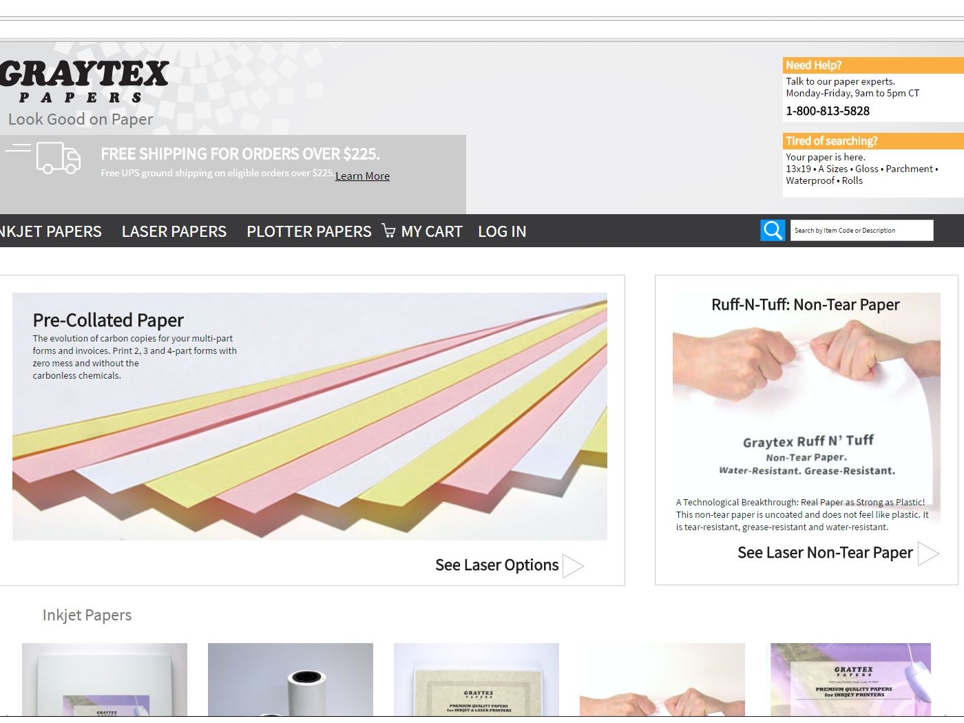
Graytex
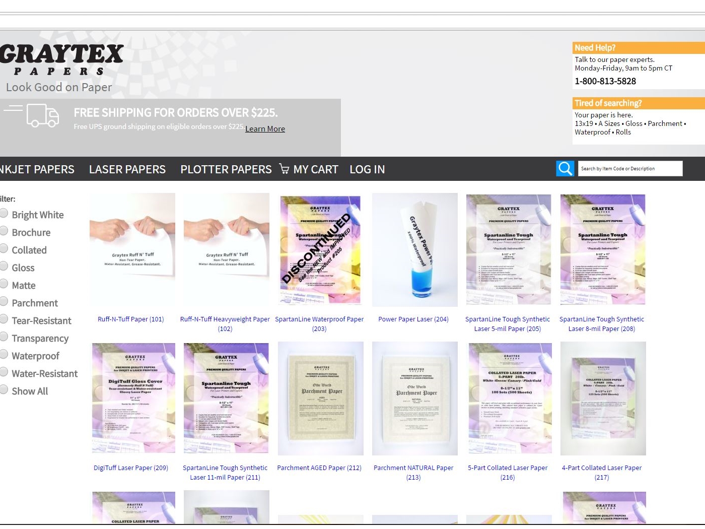
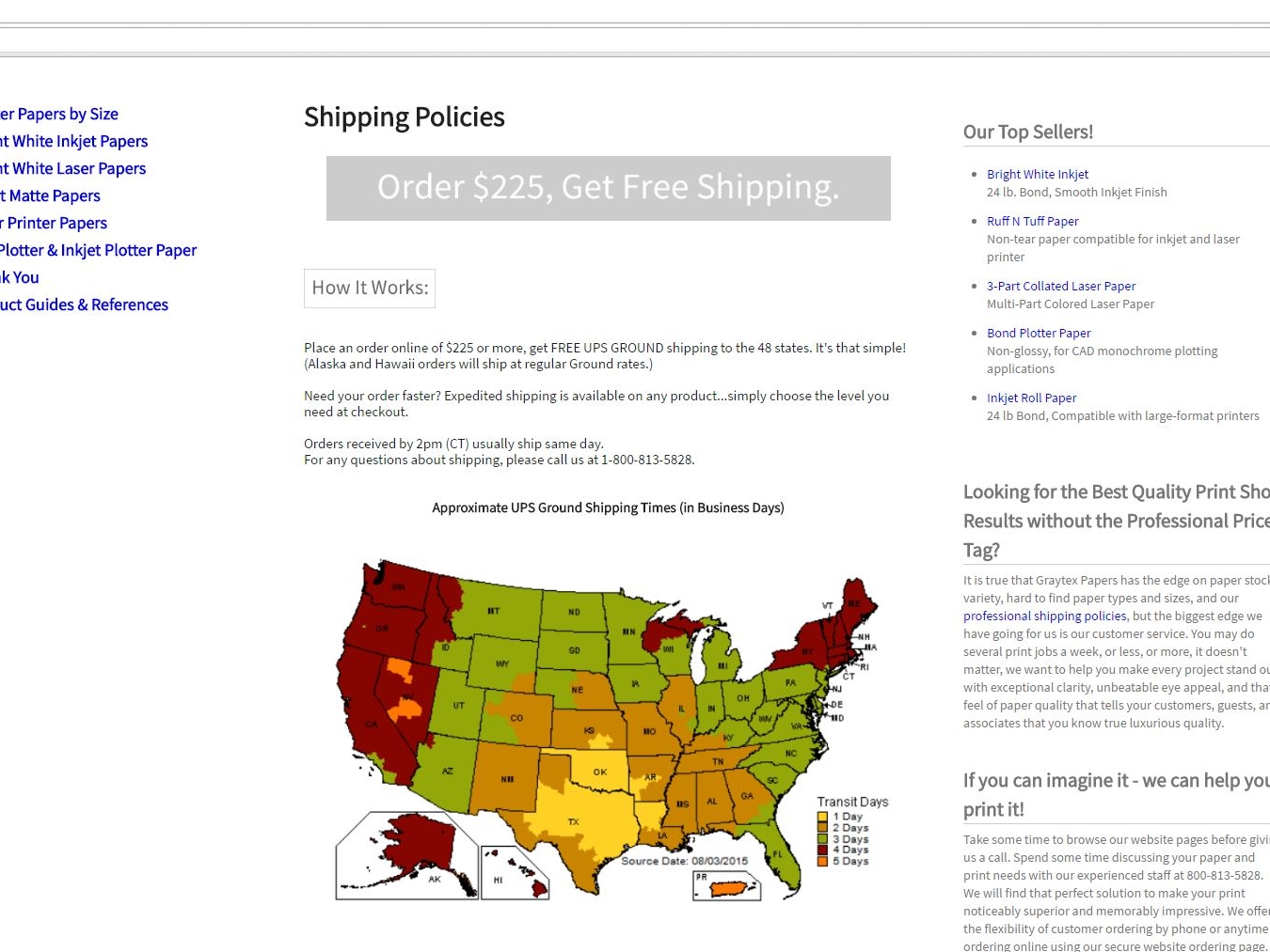


Are we really entering a post-PC world? Surging numbers of mobile users certainly make the future look that way. Mobile will soon become the standard web browsing experience- your “main website” will be your mobile site! This seismic shift means it’s crucial to build excellent mobile sites now to offer mobile visitors everything your desktop version delivers- and maybe even more. A solid mobile design is essential to prepare your company for the next big leaps in technology, too, which will focus heavily on mobile possibilities. You probably already know your mobile site should include something called responsive design. What you may not know is that not all responsive design is the same.
Just a couple of years ago, mobile-compatible sites were rare. Most administrators didn’t even have mobile versions of their sites- users had to deal with frustrating load times, painfully tiny text, awkward oversized navigation, and some non-functional features if they wanted info on the go. Development lagged behind hardware, reducing mobile browsing to a desperate measure most only resorted to in a pinch, maybe for quick driving instructions or business hours. Things have changed quite a bit since then!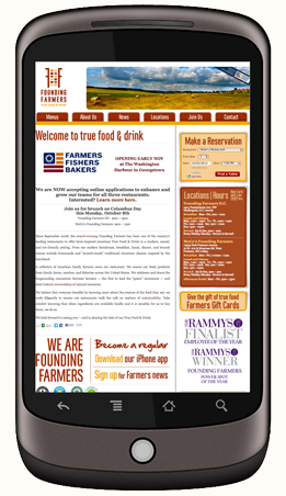
Mobile users are everywhere, and they no longer have patience for anything less than full mobile optimization.
Mobile sites of yesteryear were not very much fun >
Users expect pages that load lightning-fast and give them exactly what they’re looking for, front and center. They expect mobile-specific features that automates much of the work for them, detecting location, device type, preferences, and more. They won’t poke around your site, pinching and zooming to find what they need. They’ll get frustrated and go to another site with better mobile design.
These users expect to meet objectives in even less time than PC users, in a simpler format, on an even smaller screen. This calls for some creative new approaches made just for mobile.
Some developers will approach your mobile site by delivering a great-looking desktop version and then simply “scaling it back” for smaller screens. They might use a plug-in to automatically condense your info, or resize and rearrange your layout to fit, or even cut out crucial features to produce a “lite” version of your site. These are outdated approaches to mobile design. Not only do they consume more work hours (and presumably more cash) than current strategies, they also weaken your site overall.
Flaws with these Common Mobile Development Strategies:
1) Mobile sites shouldn’t be conceptualized or executed as watered-down versions of the full site. The WC3 recommends a “One Web” approach to design today, which means “making the same information and services available across all device platforms,” as much as reasonably possible.
Mobile is a huge design opportunity- not a downgrade-
and the future belongs to those who realize it.
2) Mobile users are not just desktop users on a smaller screen, and simply resizing your desktop site won’t cut it for them. They have different sets of expectations, needs, and priorities. They use the web differently and need sites designed specifically for them. Starting with the question “What do mobile visitors want to do on your site?” is key. A good designer will know the answers and get them right in front of your customers.
Mobile-friendly doesn’t just mean your site will load on a smartphone or tablet screen; it means your site is responsive, not only in terms of size or layout, but responsive to actual mobile user needs.
3) Great mobile design isn’t something you tack on to the end of development. Mobile design that works- gets you sales and prepares you for tomorrow’s web- is embedded in the development process from start to finish.
Mobile design is a huge design opportunity, not a downgrade, and the future belongs to those who realize it.
So What’s the Smart Way to Design for Mobile?
There are three basic approaches in professional mobile design today. Each has their own benefits. MagicLamp can help you pick the one that best fits your particular goals.
Responsive Web Design is the most common one web approach. It uses CSS queries to modify the presentation of a website based on the device display.
Benefits: Designers can use a single template for all devices, and just use CSS to determine how content is rendered on different screens.
Limitations: Testing can be a tedious process and may require some work to get site sections to size cohesively, otherwise sites can end up looking like puzzle pieces that don’t fit quite right.
Responsive sites can be sluggish in loading and performance. Why? Because they load media templates for all possible devices at once, and users have to wait for every page element to load before they can browse. This can be mitigated by incorporating a mobile first approach, where the mobile use case is prioritized during development. However, this often entails a lengthy development process, which can mean rebuilding your site from the ground up. When it’s done, though, you’ve got a really solid foundation for future mobile development and a site that’s truly responsive.
See MagicLamps’s work on these fully responsive client sites:
Aptare
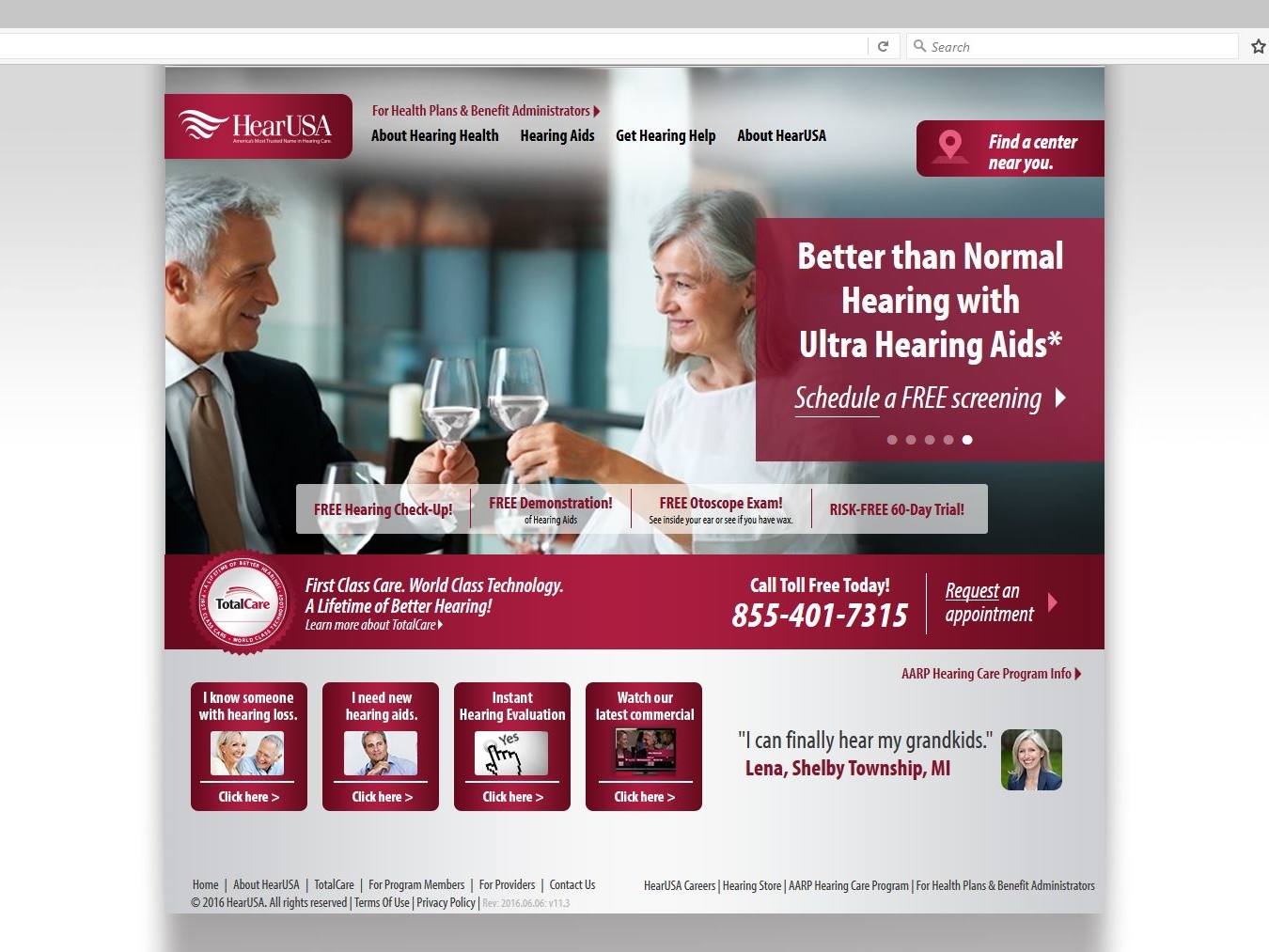
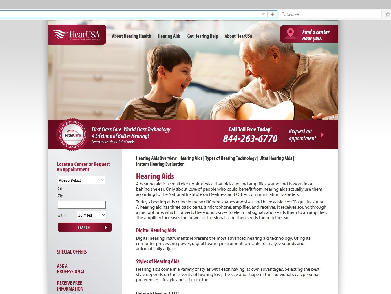
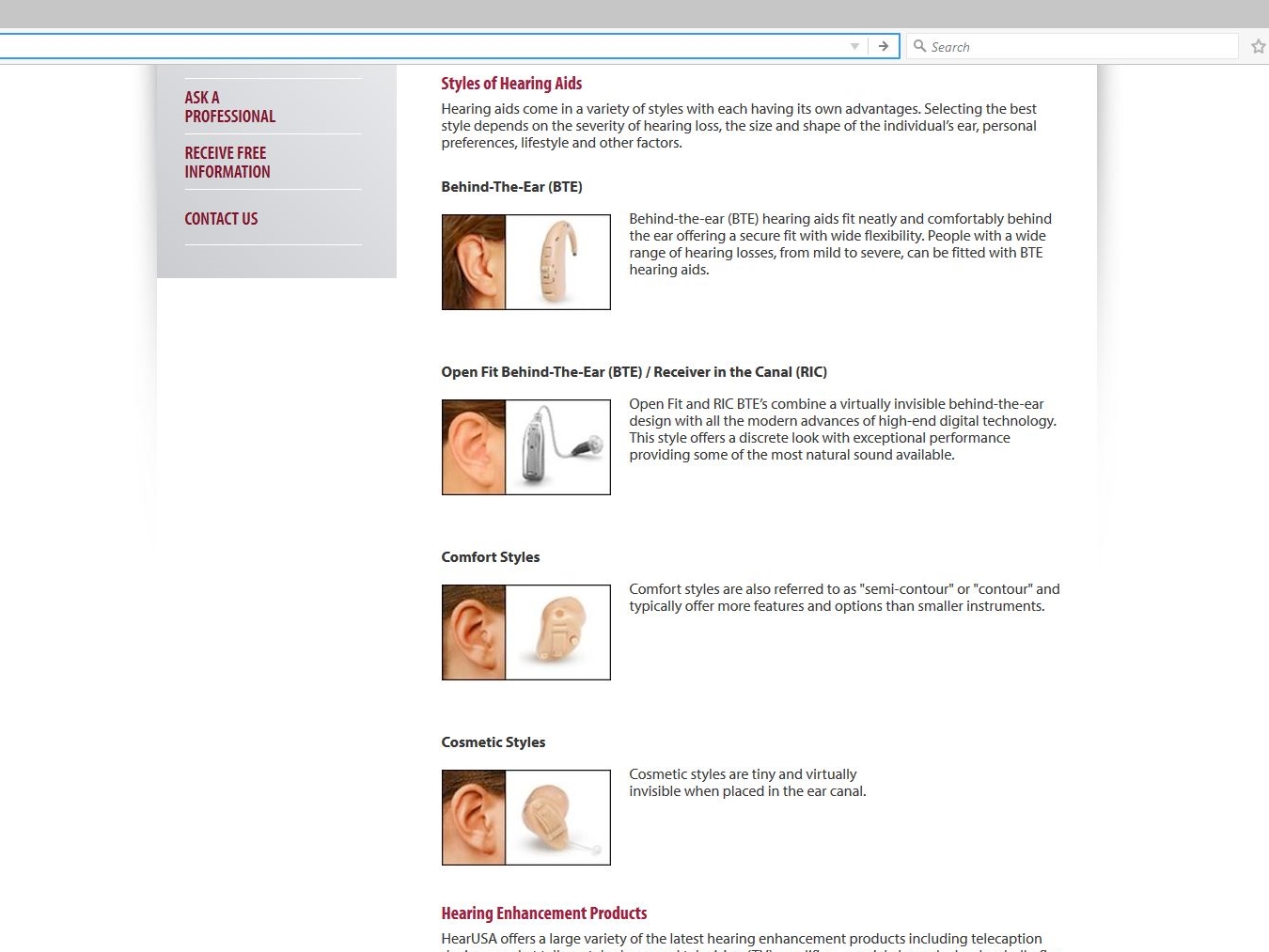
HearUSA
Client-Side Adaptive Design can deliver experiences targeted at specific devices and contexts. Adaptations happen on the client side, right in the user’s browser.
Benefits: Client-side adaptive uses JavaScript to detect device types and display your site in different ways depending on device capability. For example, smartphones with retina displays will receive retina-quality images, and phones with regular displays will receive standard quality images. You can even target your marketing to specific device models, offering iPhone users a site that’s dialed into conversions for apple users, for example.
Another big advantage of client-side adaptive over responsive: you don’t have to rebuild your website! Your developer will simply build an adaptive layer on top of your existing content and code base. Testing is also a snap with client-side adaptive, since you’ll use one set of HTML and Java templates across all devices.
Adaptive design also performs better and loads faster than responsive, because only the required resources are loaded by the device. CDN networks like Akamai and Edgecast can use most of their caching functionality without disrupting user experience.
Limitations: Client-side has a higher barrier to entry than responsive. You’ll need a developer with advanced skills and a solid grasp of JavaScript. You’ll also need to maintain and update your client-side adaptations regularly, since they’re a kind of layer on top of your existing code base.
See Client-Side Adaptive in action:
Threadless
iDeel
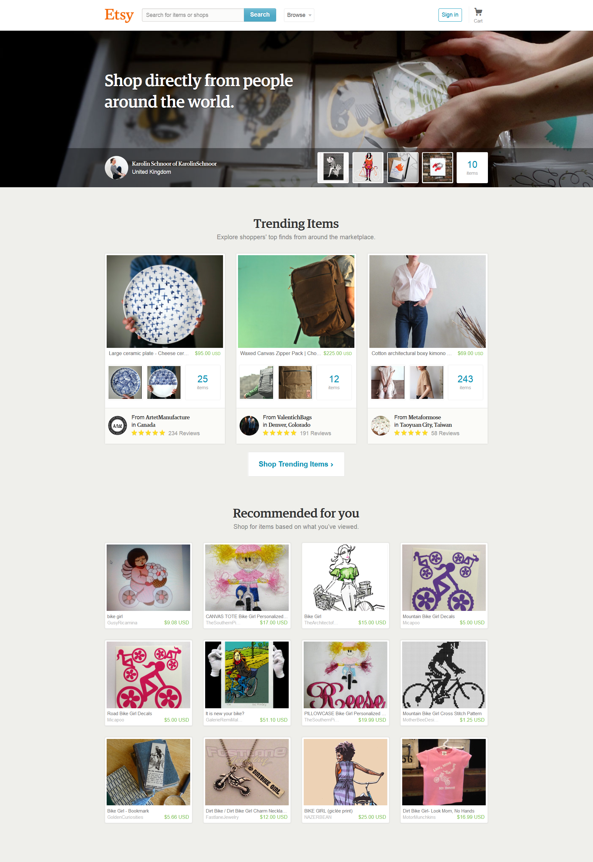
Server-Side Adaptive makes the web server do the heavy lifting of detecting a user’s device and loading the appropriate template. This approach goes beyond customized experiences for devices, so that you can even dial marketing into specific user behaviors and preferences.
Server-side adaptive features multiple device-specific templates, but unlike responsive, only the necessary template is loaded to the device, eliminating the slow performance issues responsive can suffer from.
Benefits: Server-side adaptive utilizes distinct templates for each individual device model, allowing for even greater customization, and it keeps device-detection logic on the server, making for lighter mobile pages that load faster.
Many server-side plugins are available for common CMSs and eCommerce systems like Magento.
If you’re looking to invest in an ultra-customized user experience with high performance capabilities, server-side adaptive is the way to go.
Limitations: When mobile user agent detection is performed on the server, many common caching mechanisms deployed by CDNs need to be turned off. This can result in slower user experience for both mobile and desktop users.
Server-side requires the most extensive upfront changes of these three approaches, including significant upgrades to your back-end systems, which can require hefty development time and investment. Managing multiple templates also raises ongoing maintenance costs, and performance can be impaired when servers are under heavy traffic.
See how server-side adaptive works:
Etsy
One Kings Lane
OnlineShoes.com
With so many different capabilities to compare, it can be tough deciding which approach is right for you on your own. MagicLamp developers have experience with every type of mobile approach, and we would love to tell you which one would fit you best and why.
Tell us about your project and get a free consultation now.
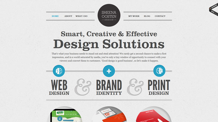 Back in 2010, Google made big news by releasing their own open source web fonts. Starting with just 19 typefaces, it was a huge improvement for developers and designers who’d been stuck with the same 9-10 web safe typefaces for their font stacks. By 2012, Google Web Fonts (since renamed Google Fonts) had grown to over 500 font families. Adobe typekit became popular around the same time, offering even more web type options. Web creators were no longer limited to a handful of body text fonts, and we all basked in the happy glow of digital progress. Unfortunately, there was a hitch. Most web designers work on Macs, known for their pristine graphic rendering. While the new fonts were looking great on designers’ Mac screens, the letters appeared very differently on the average user’s PC: they were highly
  pixilated, blurry at the edges, and “crunchy-looking.” Once developers realized they should be testing the sites on PCs, they were shocked to see their new typefaces looked, frankly, awful.
The problem wasn’t with the fonts themselves- PC browsers just weren’t advanced enough to display the new typefaces cleanly. Internet Explorer was the first to optimize character rendering; soon, open source fonts looked better in IE than any other browser. This still wasn’t very crisp, but it was better than everything else out there. Firefox quickly followed suit and improved HTML text appearance even further. The rendering you see in Firefox today is the standard that set the bar for text rendering over the last few years. Chrome’s text looked jagged and pixilated in comparison until just this August, when Google’s Chrome 37 update raised the ante again. The update came with DirectWrite support for Windows, which transformed HTML characters into something crisper and cleaner than PC users had ever seen before.


Same Fonts, Different Browsers: Firefox and Chrome’s text rendering.
(Firefox: Left, Chrome: Right)
Looking at these Chrome and Firefox text displays side-by-side, you can see how Chrome text is distinctly crisper and more resolved, looking a lot like the rendering on a Macintosh, in fact. Chrome’s new super high-resolution type display is a a huge leap for browser technology. Suddenly, all fonts look incredible, no matter who’s supplying them.
We offer the complete inventories of Google Fonts, Adobe Typekit, and Fonts.com for our clients’ web projects. The foundry previews are real HTML, not bitmaps, and they show you exactly how your fonts will look. The right type sends a cohesive message about your company to customers, telling them exactly what “personality” your business has. We also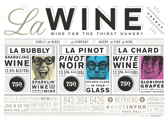 offer expert font selection advice if you’re having trouble deciding or want a second opinion. Between these resources, you get an incredibly broad typeface selection- a tool that gives you a fresher-looking site that stands out from the rest.
Graphics and Iconography with Open Source Glyphs
The evolution of typeface display technology actually gives us a powerful opportunity for rendering graphic elements, too. Recently, we’ve actually started replacing traditional graphic elements with HTML glyphs, using characters from font sets as symbols, graphics, or even images. You see glyphs like the TM and copyright symbols implemented this way traditionally, but the level of clarity in web text display now opens up a whole new world of possibilities.
Advantages of HTML Typeface Characters as Graphics:
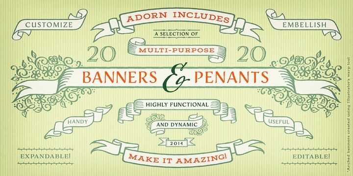
We can also create HTML iconography through typeface packages now. Whether you’re developing a web app, branding a new product line, or want some simple icons for your homepage navigation, we can offer you a whole new playground to experiment with.
These techniques not only open up possibilities for designers and creatives, they also empower developers, who can now use typography instead of graphics to stylize web apps, create brand identities, and unroll fresher-looking sites. Having access to all of these symbols opens up a whole new field programmatically. Instead of designing a graphic, resizing it to optimize loading times, coding it for html, and uploading it, programmers can literally just hit one key, paste in a character that’s already an html entity, and keep on trucking.
.png)
We’ve come a long way since Wingdings!
Interested in updating your site’s typefaces? Want to see what we can do for your icons and graphic elements? We would be happy to give you a free consultation.
Contact us today.
We were recently honored to develop the official website for celebrity chef and T.V. personality, Judy Joo. Joo is one of the four chefs on the Iron Chef UK cooking show, and she’s featured as a judge on The Food Network’s show The Next Iron Chef. Our team launched the site last month and we’re very pleased with how it came out!
Conceived by designer Wook Kim, the website showcases expansive, borderless images of Joo exploring culinary locales, pulling visitors into the homepage while rich, high-quality content keeps them clicking.
The site is completely WordPress powered, and features a recipe gallery with dozens of Judy Joo’s signature dishes, complete with mouthwatering photos. We built custom filters into the recipe page, giving visitors the option to call up recipes by type of dishe or main ingredients via a simple drop-down menu. Joo’s site administrators can upload new recipes in a snap with our easy content management system, and they do so regularly. The site even has Vimeo plug-ins so Joo can post videos that upload and play instantaneously.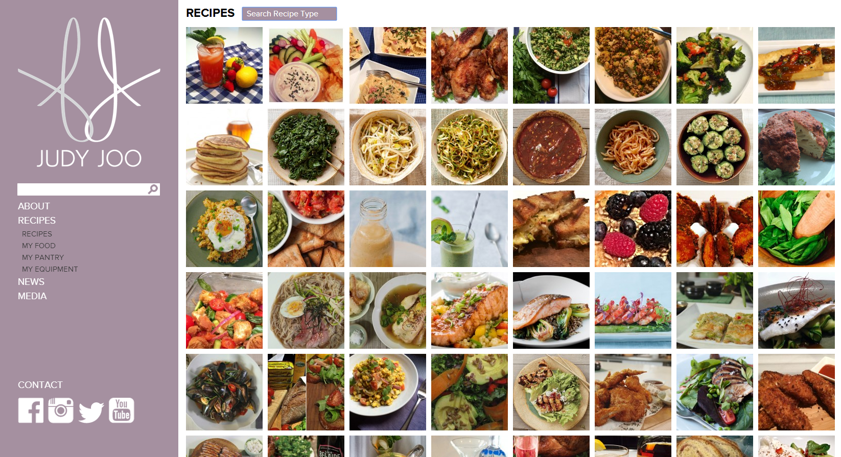
JudyJoo.com is also equipped with responsive design: the entire site sizes automatically to your browser window. The responsivity doesn’t stop with desktop browsers, it works with any mobile device screen so viewers get consistent merchandising across the technology spectrum- desktops, laptops, tablets, smartphones, and more. You can play with the site’s auto-resize to see it yourself– just drag the corner of your browser window to make the page bigger and smaller, and watch the site resize itself just as quickly as you resize the window, with zero downtime and no reloading.
Judy Joo and her staff were so pleased with the website and their MagicLamp experience that they’ve asked us to be the developer for their next web project: the official site for Joo’s new London restaurant, Jinjuu, slated to open November, 2014, in the Soho district.
MagicLamp relaunched high fashion retailer Opening Ceremony’s site this week, unrolling a smart, contemporary minimalist design that sets all attention squarely on the products.
The new design features a layout that’s even more minimalist than OC’s previous look, stark typographic treatments, and a new integrated Twitter feed. We removed the pastel design accents and background color gradients, paring the site’s palette down to classic black and white. With the new look, all of the color is in the products, creating a crisp, impeccable aesthetic fitting for this hip cosmopolitan brand.

Photos on the new homepage nest together in a gridded javascript layout nicknamed “masonry,” a name reflecting how elements of different sizes are laid in and fitted together, much like fine stonework. Semi-opaque white overlays with descriptive text (we used Adobe’s typekit) appear over each photo as visitors roll over images.
Overall, the site’s new incarnation is much more visual, heavily emphasizing images over text. OC’s new blog in particular is a great example of this strategy: huge, crisp, color-saturated images you could practically fall into dominate the screen. Your eyes can’t help but soak up the visual feast. The effect is that readers actually associate entries with the image more directly than the title or text, resulting in quicker processing and response time and greater emotional engagement. The shift from text to image is a big movement in web design today as we discover more about the psychological primacy of images and the benefits of engaging the intuitive, image-responsive right brain in user experience.
Opening Ceremony made another big announcement this week: their MICA Smart Bracelet, a smartphone-like mobile device produced in partnership with Intel, was unveiled yesterday and will be available at OC stores for the 2014 holiday season. OC is in the vanguard of companies to enter the luxury tech wear market.
Kudos to our longtime partner Opening Ceremony on all of their exciting new developments!
Faceted classification will transform your site into an experience visitors love, but it can achieve even greater feats in the hands of business owners and site administrators.
 Faceted classification isn’t just about a polished presentation for your guests- it’s also about what you want to do as a merchandiser. On top of making searches quick and easy for customers, faceted classification opens up a world of possibilities for you. The more ways you can slice and dice your product catalog, the more power you have to implement persuasive, exciting merchandising strategies. Just like customers can filter in or filter out particular facets, you and you staff can use the same system to filter items for promotional codes, new ad campaigns, clearance sales, individual discount expirations and more. With a few clicks, you could group your summer inventory on a special page, offer a discount on all items from a certain designer, set up a limited-time coupon code for any of your starter kits, or whatever makes sense for your company’s objectives at the time. When products are organized and classified this way, you have the freedom to merchandise in virtually endless ways.
Faceted classification certainly improves the user experience at the front end, but it also gives you tremendous power to merchandise effectively from the back end using the same built-in structure of information. MagicLamp builds this system into your website, letting you take advantage of the simple elegance of effective web architecture. This kind of merchandising is actually more flexible and precise than traditional storefront selling!
Want to experience MagicLamp’s faceted classification firsthand? Contact us today to set up a demo.
.jpg)
There’s more than just one kind of faceted classification. In the world of blogs, authors use labels called tags you’ll see in a list or “cloud.” Tags are actually another form of faceted classification. Bloggers tag each article with words that describe the subject, making it easy to bring up posts with shared themes together. Tags can be very useful, but they’re also free-form entries, which means bloggers type in each tag by hand. This can create problems if the tags deviate accidentally, even slightly. Tagging one blog post under “pet snake” and tagging a related post “pet snakes,” for example, will break down the integrity of the site’s organization. If you have multiple authors working on the same blog, things can get even trickier. For the system to work right, everyone has to tag facets with exactly the same word or phrase, otherwise it’s very easy to lose standardization, which prevents reliable navigation.
MagicLamp doesn’t suffer from these problems because of the way we implement our systems. For our eCommerce framework, we use pre-defined labels instead of free-form fields. Users simply click on the filters they want to apply, leaving no room for keystroke errors or mislabeling.
.jpg)
Our faceted classification systems also work faster than others. When you look at the way platforms like WordPress and Magento implement faceted classification through tags, you can see how the limitations of those system will slow down processing more and more as you develop your site and the data grows. Click a tag for “widgets,” for example, and WordPress does a search across all of your blog entries in the text field called tags for any instances of the word “widgets.” Even for a computer, going through every single blog entry word-for-word can take a long time if you have a lot of information there! The same thing can happen with eCommerce if your product information is organized like a Magento site. MagicLamp sites are different. Since we pre-index every facet, they all become independent vectors, making searches instantaneous. Heavy user traffic is no problem at all.
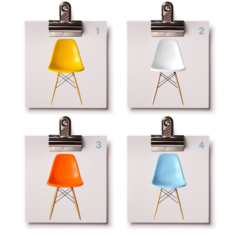
Accuracy of Classification = Integrity of Navigation.
Your web developer should be able to pick the best style of information architecture for you- one that makes the most sense for your particular business’ merchandising goals and style. At MagicLamp, we’re careful to select the systems that fit best for your type of inventory, giving you the power for optimum results!
> Next: Faceted Classification Part 3: The Power to Merchandise
< Faceted Classification Part 1: The Engine of Good eCommerce
Orange, Water-Resistant, Small, USA Made, Remote-Controlled…
Every quality of an item is something we call a facet. How do you organize all that information?
.png)
Faceted Classification is something we build into every one of our eCommerce sites. It’s a powerful feature that makes it very easy for your customers to find exactly what they’re looking for on your site in a way no other system can. Products aren’t just organized by category, or sorted according to one attribute, like color, for example. Instead, each item is coded for every attribute, or facet, that a visitor might be interested in.
If you’re an online hat retailer, this means your customers can not only look for blue hats using a search based on a color facet, but simultaneously search for hats according to style, materials, level of sun or wind protection, or even sizes current in your inventory. They can also search with any combination of these facets to find just the right hat. They can include or exclude any qualities they like. If a large, blue, cotton, US-made, waterproof hat with a brim is what they want, they can look for those exact features with a few clicks on the filter categories. Our faceted classification organizes your site like department stores organize merchandise. Customers can navigate inventory effortlessly and intuitively.
In a brick-and-mortar retail store, every item has certain qualities or attributes- color, name, size, SKU number, function, price, or manufacturer, for example. Coding these facets into our eCommerce sites makes a big difference in what both you and your customers can do on the site. If you walked into that retail store, you’d find things grouped together in a way that makes it easy to find them. Websites can do the same thing, but what happens when you have some items a customer might expect to find in two or more areas of the store? In a physical shop, you could simply place the product in both areas. On the web, it can be trickier. One of the first problems developers run into is code that only allows each product to be placed in one category, or virtual “bucket.”
Our way of implementing faceted classification gets your products cross-indexed so you and your customers don’t miss a thing. If a customer searches for a V-neck shirt, for instance, you want your site to show them all of the V-neck shirts in your inventory. If you have one blue-colored V-neck that gets coded for the facet “blue,” but not the facet “V-neck,” your customer is probably going to miss it in their search, and so will you when you need to bring up those styles for administrative tasks. With our system, the shirt would be indexed in both categories and any others that applied, basically “cross-listing” it, so it would be sure to come up in a search for any of its facets.
< An example of detailed
faceted classification for hats
on Amazon.com
On the FACE Stockholm site, we designed a product catalog where customers can browse with a broad range of sorting options. Here’s how faceted classification works in the Nail Polish section of FACE:
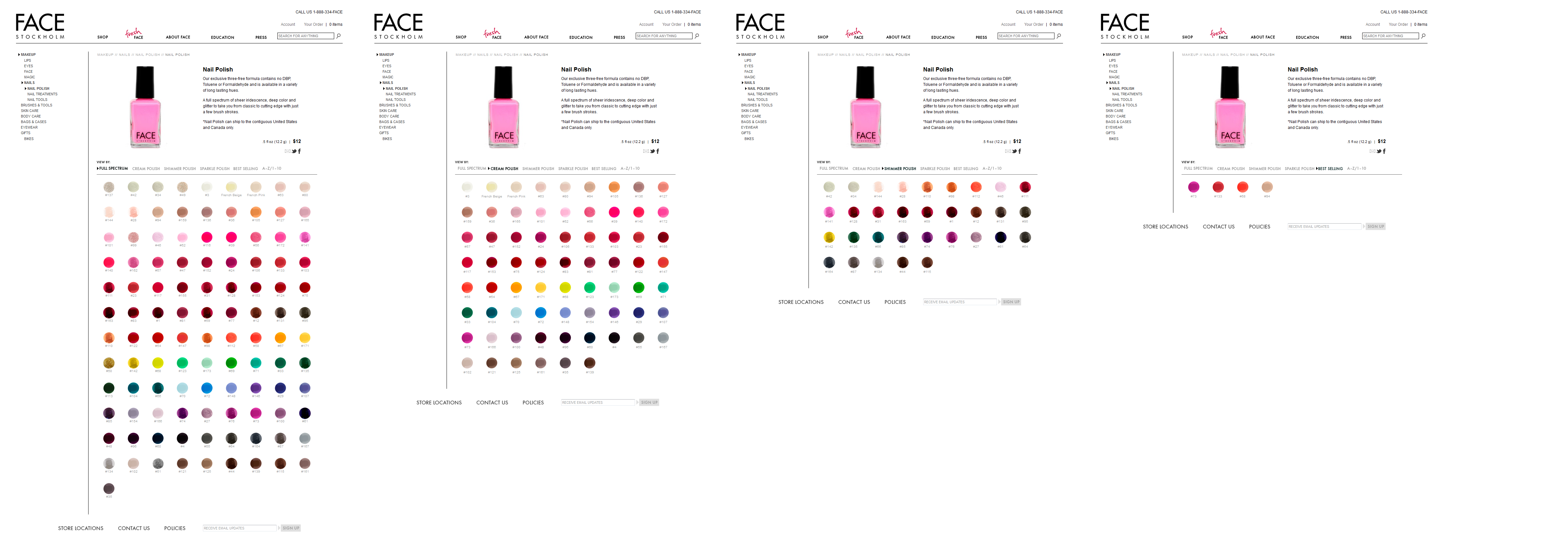
Visitors can see the complete polish inventory in the “Full Spectrum” view, sort polishes by finish (Cream, Shimmer, Sparkle), organize them in order of popularity, or simply list them in alphabetical order.
How many times have you felt perplexed in front of a huge shelf of products in a store? When displays don’t seem to be organized in any particular order, it’s hard to find what we want. A website with well-implemented faceted classification is actually easier to navigate than a physical retail store!
In the online world, the less time and energy your customers have to spend navigating your site, the happier they will be. A site without our kind of faceted classification is frustrating- shoppers have to invest extra attention sifting through more of your inventory than they want to. Whether or not your site has a clear, effective organization structure can easily mark the difference between a site customers return to and one they’ll avoid!
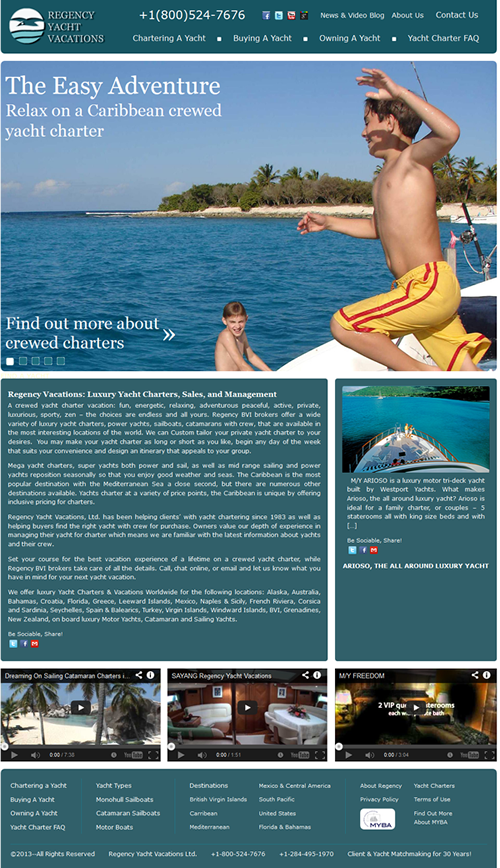
Magiclamp worked with Regency Vacations to come up with a redesign that is visually appealing, and better showcases their passion for Yacht Vacations. Whether it is an adventurous and energetic or peaceful and relaxing vacation you are looking for, the comprehensive search features allow you to find the perfect Yacht for your budget with over 20 destinations to choose from. In the new WordPress theme, Magiclamp included a slideshow with high definition images that give future Regency clients a small glimpse of what they will experience on their vacation. The simple design allows users to find the information they need easily, and quickly.
Esqueleto is a shop located in Oakland, CA, which offers a collection of art and jewelery curated by owner Lauren Wolf. After designing the Esqueleto website, Wolf chose MagicLamp Networks to develop the eCommerce site. While it was important to find a website development firm that could properly convert her clean, simple website design into a fully-functioning eCommerce site, it was also important that the eCommerce website development firm could provide a site with features such as backend Content Management System integration and a customer account portal, which would allow Esqueleto to optimize its customer service by streamlining its logistics and customer communications.
Magiclamp Networks’ Magic Shopping Cart was an optimal choice for Esqueleto. 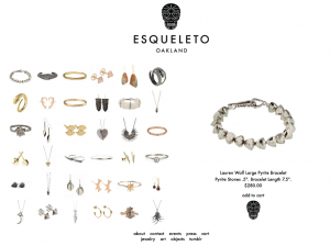 Magiclamp fully integrated the design of the Esqueleto brand with the needed modern function of the Magic Shopping Cart, which includes integration with the custom Content Management System. The result is a beautiful and minimalistic website whose real appeal lies in the speed and functionality delivered by MagicLamp’s custom JavaScript programming and image-based scripting. MagicLamp integrated a custom Zoom feature into the product pages, so Esqueleto’s website visitors are offered a comprehensive view of the objects, jewelry and art of the shop.
Furthermore, Magiclamp’s Content Management System provides Esqueleto with the ability to edit content on the website in a straightforward and real-time manner while maintaining proper Search Engine Optimization and web compatibility. Click here to learn more about MagicLamp’s Content Management System.
The Esqueleto website has a completely custom appeal. Initially, one notices the minimal design and the simple menu selections. Along with the product display grid, the visitor can view all products within a single category without switching page views or waiting for images to load. Images load immediately and the design is maintained across browsers, platforms and devices, including iOS mobile devices.
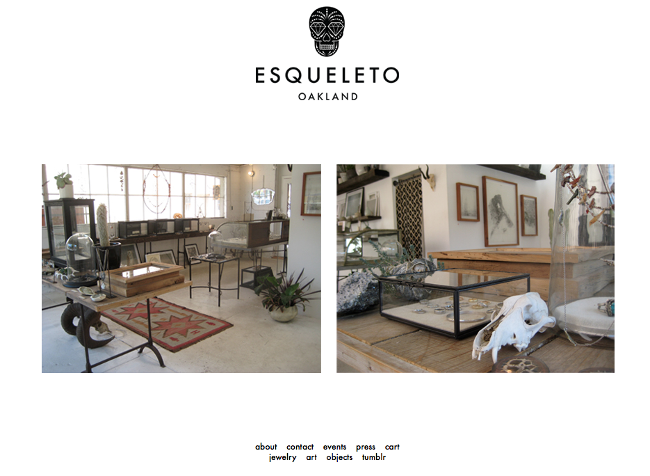 The Esqueleto website provides its visitor with a very strong impression of quality and value. In an global eCommerce environment where aesthetics and value attribution are increasingly important, Magiclamp Networks delivers a product that raises the bar in eCommerce and custom web development. The simple, clean aesthetic of Esqueleto.com allows the website to virtually disappear from the viewers mind, so all that is left to see are the unique imperfections of handcrafted art.
Click here to view MagicLamp’s complete Web Development Portfolio.