In modern web design, the more streamlined, focused experience you can give your visitors, the better your results. Far from a niche style, Minimalism is actually key to any good professional website today.
Web design is all about appealing to your customer’s eye and drawing them back again and again to your site. In eCommerce design, the ultimate goal is getting your product purchased. A well thought-out, appealing design will keep your viewer engaged, while supporting the credibility of your product, site, and business as a whole.
As web designers, we have seen many designs become overworked, under-planned and simply unfocused. An experienced web designer learns to balance design versus functionality and simplicity versus gimmicks. While staying at the forefront of web trends is a goal for any site, an e-commerce site’s main focus has to be getting the consumer to purchase the product.
.png)
Remember websites in the early 90’s? Busy, info-packed layouts with bright flashing colors that lit up your screen like a disco ball? Although we find those early designers’ “more is more” enthusiasm for the brand-new online world a little endearing, web design has come a long way since. Research shows us that less really is more when it comes to engaging visitor attention, and success online is all about how your site shapes people’s focus. Caption: If your site still looks like this, it’s time for an upgrade!
Minimalist aesthetics are a popular design strategy in e-commerce today. The style directs customer focus to the product immediately, eliminating any clutter that would distract the viewer. Minimalist design allows the product to become the focal point of the site. By breaking a design down to the bare essentials, you can produce a clean, but very functional site. A good minimalist designer knows how to use white space, create balance and contrast, and precisely focus the content. These types of designs guide the viewer’s eye- not to flashy ephemeral web trends, but the clear-cut star of the site, the product.
Companies sometimes shy away from minimalist designs for fear they might look unfinished or too simple, but when they’re done right, minimalist designs are some of the most beautiful, classic and engaging sites on the web.

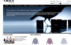
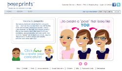
One great example of minimalist design is MagicLamp site Odin New York. By simply showcasing their products through high quality imagery, Odin created a storefront that exudes the high class, fashion forward image it’s known for. With simple lines, clean typography, generous white space and outstanding product photography, Odin uses clean, minimal design to focus on what their site is for: selling their products. Another excellent example of using minimalist design to focus on the end goal is PosePrints. PosePrints created a cohesive site aesthetic with careful use of white space that draws the eye to the product focal point. Using a simple monochromatic color scheme, the only flashy items on this site are the products themselves. The stationary card images are the color and the “pop” that stand out on this site. PosePrints’ design gives the customers a sense of style without distracting them from the product itself.

When it comes to web design and minimalism, remember “less is more” and sometimes less can bring you more…revenue.